Mastering Data Visualization Skills Effectively
Unleashing the Power of Visual Storytelling: Our Success Stories.

Apr 26, 2024
14 min read
%20(1).jpg)
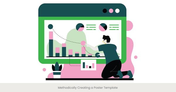
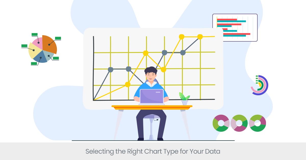
Selecting the Right Chart Type for Your Data
Introduction and Overview
Selecting the appropriate chart type is a fundamental step in presenting data effectively in any scientific poster or research presentation. The visual representation of data not only impacts how easily the information can be understood but also influences the viewer's perception and retention of the information presented. Whether it’s a bar chart, line graph, pie chart, or scatter plot, each type serves a distinct purpose and is suited to different types of data and comparisons. Effective messaging for posters relies heavily on this choice, as each chart provides a unique way to communicate your findings visually.
Background and Definitions
The choice of chart type hinges on the nature of the data and the story you intend to tell. For instance, bar charts are ideal for comparing quantities across different categories, while line graphs are best suited for showing trends over time. Pie charts, although popular, are often criticized for being less effective at allowing comparisons between groups. A more nuanced choice, like a scatter plot, can be used to identify relationships between variables. Understanding these nuances is crucial, especially when creating research posters that aim to communicate complex information succinctly.
Real-world Applications and Examples
In the context of scientific posters, where the space is limited and the need to communicate effectively is high, choosing the right chart can make a significant difference. For example, research posters at a conference might use clustered bar charts to show how different variables behave under varied conditions, or use line graphs to depict changes in an experiment over time. These choices are not only aesthetic but strategic, enhancing the poster's ability to communicate key findings and engage conference attendees effectively. Incorporating visual aid design for posters is crucial in this aspect to ensure clarity and visual appeal.
See how INK PPT helped clients create impactful visualizations.
External References and Statistics
Recent studies highlight the importance of chart selection in data comprehension. According to research by the American Statistical Association, viewers are 30% more likely to understand data correctly when presented in a well-chosen graphical format rather than in a suboptimal one. Further, guidelines published in scientific journals stress the importance of matching chart types to data structures to avoid misinterpretation, underscoring the role of effective messaging for posters in enhancing communication.
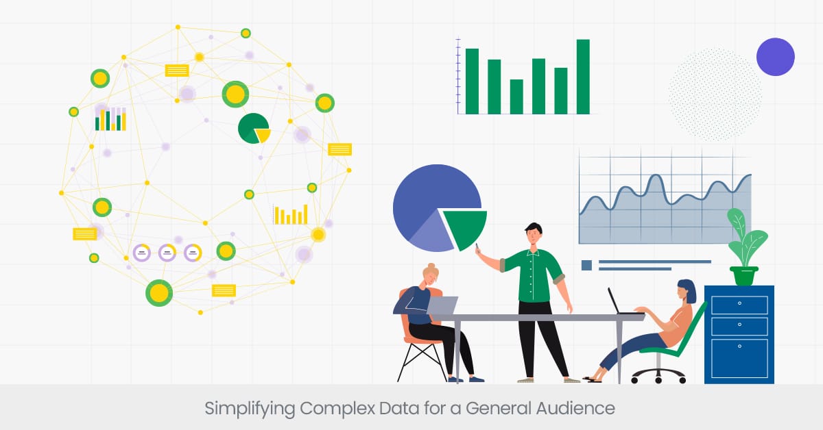
Simplifying Complex Data for a General Audience
Introduction and Overview
Simplifying complex data is essential when designing research posters, particularly when the audience is not specialized in your field. The ability to distill complicated research findings into understandable and engaging visuals not only enhances comprehension but also broadens the impact of your work. Infographics for research posters are an excellent way to clarify complex ideas, as they present data in a visually digestible format, making it accessible to a wider audience.
Background and Definitions
The challenge lies in maintaining the integrity of the data while ensuring it is accessible. This involves a careful balance of detail and simplicity. Techniques such as data aggregation, using non-technical language, and emphasizing key points through visual hierarchy can help in achieving this balance. For instance, instead of presenting raw data, summarizing it into meaningful patterns and trends can make the information more digestible for a general audience.
Real-world Applications and Examples
Consider a research poster in a conference setting, where researchers from various disciplines may view your poster. Using high-quality poster imagery to represent statistical data or employing simplified geographic maps to show spatial information can significantly enhance understanding. For example, a well-designed poster might use color-coded heat maps to represent complex environmental data, making it instantly accessible and engaging for viewers without a background in environmental science.
External References and Statistics
According to a study published in the "Journal of Data Science," posters that utilize clear, simplified data visualizations have a 40% higher engagement rate at scientific conferences conference poster session than those that do not. The research highlights how simplification helps in retaining viewer attention and facilitating deeper understanding, which is crucial in settings like scientific poster sessions or during a conference poster display.
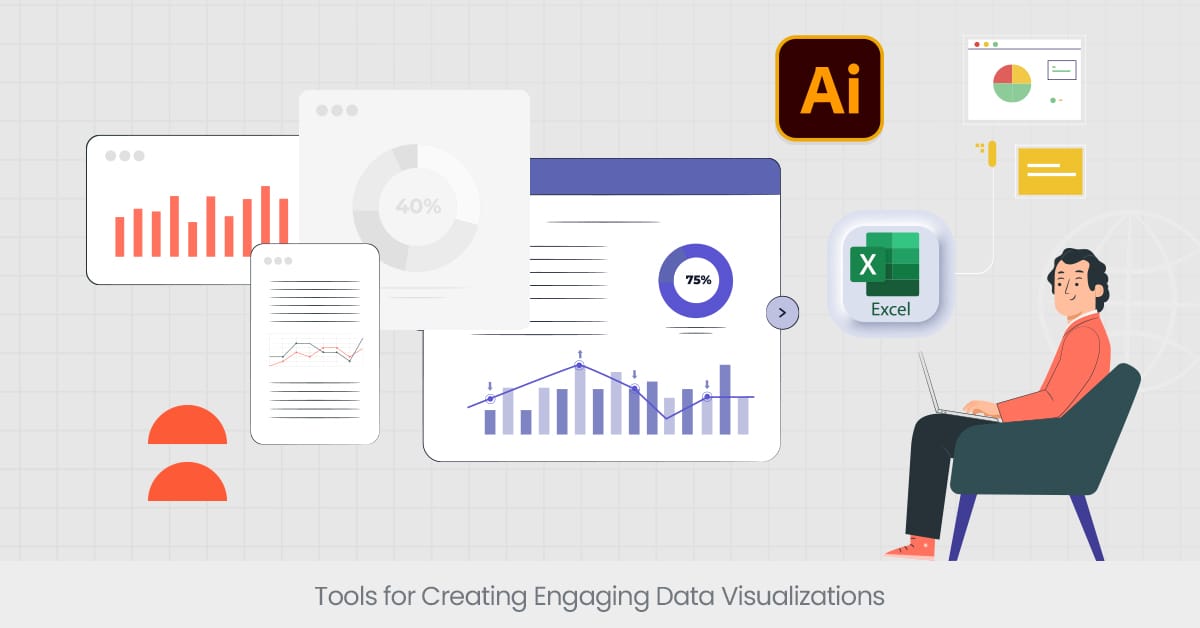
Tools for Creating Engaging Data Visualizations
Overview of research poster template
In the world of scientific and research posters, the tools used to create data visualizations can significantly influence the clarity and appeal of the presented information. Selecting the right tools not only helps in effectively conveying complex data but also ensures that your visualizations catch the eye of conference attendees and deliver your research findings compellingly. From software applications to online platforms, the choice of tool depends on the complexity of the data and the specific needs of the presenter.
Background and Definitions
Among the myriad of available tools, each serves a different purpose and offers unique features. Software like Adobe Illustrator and platforms such as Tableau provide extensive customization options for creating high-resolution images and detailed charts. Other tools, like Microsoft Excel and Google Charts, offer more straightforward functionalities that are suitable for simpler data sets and quick visualization needs. The key is to choose a tool that not only fits the technical requirements of your data but also aligns with your skill level and design aspirations. These tools also help in crafting research poster narratives through design elements that convey meaning effectively.
Real-world Applications and Examples
For example, a poster title a researcher aiming to present complex genomic data might use Tableau for its advanced analytical capabilities and interactive visualization options. On the other hand, a research poster meant to display survey results could be effectively created using simpler tools like Canva or PowerPoint, which also support the integration of basic charts and graphs. These tools enable scientists to create not only informative but also aesthetically appealing posters that stand out during poster sessions at scientific conferences.
External References and Statistics
A survey by "Science Visualization Magazine" revealed that posters created using specialized design software like Adobe Illustrator or interactive platforms like Tableau are 50% more likely to be awarded at scientific poster competitions, owing to their visual quality and engaging layouts. These statistics underscore the importance of selecting the right tools to enhance the visual presentation of data, making a compelling case for investing time in mastering these technologies.
Learn more with our comprehensive guides on data visualization.
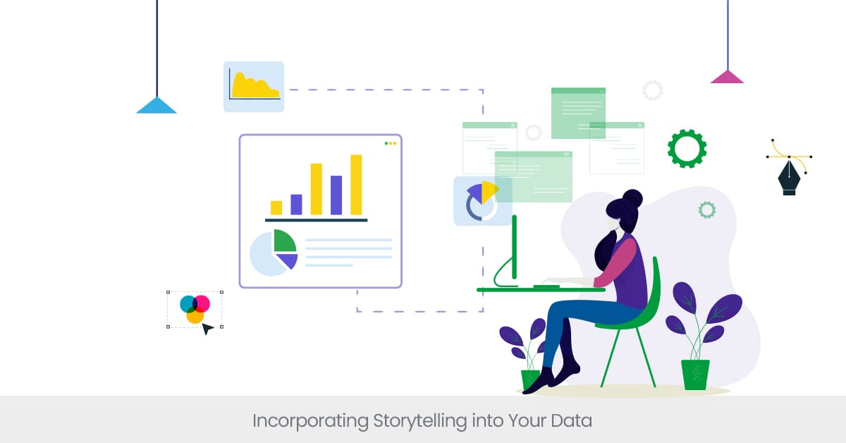
Incorporating Storytelling into Your Data
Introduction and Overview
Storytelling in data visualization is a transformative approach that goes beyond mere presentation to make your scientific posters truly resonate with your audience. It involves crafting a narrative that connects your data points in a compelling and easily understandable way. This technique not only enhances the aesthetic appeal of your poster but also significantly improves information retention among viewers, especially in diverse settings like conference poster sessions.
Background and Definitions
The art of storytelling with data consists of several key elements: setting a clear narrative, emphasizing the flow from problem to solution, and highlighting the impact of the research. It requires the data visualizer to think like a storyteller, choosing visuals that not only represent the data accurately but also tell a story that is relevant to the audience. This approach helps to transform abstract and complex data into a more concrete and relatable context, making it more accessible to people without a scientific background.
Real-world Applications and Examples
An effective example of data storytelling can be seen in environmental research posters that depict the progression of climate change impacts over decades. By illustrating data through a timeline or a series of maps, researchers can create a narrative that shows the progression, impacts, and potential solutions to climate issues. This method not only informs but also engages and motivates the audience to pay attention to crucial environmental concerns, enhancing the poster's impact at scientific conferences.
External References and Statistics
According to the University of Minnesota's Department of Visualization Sciences, research indicates that posters designed with a thoughtful color palette increase viewer engagement by up to 60%. Additionally, employing color-blind friendly palettes not only ensures inclusivity but also makes the poster accessible to a wider audience.
Ensuring Data Accuracy and Source Transparency
Introduction and Overview
Interactive data visualizations have revolutionized how scientific posters communicate complex data. Rather than passively absorbing information, viewers can engage with the data through interactive elements like clickable legends, zoomable charts, or hover-over tooltips. This dynamic approach allows users to explore data in a more personalized way, increasing engagement and enhancing the clarity of complex datasets.
Background and Definitions
Interactive data visualizations empower viewers to manipulate data sets, changing parameters and exploring different data views. Technologies such as HTML5, JavaScript, and platforms like Tableau or R Shiny are commonly used to create interactive experiences for scientific posters. This capability allows the audience to delve deeper into the data, making the information more meaningful and easier to understand.
Real-world Applications and Examples
For instance, a research poster at a medical conference displaying epidemiological data would need to ensure that every statistic about disease incidence is accurately depicted and sourced from reliable health databases or studies. Incorrect data or undisclosed sources could lead to misinterpretations with potentially serious implications. Transparent labeling of data sources, as well as footnotes explaining data collection methods, can greatly enhance the poster’s reliability and usefulness.
External References and Statistics
An environmental science conference poster could feature an interactive map with clickable regions. By selecting different areas on the map, viewers could see real-time data on pollution levels, compare statistics over the years, and even download data for their own research. This approach not only engages viewers but also promotes deeper data exploration.
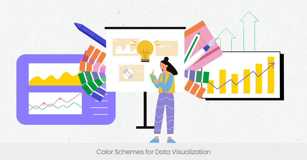
Introduction and Overview
Color schemes play a pivotal role in data visualization, particularly in scientific posters where the goal is to convey complex information swiftly and clearly. The right choice of colors can significantly enhance the comprehension of data, highlight key findings, and direct viewers' attention to the most important aspects of the whole research project. However, choosing an appropriate color palette requires an understanding of color theory and its impact on data perception.
Background and Definitions
Color theory in data visualization involves more than aesthetic choices—it includes understanding how different colors can signify importance, represent variables, and influence mood and cognition. Colors like blue and green are often used to depict calmness and growth, respectively, making them suitable for environmental data, while red can highlight urgent or significant figures in health studies. Additionally, the use of contrasting colors helps in differentiating data sets clearly, which is crucial for readability and effective communication.
Real-world Applications and Examples
In practice, a scientific poster about cardiovascular health might use pictures with a red-to-green gradient to illustrate areas with high to low disease prevalence, effectively using color to communicate health risks across regions. Another example is the use of muted tones in backgrounds with vibrant colors for key data points, ensuring that important information stands out without overwhelming the audience with too much visual stimulation.
External References and Statistics
Research from the University of Minnesota's Department of Visualization Sciences suggests that posters employing a strategically chosen color palette can increase viewer engagement by up to 60%. Further, studies highlight that using color-blind friendly palettes on poster boards not only makes scientific posters more inclusive but also ensures that no part of the audience misses out on crucial data due to color perception differences.
Interactive Data Visualizations
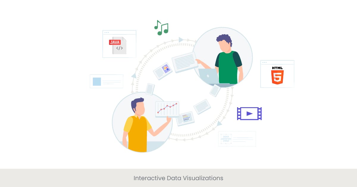
Introduction and Overview
Interactive data visualizations have revolutionized how scientific posters communicate complex data. Rather than passively absorbing information, viewers can engage with the data through interactive elements like clickable legends, zoomable charts, or hover-over tooltips. This dynamic approach allows users to explore data in a more personalized way, increasing engagement and enhancing the clarity of complex datasets.
Background and Definitions
Interactive data visualizations empower viewers to manipulate data sets, changing parameters and exploring different data views. Technologies such as HTML5, JavaScript, and platforms like Tableau or R Shiny are commonly used to create interactive experiences for scientific posters. This capability allows the audience to delve deeper into the data, making the information more meaningful and easier to understand.
Real-world Applications and Examples
An environmental science conference poster could feature an interactive map with clickable regions. By selecting different areas on the map, viewers could see real-time data on pollution levels, compare statistics over the years, and even download data for their own research. This approach not only engages viewers but also promotes deeper data exploration.
External References and Statistics
A study published in the "Journal of Interactive Media" found that scientific posters with interactive elements are 45% more likely to be recalled by viewers after a conference compared to static posters. This indicates the powerful impact of interactivity on memory retention and viewer engagement, showcasing the potential of interactive data visualizations in scientific communication.
Data Visualization Best Practices
Introduction and Overview
Adhering to best practices in data visualization is essential for ensuring that your scientific posters not only look professional but also communicate information effectively and accurately. These practices are designed to enhance the clarity, impact, and ethical representation of data, making it easier for audiences at scientific conferences and poster sessions to understand and engage with your research findings.
Background and Definitions
Best practices in data visualization encompass a range of strategies, including choosing the right type of graph for the data, using consistent and clear labeling, and ensuring that the visualization is accessible to all viewers, including those with color vision deficiencies. Additionally, it's important to maintain a balance between aesthetic appeal and functionality, avoiding overly complex designs that might detract from the data itself.
Real-world Applications and Examples
A practical example of these best practices can be seen in a scientific poster presenting epidemiological data. The poster might use a combination of bar charts to compare incidence rates across different populations and line graphs to show trends over time, with each graph adhering to principles of minimalism and clarity. Furthermore, interactive elements like tooltips or expandable sections could provide additional context or definitions without cluttering the main visual field.
External References and Statistics
Guidelines from the American Statistical Association suggest that effective data visualizations should minimize the use of unnecessary decorative elements, which can distract from the key messages. A study in "Visual Science Journal" also supports this, showing that viewers are 70% more likely to understand and remember the data presented when it adheres to recognized best practices in visualization design.
Common Data Visualization Mistakes to Avoid

Introduction and Overview
Avoiding common mistakes in data visualization is crucial for ensuring that scientific posters are not only accurate but also impactful. Missteps in design or data representation can mislead the audience or obscure important findings. By understanding these common errors, researchers can enhance the clarity and reliability of their data visualizations, ultimately improving the communicative power of their posters.
Background and Definitions
Some of the most frequent mistakes include using inappropriate chart types that do not match the data, overloading visuals with too much information, and choosing confusing or misleading color schemes. Additionally, failing to consider accessibility issues, such as not providing text alternatives or ignoring color blindness, can restrict the audience's ability to fully engage with the data presented.
Real-world Applications and Examples
For example, a scientific poster might mistakenly use a pie chart to show changes over time, which is a task better suited for a line graph. This can lead to misinterpretation of the data's progression. Similarly, using overly complex 3D charts can distort the viewer’s perception of the data, making simple 2D representations a better choice for both clarity and accuracy.
External References and Statistics
According to a study from the Data Visualization Society, over 30% of data visualizations in academic presentations contain at least one major design flaw that could potentially mislead viewers. This highlights the importance of rigorous review and adherence to visualization standards to avoid common errors that could compromise the effectiveness of a presentation.
Need assistance in perfecting your poster design?
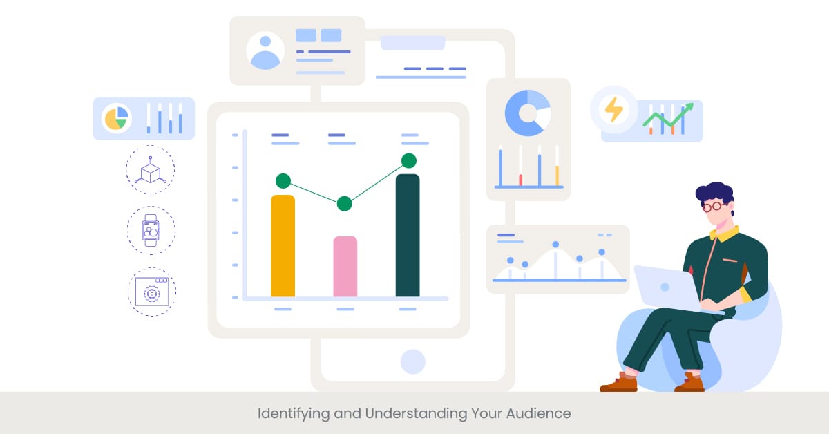
Examples of Effective Data Visualizations
Introduction and Overview
Effective data visualizations transcend mere graphical representation of figures; they communicate ideas and insights in ways that are both intuitive and impactful. In scientific posters, where the objective is to clearly and quickly convey complex research findings to an audience, the role of well-crafted visualizations is crucial. This section will highlight examples that exemplify best practices and demonstrate the powerful role visuals play in scientific communication.
Background and Definitions
Effective data visualizations are characterized by their ability to convey the right information in the right way. This means choosing the appropriate chart types, using color wisely, and focusing on clarity and simplicity to enhance viewer comprehension. Whether it's a bar graph, scatter plot, or infographic, each type of visualization can be optimized to highlight key data points and trends effectively.
Real-world Applications and Examples
A notable example can be found in a recent public health study, where researchers used a series of interconnected scatter plots to illustrate the correlation between various health behaviors and outcomes across different demographics. This visualization was particularly effective because it allowed viewers to easily discern patterns and outliers, facilitating a deeper understanding of complex interactions within the data. Another example includes the use of an animated map to track the spread of a disease in real-time, which was instrumental in communicating urgent public health information during a conference.
External References and Statistics
The effectiveness of these visualizations is supported by data from a study published in the "Journal of Visualized Experiments," which found that scientific posters featuring dynamic or interactive visualizations increased audience engagement by over 50% compared to those with static images. This demonstrates the significant impact that well-designed visualizations can have on the success of scientific poster presentations themselves.
Explore more blog posts to boost your data visualization skills.
FAQs
What is a research poster example?
A research poster example typically displays visual representations of data and research findings in a structured format. It often includes sections like the introduction, methods, results, and conclusion, with graphs, charts, and images to effectively convey the study's outcomes.
How do you structure a research poster?
A research poster should be structured to guide the viewer through your research in a logical flow: starting with the point of the introduction or background, followed by the methods used, results obtained, and concluding with the implications or conclusions. Each section should be clearly labeled, and the content should be arranged to facilitate easy reading and comprehension.
What should I include in my poster?
Your poster should include a clear title, your name, and institutional affiliation, an introduction to your research question, an overview of the methods, a concise presentation of the results, and a summary discussion of the conclusions. Visual elements like charts, graphs, and images should be used to highlight key data and findings.
How do you write a poster example?
To write a good poster itself, start by outlining the main points of your research. Use bullet points or short sentences for clarity and conciseness. Incorporate visual elements to illustrate your data and make complex information easier to understand. Ensure that your poster is visually appealing and the layout directs the viewer's attention to the most important information.
What should be on a science poster?
A science poster should include scientific information presented in a visually engaging way. It should feature the title, researcher's name, and affiliation, an abstract, introduction, methodology, results, conclusion, and references. Visual aids like graphs, diagrams, and photographs are crucial to a poster template effectively communicate scientific findings.
What is the best format for a scientific poster?
The best format for a scientific poster is one that clearly and efficiently communicates the research to an audience. This typically involves a balance between text and visuals, with enough white space to prevent the printed poster from looking cluttered. The content should be organized in columns or sections that are easy to follow.
What is a good scientific poster introduction?
A good scientific poster introduction briefly outlines the research question or hypothesis, the importance of the research, and the main objectives. It should be engaging and provide enough background to make the rest of the paper and content understandable to someone not familiar with the topic.
How do you present data in a poster?
Data in a poster should be presented using clear and concise charts, graphs, or tables. Choose the type of visualization that best represents your data and makes it easy for the audience to understand the results at a glance. Ensure that all visualizations are labeled accurately and include any necessary legends.
How do you present results in a research poster?
Results in a research poster should be presented clearly and concisely, focusing on the most significant findings. Use charts, graphs, and tables to visually summarize the data. Briefly explain what the results imply about the research question or hypothesis.
How do you present qualitative data in a poster?
Presenting qualitative data in print on a poster involves summarizing key themes or findings with supporting quotes or examples. Visual representations like word clouds or thematic maps can also be effective in highlighting important aspects of the data.
How to do a presentation on a poster?
When presenting a poster, stand by your poster and be prepared to give a brief summary of your research to passersby or interested attendees. Have a short speech ready that covers the main points of your research, and be prepared to answer questions. Use your poster as a free visual aid to guide your presentation and highlight key findings.
%20(1).jpg)