Visuals and Talk Tracks: A Symbiotic Relationship
Unleashing the Power of Visual Storytelling: Our Success Stories.

Apr 26, 2024
16 min read
%20(1).jpg)
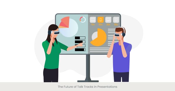
The Importance of Data visualization tools in Presentation
Engaging Audiences with Effective Visuals
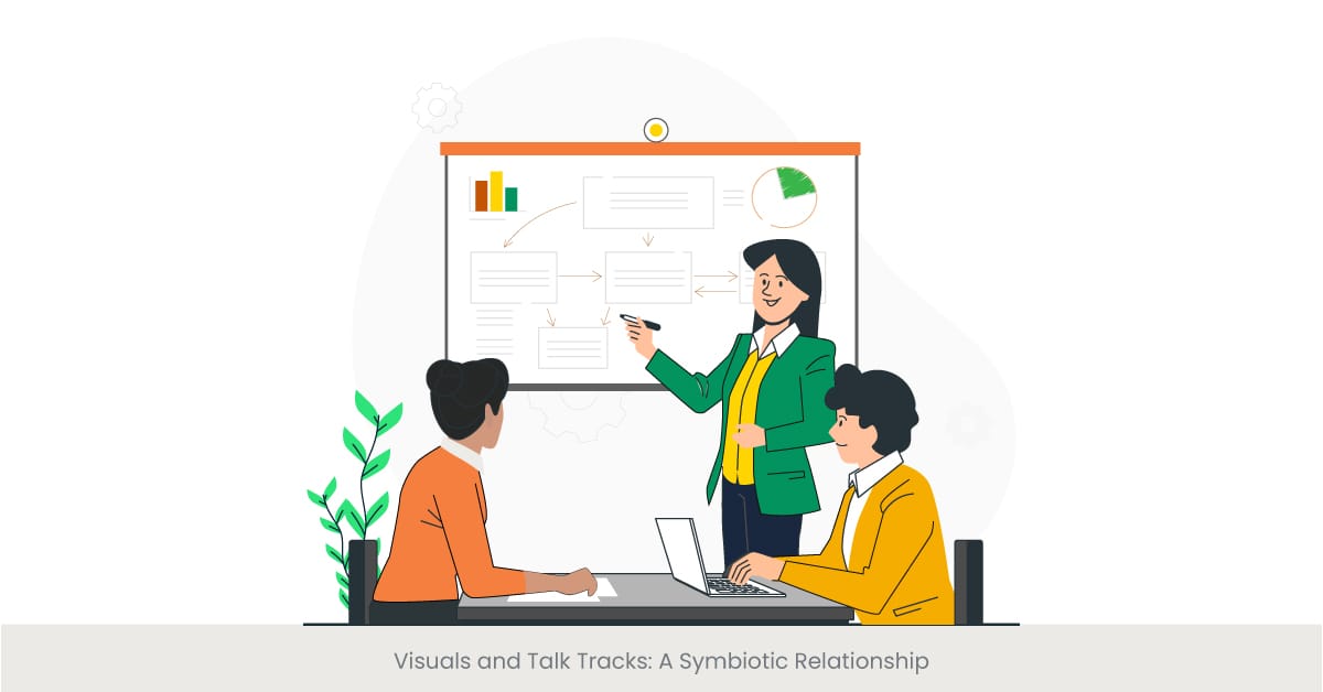
Visuals play a pivotal role in enhancing presentations, creating a symbiotic relationship between the presenter's words and the audience's comprehension. By integrating visual aids into a presentation, the presenter can not only capture but also maintain the audience's attention, making complex information more accessible and their interactions memorable. This is particularly important in a world where visual content is a primary form of communication across various media platforms.
The Evolution and Impact of data visualizations in Communication
Historically, visuals have been an essential part of storytelling and education, evolving from ancient cave paintings to sophisticated digital graphics in modern presentations. The development of visual aids present data and, from simple chalkboards to advanced data visualization tools, illustrates a significant transformation in how information is presented and perceived. These tools have enabled presenters to represent data and concepts visually, making them easier to understand and engaging for the audience.
Real-World Applications and Trends
In the corporate world, effective use of visuals in presentations can lead to better engagement, clearer communication of ideas, and more persuasive arguments. Companies often employ slide decks, infographics, and videos to present annual results, strategic plans, and training materials. For example, a well-designed infographic can summarize extensive market research data into an easily digestible format, enabling the audience to grasp complicated concepts quickly.
Visual Transforming Talk Tracks
A well-structured presentation talk track is crucial for guiding the audience through the content. By clearly defining the message, objectives, and key points, the speaker creates a coherent flow that aligns with visual elements, improving audience comprehension. A well-crafted talk track keeps the audience engaged and ensures message retention.
Evidence of Effectiveness
Research supports the effectiveness of visuals in presentations. According to studies, people remember 65% of information when it's paired with relevant images compared to 10% when the information is presented via text alone. Further, data visualization aids like bar charts and pie charts help in visualizing data breaking down sales statistics and market analysis that enhance the comprehension of the data presented. Tools such as Google Slides and PowerPoint offer vast template libraries that assist in creating visually appealing and informative presentations, ensuring that the audience not only understands the content but also retains it longer.
Need help with your talk track? Contact INK PPT for expert guidance.
Types of Visuals: From Slides to Infographics
Exploring the Spectrum of Visual Aids
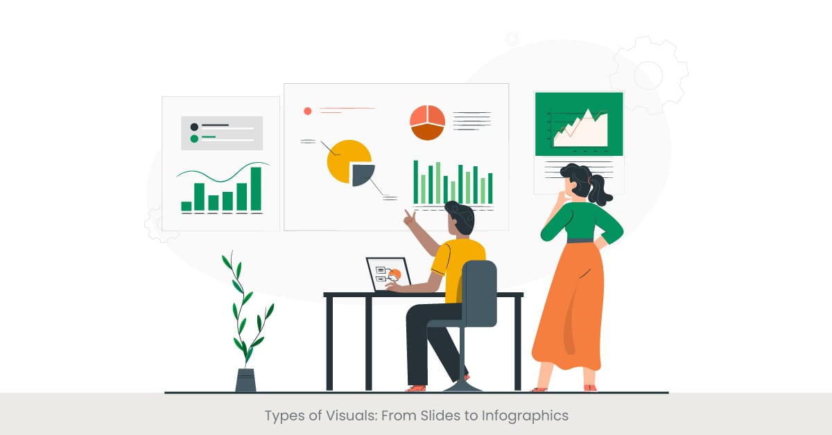
Visual aids are diverse and can significantly enhance the effectiveness of a presentation by clarifying, illustrating, and bringing data to life. They range from traditional slides to more innovative forms like infographics, videos, and even interactive dashboards. Each type of visual serves a specific purpose: slides often provide structure to the presentation, infographics condense complex data into digestible graphics, and videos can evoke emotional responses or demonstrate processes in action.
Historical and Functional Background
The use of visual aids in presentations has evolved significantly with advancements in technology. Originally limited to objects like flip charts and overhead projectors, today's presenters have unlimited access to a range of tools that include digital slideshows (like PowerPoint and Google Slides), animated graphs, and even virtual reality experiences. The choice of visual depends on the target audience, the nature of the information presented, and the environment in which the presentation is delivered.
Case Studies and Modern Examples
Modern presentations are increasingly leveraging dynamic visual aids to keep the audience engaged. For examples, interactive bar charts and pie charts are used to present financial forecasts and performance statistics that allow the audience to explore different variables and data points interactively. Another examples where data visualization helps is the use of Gantt charts in project management to depict project schedules, including start and finish dates of elements, helping teams visualize deadlines and dependencies.
Validating with Research and Statistics
The effectiveness of various types of visuals in presentations is well-documented. According to research, visual aids can increase retention rates by up to 65%, compared to presentations without visuals. Tools like big data and visualization software enhance this further by enabling the presenter to manipulate large datasets and create visuals that are not only informative but also aesthetically pleasing. As a result, tools such as data visualization tools and software like Tableau or Adobe Illustrator are becoming essential in the toolkit of modern presenters.
Transformative Power of Visual in Presentations
Storytelling in presentations brings data and concepts to life, making them more relatable and memorable. By framing information in the context of a narrative, presenters can captivate their audience's attention and evoke emotions that support the message. Visual aids can enhance storytelling, helping the audience visualize the journey and key takeaways.
Ready to elevate your presentations? Reach out to INK PPT today!
Design Principles for Presentation Visuals
Fundamental Design Concepts for Visuals
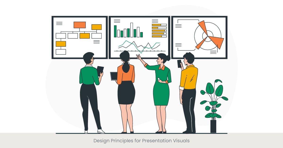
Effective visual design in presentations is not just about aesthetics; it's about communication. The fundamental principles—contrast, balance, alignment, repetition, and hierarchy—serve as the backbone of any visual design endeavor. These principles ensure that the visuals are not only pleasing to the eye but also organize and present information in a way that is easily accessible and understandable to the target audience. By applying these principles, designers can create visuals that enhance the presentation's message rather than distract from it.
Historical Context and Evolution of Design
The evolution of design principles can be traced back to the early days of the art of visual communication, where simplicity and clarity were paramount. Over the decades, these principles have been refined as the fields of graphic design and data visualization have grown. Today, these principles are integrated into the software that drives the creation of visual aids, such as Adobe Photoshop and Sketch, allowing even non-designers to apply professional design standards to their presentations.
Practical Applications and Contemporary Trends
In practice, these design principles are applied in various ways across different types of visuals. For examples, in slide design, alignment and hierarchy help in organizing the content clearly, making it easier for the audience to follow along. Contrast, organization and balance are particularly important in infographics, where diverse elements must coexist without overwhelming the viewer. Additionally, contemporary trends such as minimalism and flat design emphasize simplicity and organization, ensuring that the focus remains on the content rather than the decoration.
Supporting Evidence from Design Experts
Design experts advocate for the importance of adhering to these principles to ensure that visual aids fulfill their purpose. Research and case studies have shown that presentations designed with these principles in mind are more likely to retain the audience's attention and facilitate understanding. For instance, a study found that presentations using a consistent color scheme and clear typographical hierarchy resulted in a 50% increase in audience engagement. This underscores the necessity of thoughtful design in presentation visuals to convey information effectively.
Enhancing Your Talk Track with Visual Aids
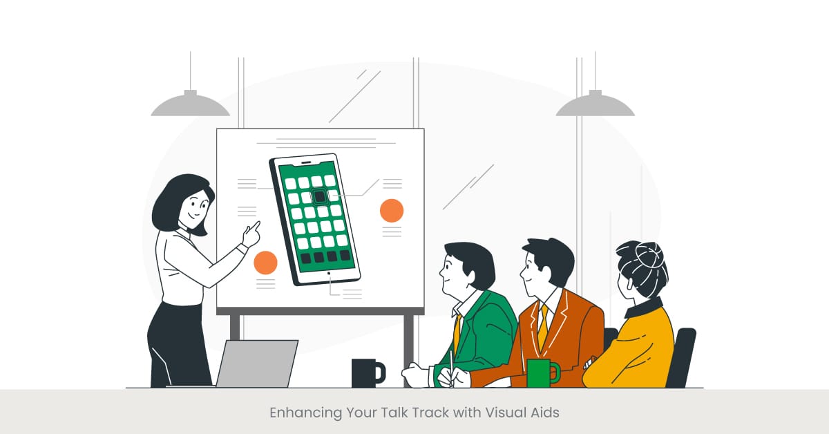
The Role of Visual Aids in Enhancing Narratives
Visual aids are more than just decorative elements in a presentation; they are integral to enhancing the talk track by reinforcing the spoken words, facilitating deeper understanding, and making the message memorable. Whether it's a full slide deck, simple pie chart or a complex animation, each visual aid should be designed to complement the narrative, emphasizing key points and assisting in storytelling. This symbiotic relationship between visuals and talk tracks helps in keeping the audience engaged and focused.
Background on the Integration of Visual and Speech
The integration of visual and speech in presentations has a rich history, evolving significantly with advances in technology. From the early use of hand-drawn illustrations to today's sophisticated digital visual, the goal has always been to aid comprehension. The cognitive theory of multimedia learning suggests that people learn better from words and pictures than from words alone. This theory underscores the importance of using visual aids to supplement a talk track, as they can help bridge gaps in understanding and retention.
Real-World Examples and Current Practices
In professional settings, the enhancement of talk tracks with visual aids can be seen in various successful presentations. For examples, at technology conferences, speakers often use slides containing graphs, diagrams, and videos that visually represent their developments and data, making complex information more accessible to the audience. Similarly, in educational seminars, instructors use visual aids like PowerPoint slides and handouts to highlight important theories and models, enhancing students' learning experiences by aligning visual with verbal explanations.
Research and Evidence Supporting Visual Aid Effectiveness
The effectiveness of visual aids in presentations is well-supported by research. Studies indicate that when visual aids are used effectively, they can significantly improve audience understanding and recall. For instance, a survey of business professionals showed that presentations that effectively used visual aids were rated as 43% more persuasive than those without. Tools such as visual aids are not just aids; they are crucial components that can dramatically increase the clarity and impact of a presentation.
Visual Transforming Talk Tracks
Effective talk tracks for events are designed to resonate with the audience's needs and interests. By adjusting tone, language, and pacing, speakers can ensure engagement and clarity. Integrating relevant visual aids enhances the experience, supporting the speaker's message and maintaining the audience's attention throughout the event.
Check out our comprehensive guides to craft your perfect presentation.
Synchronizing Your Talk Track with Visualizations
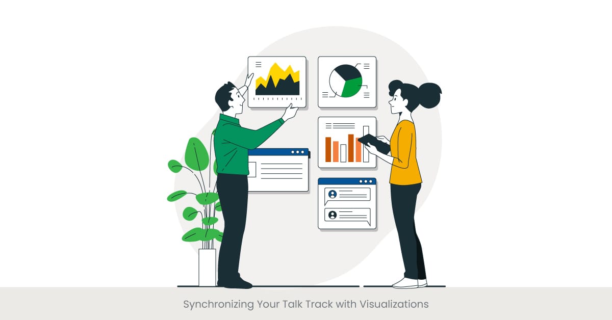
Aligning Visual with Verbal Content
The synchronization of visual and talk tracks is essential for creating a seamless presentation experience. Effective synchronization means that visual not only appear at the right moment to complement the spoken word but also accurately reflect the message being conveyed. This alignment enhances understanding and retention by providing the audience with a dual-input (visual and auditory) learning experience, which is proven to be more effective than single-input methods.
The Evolution of Synchronization Techniques
Over the years, the techniques for synchronizing visual with talk tracks have evolved significantly, particularly with the advent of advanced presentation software and tools. Early presentations might have relied on manual methods like cue cards or slide projectors operated in sync with the speaker. Today, technologies like PowerPoint and Prezi allow speakers to embed timing into their presentations, ensuring that visual transitions and the appearance of key points are perfectly timed with the verbal delivery.
Effective Strategies and Modern Implementations
To effectively synchronize visual with a talk track, presenters often rehearse with their visual aids to ensure timing and delivery are polished. For examples, a presenter might use a clicker to advance slides to maintain control over the pacing. Modern presentations may also incorporate videos background music or animations that are timed to start and stop at specific points during the talk, which can help emphasize particular features, messages or data points discussed verbally.
Supporting Data and Expert Opinions
Research supports the benefits of synchronized presentations. Studies have shown that presentations where visual and talk tracks are well-aligned lead to better comprehension and retention rates among audiences. For instance, a study in educational psychology found that students who attended lectures with synchronized visual performed 25% better on subsequent tests than those who attended lectures without such aids. This illustrates the importance of careful planning and execution in the synchronization of visual and verbal content.
The Psychology of Visual Information Processing
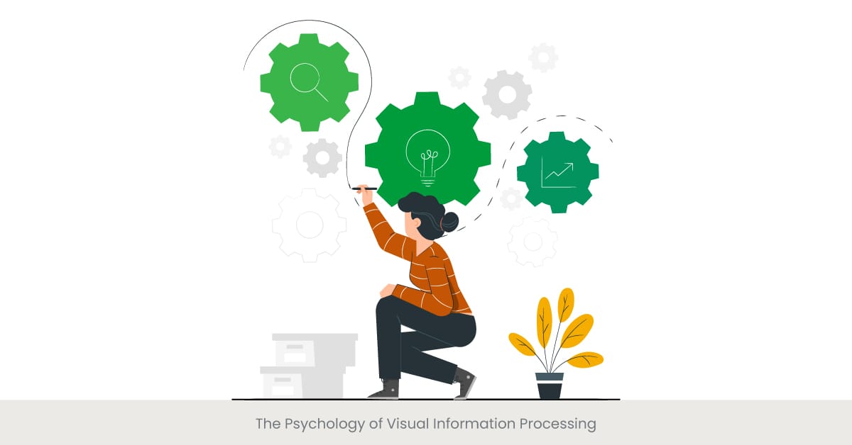
Understanding Visual Perception and Cognition
Visual information processing is a critical component of how we understand and interact with the world. It involves the perception, interpretation, and memory of visual inputs. In the context of presentations, this means that how visual are designed and presented can significantly affect the audience's ability to process and retain information. Effective visual communication leverages our innate ability to rapidly digest visual information as opposed to textual or auditory information, which generally requires more cognitive effort to process.
Historical Insights into Visual Cognition
The study of visual information processing has roots in cognitive psychology, which explores how people perceive, remember, think, speak, and solve problems. Researchers like Richard Mayer have developed principles based on cognitive load theory, which suggests that our working memory has limited capacity. Well-designed visual can reduce this cognitive load by efficiently conveying concepts and data, making it easier for the audience to process, analyze, and remember information.
Practical Applications in Presentation Design
In practical terms, understanding the psychology behind visual information processing can greatly enhance the effectiveness of presentation visual. For examples, using diagrams to illustrate complex processes or relationships can help the audience visualize and better understand difficult concepts. Additionally, incorporating meaningful animations can effectively draw attention to key points and aid in building a logical flow, making the presentation more dynamic and engaging.
Research and Theoretical Support
Research in the field of psychology provides strong support for the use of visual in presentations. Visual aids have been shown to improve comprehension and retention by up to 400 percent. A notable study demonstrated that individuals are 55% more likely to recall information if it is accompanied by relevant visual compared to hearing the information alone. This underscores the importance of aligning presentation visual with cognitive principles to maximize their impact.
Tools and Software for Visual Creation
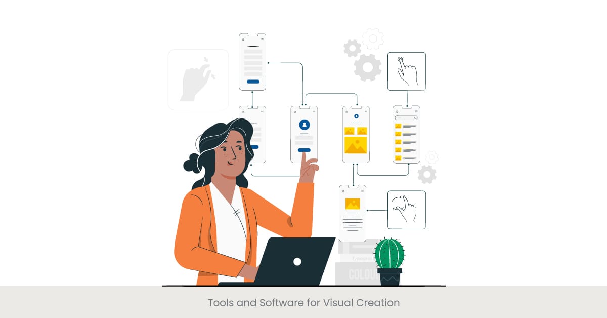
Overview of Visual Creation Tools
In the digital age, an array of tools and software has emerged to assist in the creation and distribution of powerful visual aids for presentations. From basic graphic design programs to sophisticated data visualization platforms, these tools enable presenters to craft visual that are not only engaging but also highly informative. Popular options include Adobe Creative Suite for detailed graphic designs, PowerPoint for slide-based presentations, and Tableau for complex data visualizations.
Evolution and Capabilities of Visual Tools
The evolution of visual creation tools has been marked by significant advancements in technology. Early tools were often limited in functionality, offering basic shapes and text options. Today, software like Adobe Illustrator and Canva provides users with a vast array of features including 3D models, intricate patterns, and custom animations, all designed to enhance the visual appeal and communicative power of presentations. Similarly, data visualization tools have grown from simple charts and graphs to dynamic visualizations that interactively display large volumes of data.
Real-World Applications and Impact
The impact of these tools can be seen in various sectors, from business to education. In business, for examples, tools like Google Slides and PowerPoint are commonly used to create presentations for stakeholder meetings and marketing pitches. These tools help convey complex business data through charts, graphs, and infographics, making it easier for the audience to digest and engage with the information. In education, teachers use visual creation software to design interactive lessons that cater to various learning styles, significantly improving student engagement and understanding.
Supported by Research and Expert Opinions
Research supports the efficacy of using advanced tools for visual creation. Studies have shown that presentations featuring high-quality visual can increase audience engagement and retention rates. For instance, a survey among business professionals indicated that presentations with dynamic and well-designed visual resulted in a 75% increase in audience attentiveness and a 50% increase in message retention. Experts in graphic design and visual communication also advocate for the use of professional tools to ensure visual are not only aesthetically pleasing but also functionally effective.
Detailed Examination of Successful Implementations
Interactive talk tracks invite audience participation, fostering engagement and deeper understanding. Whether through questions, polls, or interactive visual aids, an interactive approach encourages dialogue, keeping the audience involved. Incorporating such elements into a talk track can transform a standard presentation into a dynamic, engaging experience that resonates with the audience.
Accessibility in Visual Design
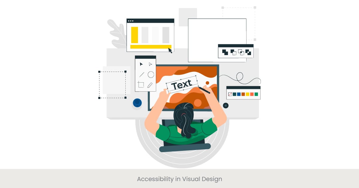
Importance of Accessible Visual Aids
Accessibility in visual design ensures that all members of an audience, including those with disabilities, can effectively receive and interpret information. This inclusivity is not only a matter of ethical responsibility but also enhances the overall impact of a presentation. Accessible visual aids accommodate a range of disabilities, including visual impairments, hearing loss, and cognitive disabilities, making presentations more universally understandable and engaging.
Historical Context and Regulations
The commitment to accessible visual design has grown alongside broader movements toward inclusivity and equal access in society. Regulations such as the Americans with Disabilities Act (ADA) in the United States and similar laws worldwide have spurred advancements in accessible design. These regulations require that public communications and resources, including digital content and presentations, be accessible to people with disabilities, driving the adoption of best practices in accessible visual and web design.
Implementing Accessible Design Practices
To create accessible visual, designers must consider several factors: color contrast, text size, and alternative text for images. Using high contrast color schemes, for examples, helps those with visual impairments distinguish elements on a slide. Similarly, providing text descriptions for images (alt text) ensures that individuals who use screen readers won't miss out on crucial information conveyed through visual. Additionally, ensuring that all visual media include captions or transcripts for audio components aids those with hearing impairments.
Evidence and Expert Recommendations
Studies and expert recommendations highlight the effectiveness and value of incorporating accessibility into visual design. For instance, research indicates that presentations that consider accessibility not only reach a wider audience but also tend to be clearer and more comprehensible even for audiences without disabilities. Experts in UX/UI design consistently advocate for the principles of universal design, which suggest designing content to be accessible to all people, regardless of their age, ability, or status in life.
Crafting and Perfecting Your Presentation Talk Track
The paragraph about presenters' talk track development should be included in the section that specifically addresses how to craft and improve a talk track. Here, you can delve into how presenters should focus on clarity, coherence, and audience engagement when developing their talk tracks. You can also touch on legal considerations related to using visuals and content.
Explore more insights on creating memorable presentations in our blogs!
Case Studies: Visual Transforming Talk Tracks
Transformative Power of Visual in Presentations
Visual aids can dramatically transform talk tracks by making them more engaging, understandable, and memorable. This section will explore several case studies where the strategic use of visual has led to notable improvements in communication effectiveness, audience engagement, and message retention.
Detailed Examination of Successful Implementations
One notable case involves a global marketing firm that redesigned its client presentations using high-quality infographics and video testimonials with new insight and analysis. The result was a significant increase in client retention rates and a 40% improvement in meeting outcomes, as clients were better able to understand the data and results presented. Another case from the education sector shows a university professor who incorporated interactive diagrams and real-time data visualizations into lectures, leading to higher student test scores and more positive course evaluations.
Insights from Real-World Examples
These case studies highlight the importance of choosing the right visual aids and aligning them closely with the talk track. For instance, in the marketing firm examples, infographics and graph, were used to simplify complex data into digestible visual, while video testimonials provided a human element that text slides could not convey. Similarly, the professor used interactive visual to engage students actively, making the learning process more immersive and effective.
Validation Through Research and Feedback
Feedback and research from these case studies demonstrate the positive impact of integrating visual with talk tracks. Surveys conducted post-presentation showed that audiences from both the corporate and educational sectors reported higher satisfaction levels and better understanding of the material presented. Additionally, these case studies are supported by academic research indicating that the strategic use of visual can enhance cognitive absorption, facilitate better understanding, and increase retention of information.
Discover how INK PPT has transformed presentations for clients like you.
Legal Considerations: Copyrights and Permissions
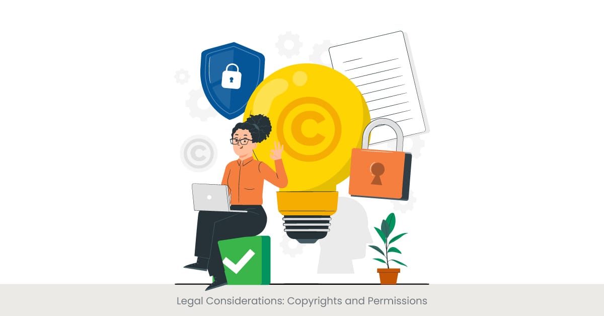
Navigating Copyright Laws in Visual Design
When using visual in presentations, it's crucial to understand and respect copyright laws to avoid legal issues. Copyrights protect the creative works of artists and designers, ensuring they receive recognition and compensation for their work. When presenters use copyrighted materials such as images, videos, or diagrams without proper permissions, they risk infringing on the rights of the copyright holders.
Historical Overview and Importance
The concept of copyright has evolved significantly since its inception, designed to balance the rights of creators with the public’s interest in accessing creative works. In the context of presentations, this means ensuring that visual are either created by the presenter, licensed appropriately, or fall under the category of fair use. Understanding these elements is essential for legally incorporating visual aids into presentations.
Practical Steps for Compliance
To comply with copyright laws, presenters should either use visual created by themselves, obtain proper licenses for the use of third-party materials, or use materials available in the public domain. Additionally, many online platforms offer unlimited access to royalty-free images and visual that can be used with little to no restrictions. Tools like Google Slides and PowerPoint also provide access to a collection of stock images and templates resources that are cleared for commercial use, easing the burden of copyright compliance.
Case Studies and Expert Advice
Legal experts often cite cases where failure to adhere to copyright laws has resulted in costly litigation for businesses and educators. For examples, a small business once faced a lawsuit for using copyrighted images in their sales presentations without proper authorization. This case underscores the importance of understanding and implementing copyright best practices when selecting and using visual aids.
Frequently Asked Questions (FAQs)
What is the meaning of the word visual?
The term "visual" refers by definition to anything that can be seen or perceived with the eyes. In the context of presentations, it pertains to elements like charts, images, videos, and any form of graphic content that aids in visual learning and comprehension.
What are the different types of visual?
There are several common types of visual used in presentations, including slides, infographics, videos, charts (like bar, pie, and line charts), graphs, diagrams, and dynamic data visualizations. Each type serves different purposes in enhancing understanding and engagement.
What is an examples of enhancement?
An example of enhancement in presentations could be the use of an animated graph, chart or bar chart to represent sales growth over time. This not only makes the data more engaging but also helps in better illustrating the progression, which enhances the audience's understanding.
What are visual aids?
Visual aids are tools used in presentations to help convey information more effectively. They can include slides, charts, graphs, videos, and any other visual elements that support and enhance the verbal message.
What is the most common type of visual aids?
The most common type and style of visual aids in presentations are slides created with software like PowerPoint or Google Slides. These may include a combination of text, images, charts, and other graphics.
What is the main purpose of data visualization?
The main purpose of data visualization is to simplify complex data sets into more understandable and visually appealing representations. This helps audiences to analyze, explore and comprehend significant amounts of data quickly and effectively.
What are the five data visualization techniques?
Five common data visualization techniques include bar charts, pie charts, line graphs, scatter plots, and heat maps. Each of these five visualization techniques can be used to represent different kinds of data relationships, variables and trends.
What is an example of data visualization?
An example of data visualization is a heatmap used to show areas of high activity on a map of a website or map, helping marketers understand where users spend the most time.
What is a symbiotic relationship between humans?
A symbiotic relationship between humans refers to a mutually beneficial interaction, such as between a person and their gut bacteria, where both the human and the bacteria benefit from each other’s existence.
What is the main point for using visual aids?
The main point for using visual aids in presentations is to enhance the communication of information, making it more engaging and easier to understand. Visual aids help to illustrate and reinforce the spoken content, thereby increasing audience retention and interest.
%20(1).jpg)