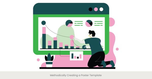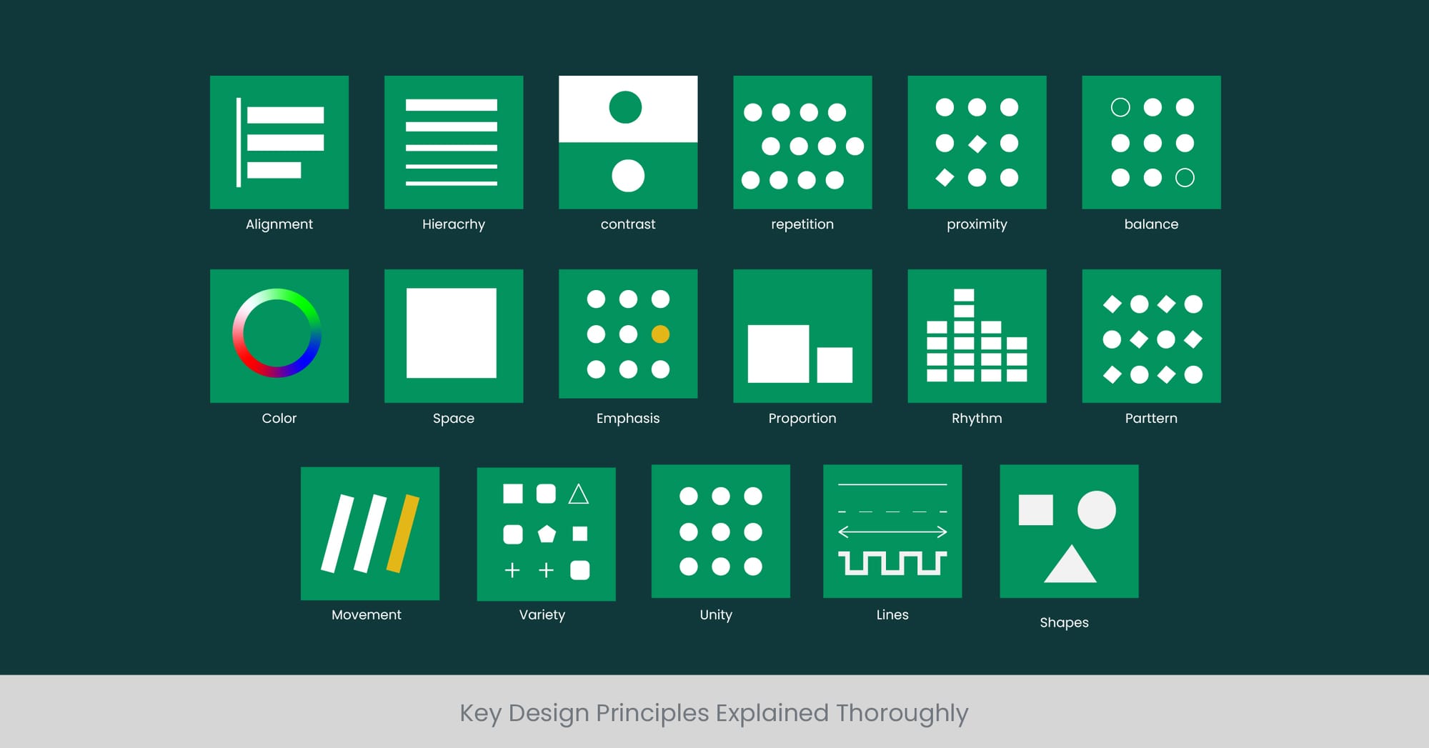
Key Design Principles Explained Thoroughly
Unleashing the Power of Visual Storytelling: Our Success Stories.

Apr 8, 2024
18 min read
%20(1).jpg)
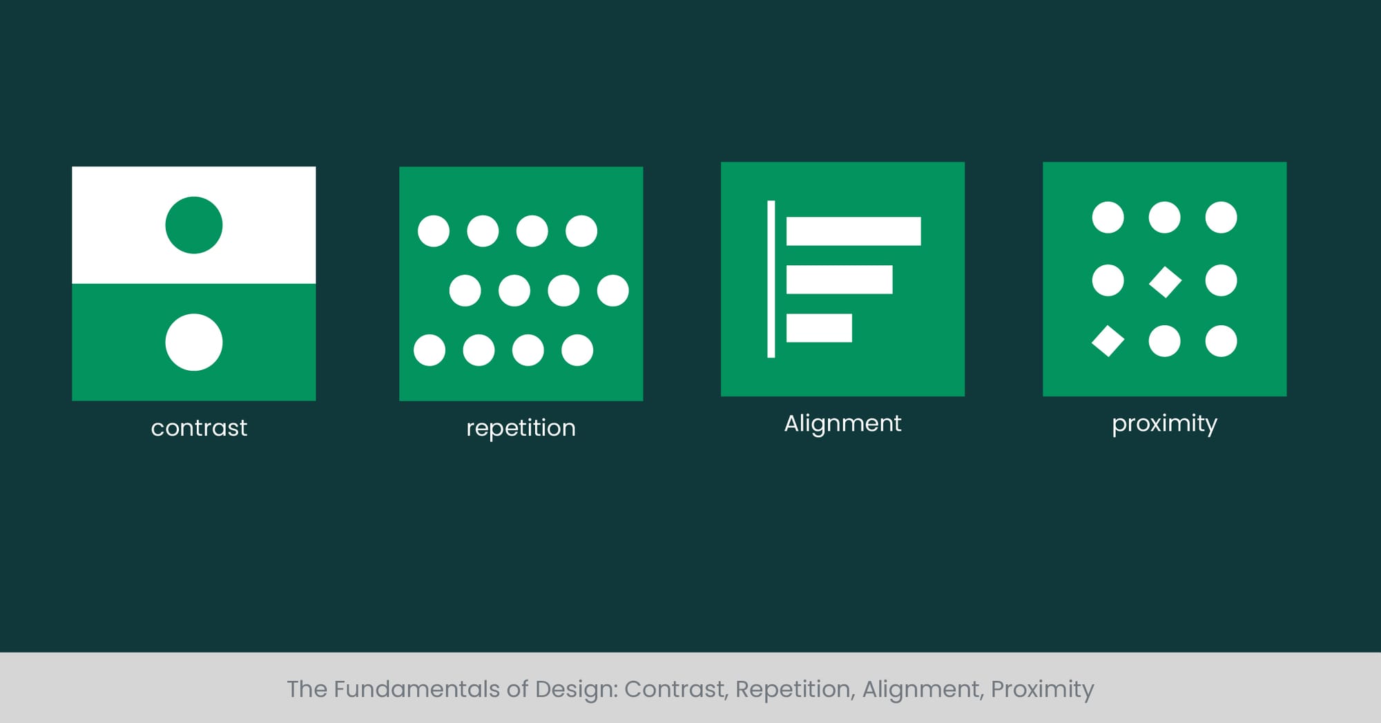
The Fundamentals of Design: Contrast, Repetition, Alignment, Proximity
Unlocking the Basics of Impactful Design
At the heart of any Effective Poster Layout lies a foundation built on the fundamentals of design: contrast, repetition, alignment, and proximity. These principles are not merely artistic choices but strategic tools that guide the viewer's eye and create a coherent visual experience. Understanding these elements is crucial for anyone venturing into Infographics for Research Posters, as they form the building blocks for crafting messages that stand out and resonate.
The Roots of Visual Appeal
The principles of contrast, repetition, alignment, and proximity have their roots deep in the psychology of visual perception. Contrast creates a dynamic that draws attention, highlighting key areas and guiding the viewer's focus. Repetition reinforces themes and unifies the design, creating a rhythm that enhances visual flow. Alignment brings order to the layout, making content appear organized and professional, while proximity groups related elements, helping in delivering a clear and cohesive message. Together, these principles navigate the complexity of design choices, making Effective Poster Layout not only aesthetically pleasing but also functionally effective.
Bringing Principles to Life with Real-World Applications
The application of these design principles can be seen in successful Infographics for Research Posters across various industries. From movie posters that use contrast to depict conflict, to event posters where repetition creates a memorable brand image, these fundamentals are versatile tools. A well-aligned conference poster, where text and visuals are neatly organized, or a charity event poster that skillfully groups elements through proximity, shows how these principles work in tandem to convey messages powerfully and persuasively.
Expert Insights and Quantitative Validation
These design fundamentals are supported by a wealth of academic research and industry insights. Studies in visual communication emphasize the role of contrast in capturing attention and enhancing readability. Repetition's ability to improve brand recall is documented in marketing research, highlighting its importance in Effective Poster Layouts aiming for long-lasting impact. Experts in graphic design consistently advocate for meticulous alignment and thoughtful proximity to achieve clarity and harmony in Infographics for Research Posters. These principles, backed by evidence, empower designers to create with confidence and purpose.
Color Theory in Poster Design
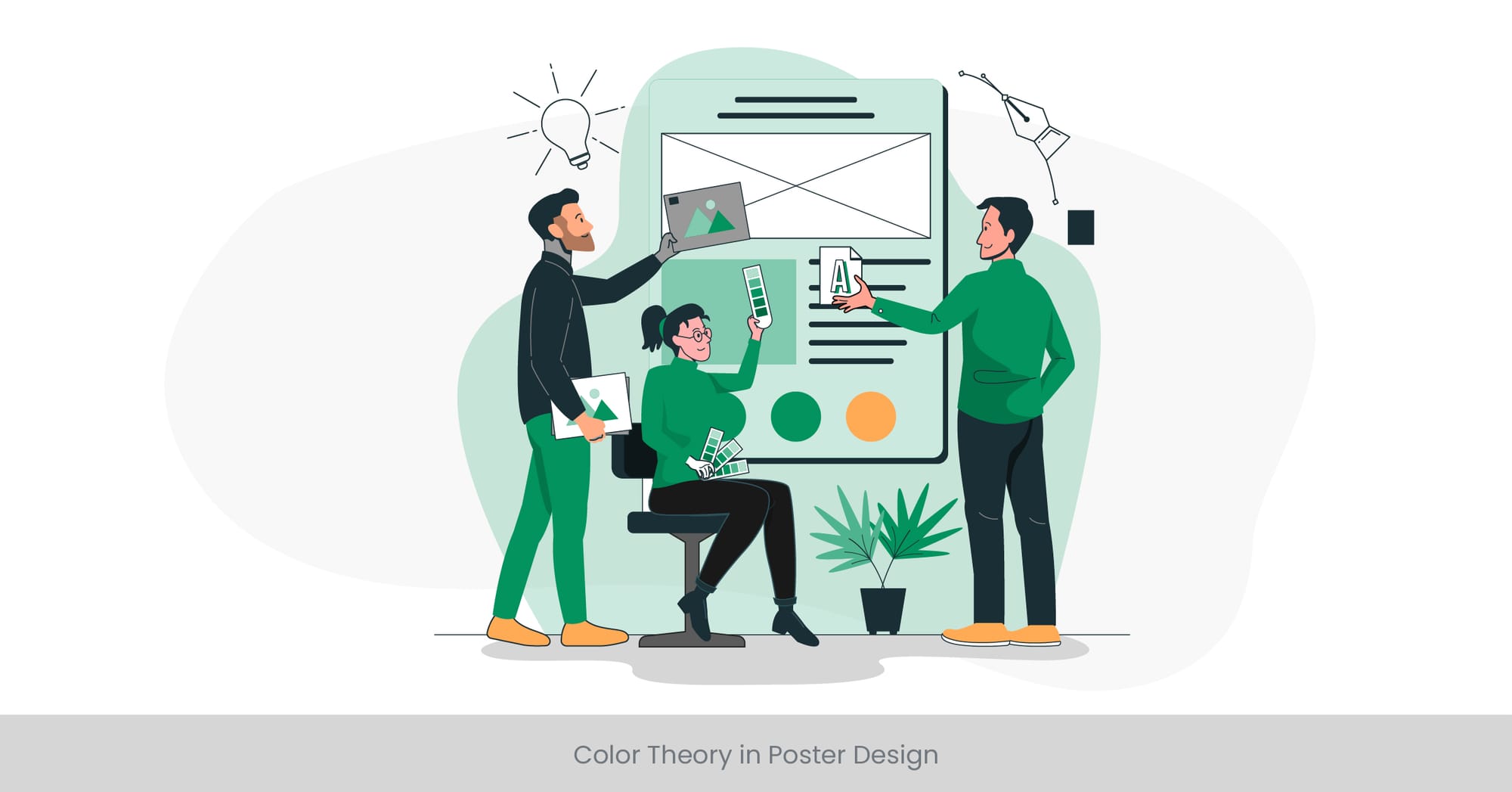
Mastering the Spectrum: The Power of Color in Posters
Color theory is a pivotal element in the tapestry of design, especially in the creation of poster designs. It goes beyond mere aesthetics; it's about communicating mood, conveying messages, and invoking emotions. Utilizing color theory in poster design template creation transforms a simple layout into a compelling piece that grabs attention and communicates effectively. Understanding color harmony, color psychology, and the impact of color combinations can turn a good poster into a great one.
The Science and Emotion Behind Color Choices
Color theory isn't just an art; it's rooted in science and psychology. Colors can make us feel a certain way, drive actions, and influence perceptions. Warm colors can evoke feelings of passion and energy, while cool colors are calming and soothing. The use of color in posters is not just about making them look good; it's about making them feel right. For instance, the choice of a bold font in a bright color can make a statement that is both visually striking and emotionally engaging.
Real-World Examples: How Colors Define Success
The most iconic posters often use color to define their era, message, or emotional appeal. Consider the vibrant, psychedelic colors of vintage concert posters that capture the spirit of the '60s, or the stark contrasts used in modern minimalist posters that demand attention and convey a clear, focused message. In the realm of commercial advertising, color is used to brand identity, with companies utilizing specific palettes to ensure they're recognized at a glance. These examples showcase how the strategic use of color elevates poster design from mere information dissemination to an art form that resonates with viewers.
Guided by Experts: The Impact of Color Documented
Research in color psychology and marketing studies underscore the significant impact of color on consumer behavior and perception. Studies have shown that color can increase brand recognition by up to 80%, making it a crucial element in poster design template free choices. Experts in visual communication advocate for the thoughtful application of color theory to ensure posters not only capture attention but also communicate the intended message and evoke the desired emotional response. The thoughtful application of color, guided by theory and validated by research, is a testament to its power in design.
Typography: Choosing the Right Fonts
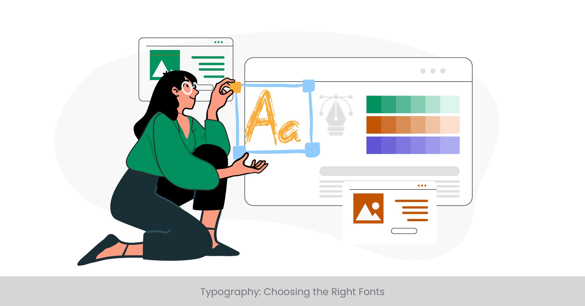
Crafting Messages with Typeface
Typography is the art and technique of arranging type to make written language legible, readable, and appealing when displayed. In the context of poster designs, choosing the right fonts is crucial because typography can significantly affect the poster's overall impact and effectiveness. The right font not only conveys the message but also enhances the design, setting the tone and aligning with the poster's theme. Whether it’s for a bold statement or subtle information, the choice of typography can make or break the viewer's engagement.
The Roots and Routes of Typography in Design
Typography's importance in design stretches back centuries, evolving from hand-crafted lettering to digital fonts. Each font carries its own psychological weight and can evoke different emotions and reactions. Serif fonts, for example, are often seen as traditional and reliable, while sans-serif fonts are viewed as modern and clean. Understanding the history and characteristics of different typefaces provides a deeper insight into how best to use typography in poster designs, ensuring that the chosen font aligns with the message and aesthetic of the poster.
Illustrating Success Through Typeface Selection
Across the spectrum of poster designs, from vintage to modern, typography has played a pivotal role in their success and recognition. Classic movie posters, iconic brand campaigns, and even revolutionary political posters have leveraged typography to create an immediate visual impact and support their message. Case studies from design campaigns highlight how a well-chosen font can enhance brand identity, improve readability, and increase viewer engagement. These examples serve as a testament to the power of typography in effectively communicating a poster’s message.
Expert Opinions and Statistical Insights on Typography
Design experts and typographers emphasize the strategic importance of font selection in achieving effective communication through design. Research on readability and viewer perception underscores the impact of typography on engagement and message retention. For instance, studies have shown that typeface legibility directly influences the viewer's ability to absorb and remember information. This underscores the importance of selecting the right typography for poster layouts, reinforcing the message and ensuring it resonates with the intended audience.
Using White Space Effectively
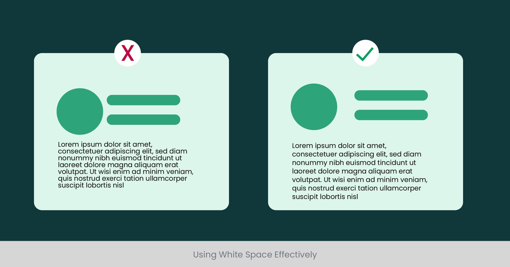
The Art of Breathing Room in Design
White space, often referred to as negative space, is the unmarked portion of a page or an area within a design. Far from being mere emptiness, effective use of white space is an essential element of design aesthetics and readability. It offers visual breathing room for the eye, contributing to a design’s balance and helping to focus attention on the core message. In poster designs, mastering white space means achieving an uncluttered, impactful composition that guides viewers’ eyes through the content in a deliberate manner.
The Principles Behind White Space
Understanding the principles of white space involves recognizing its function not as absence but as an active component of design. It separates and groups information, creating hierarchy and flow. The strategic use of white space around text and visual elements can significantly enhance readability and comprehension. Historically, designers have leveraged white space to create a focal point or to convey a minimalist aesthetic, proving that sometimes less truly is more.
Real-World Applications and Impact
In the world of poster designs, the use of white space can be observed across various genres and eras. Modernist posters of the early 20th century, for example, utilized white space to create a sense of simplicity and elegance. Today, designers employ white space to emphasize specific elements, reduce cognitive overload, and create a clean, inviting layout. A poster with well-managed white space can convey a message more powerfully than one crammed with information and imagery, as the unoccupied space speaks volumes about what is truly important.
Expert Insights and Quantitative Evidence
Experts in graphic design and visual communication consistently highlight the importance of white space in enhancing design effectiveness. Studies in the field of psychology and marketing have shown that layouts with ample white space are perceived as more luxurious and trustworthy. Moreover, research indicates that appropriate use of white space can improve comprehension by up to 20%, making it a critical factor in the design of educational and commercial posters alike. By integrating white space thoughtfully, designers can create posters that not only attract attention but also facilitate a deeper engagement with the content.
Layout Strategies for Information Hierarchy
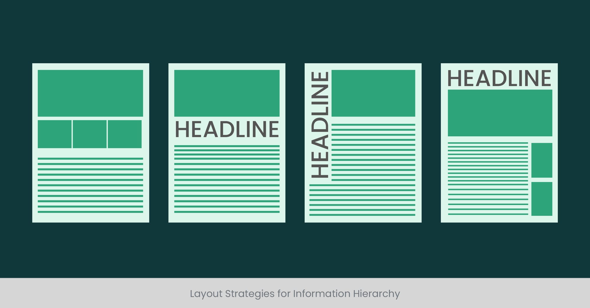
Structuring Content for Clarity and Impact
In the realm of poster designs, the organization of information is not just about aesthetic appeal but also about ensuring clarity and delivering impact. Effective layout strategies are essential for establishing an information hierarchy that guides the viewer's eye through the content in a logical and engaging manner. This involves prioritizing elements based on their importance, using size, color, and placement to distinguish between primary messages and supporting details. A well-thought-out information hierarchy not only enhances the design's visual appeal but also improves the poster’s communicative effectiveness.
Foundations of Effective Information Organization
The foundation of a successful information hierarchy lies in understanding how viewers process visual information. The principles of visual hierarchy involve manipulating various elements such as contrast, scale, and color to denote importance and order within the design. Historical examples of effective poster designs, from wartime propaganda to contemporary advertising, demonstrate how strategic layout choices can capture attention and convey messages efficiently. By studying these principles and examples, designers can craft posters that not only stand out but also communicate clearly and persuasively.
Illustrating Hierarchical Success in Design
Real-world applications of layout strategies abound in the most iconic and effective posters. Take, for example, the minimalist designs of Swiss Style posters, where hierarchy is achieved through strict grid systems and typographic contrast. Or consider the dynamic layouts of movie posters, where the interplay of images and text guides the viewer’s attention seamlessly from the title to the critical details. These examples highlight how varying strategies can be employed to achieve a clear, impactful hierarchy that enhances both the aesthetic and functional aspects of a poster.
Leveraging Expert Insights and Research
Research in graphic design and visual perception supports the critical role of layout in viewer engagement and comprehension. Experts advocate for the thoughtful arrangement of elements to create a hierarchy that is instantly recognizable, facilitating quick understanding and retention of the message. Studies have found that effective information hierarchy not only attracts viewers but also significantly influences their ability to remember and act on the information presented. Through careful planning and strategic design, posters can thus achieve a balance of form and function, making them more effective as tools of communication and persuasion.
Incorporating Visual Elements: Photos, Charts, and Icons
Enhancing Communication with Visuals
In the landscape of poster design, visual elements like photos, charts, and icons play a pivotal role in conveying complex information quickly and engagingly. These elements not only break the monotony of text but also add depth to the message, making it more memorable. A well-chosen image or an aptly placed icon can summarize a concept at a glance, providing an instant connection with the viewer. This section explores the strategic use of visuals in poster designs and how they can significantly enhance the poster’s ability to communicate and persuade.
The Science of Visual Appeal
Humans are visual creatures by nature, with studies showing that visuals are processed 60,000 times faster in the brain than text. The effective use of photos, illustrations, charts, and icons in posters taps into this cognitive processing power, enabling designers to present data and ideas in a more digestible format. Historical trends in poster design show a shift from text-heavy layouts to more visually oriented designs, reflecting the growing recognition of visual elements' power to attract and maintain viewer attention.
Real-World Applications and Inspirations
From the iconic “I Want You” Uncle Sam army recruitment poster to modern infographics and social media campaigns, the use of visuals has been a constant feature of memorable poster designs. Photos offer a glimpse into real-life situations, charts simplify complex data, and icons symbolize ideas succinctly. For instance, environmental awareness posters often use powerful imagery to evoke an emotional response, while informational posters may rely on charts and icons to present data efficiently. These examples underscore the versatility and impact of visual elements in enhancing message delivery and viewer engagement.
Backed by Expertise and Evidence
The strategic inclusion of visual elements in posters is not just an artistic decision but one grounded in research and expert insights. Visual communication studies underscore the effectiveness of visuals in enhancing comprehension, recall, and persuasion. Icons and symbols, for instance, are shown to transcend language barriers, making messages accessible to a broader audience. Furthermore, the incorporation of charts and infographics in educational and marketing materials has been linked to higher engagement rates and better information retention. By carefully selecting and integrating visual elements, poster designers can leverage these insights to create more effective and impactful designs.
Design Consistency Across Your Poster
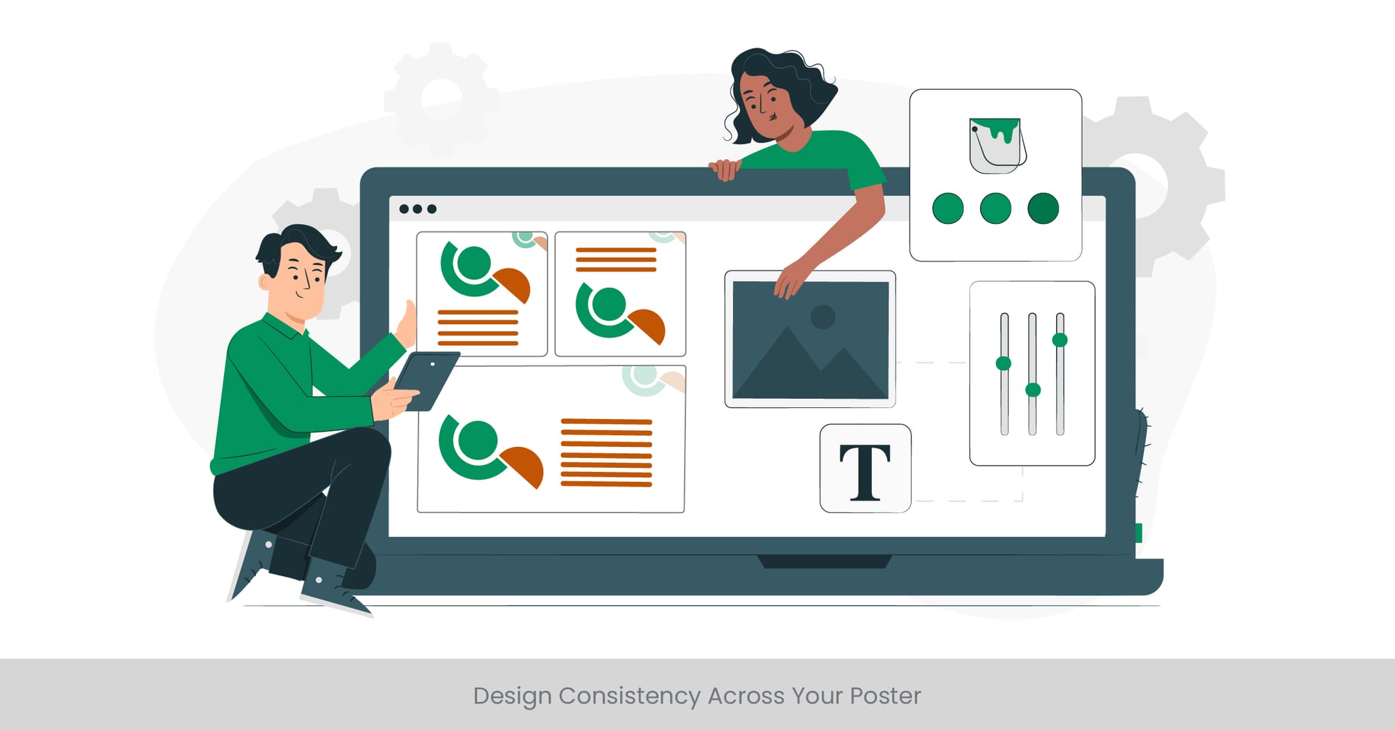
The Key to Cohesive Visual Communication
Design consistency is the glue that holds the visual elements of a poster together, creating a seamless and harmonious presentation that enhances viewer comprehension and retention. Consistency in design elements such as color palette, typography, and visual style ensures that the poster communicates its message effectively, without confusing or overwhelming the audience. This section explores the importance of consistency in poster design and how it contributes to a poster’s ability to engage and inform its audience.
Building a Visual Language
Consistency in poster design goes beyond mere repetition of elements; it's about creating a visual language that resonates throughout the piece. This visual language encompasses the consistent use of color schemes, font styles, and imagery that align with the poster’s theme and objectives. Historical and contemporary examples of effective poster designs demonstrate how a cohesive visual language can enhance brand recognition, convey professionalism, and establish an emotional connection with the viewer.
Case Studies: Consistency in Action
Successful marketing campaigns and iconic poster series provide clear examples of the power of design consistency. For instance, the continuity in Apple’s advertising posters, with their minimalist aesthetic and distinctive typography, reinforces the brand's identity and values. Similarly, film franchises like the "Harry Potter" series maintain a consistent design theme across posters, creating a recognizable visual signature that fans instantly connect with. These case studies illustrate how maintaining design consistency can be a powerful tool in building anticipation, loyalty, and recognition.
Expert Insights and Guidelines
Design experts emphasize the importance of consistency as a fundamental principle of visual communication. Guidelines on maintaining consistency suggest starting with a clear design framework or template, which serves as a guide for integrating various elements harmoniously. Research in branding and marketing highlights the role of visual consistency in enhancing brand recall and viewer engagement. By adhering to a consistent design approach, poster creators can ensure that their message is delivered clearly and memorably, maximizing the poster’s impact and effectiveness.
Avoiding Overdesign: Simplicity is Key
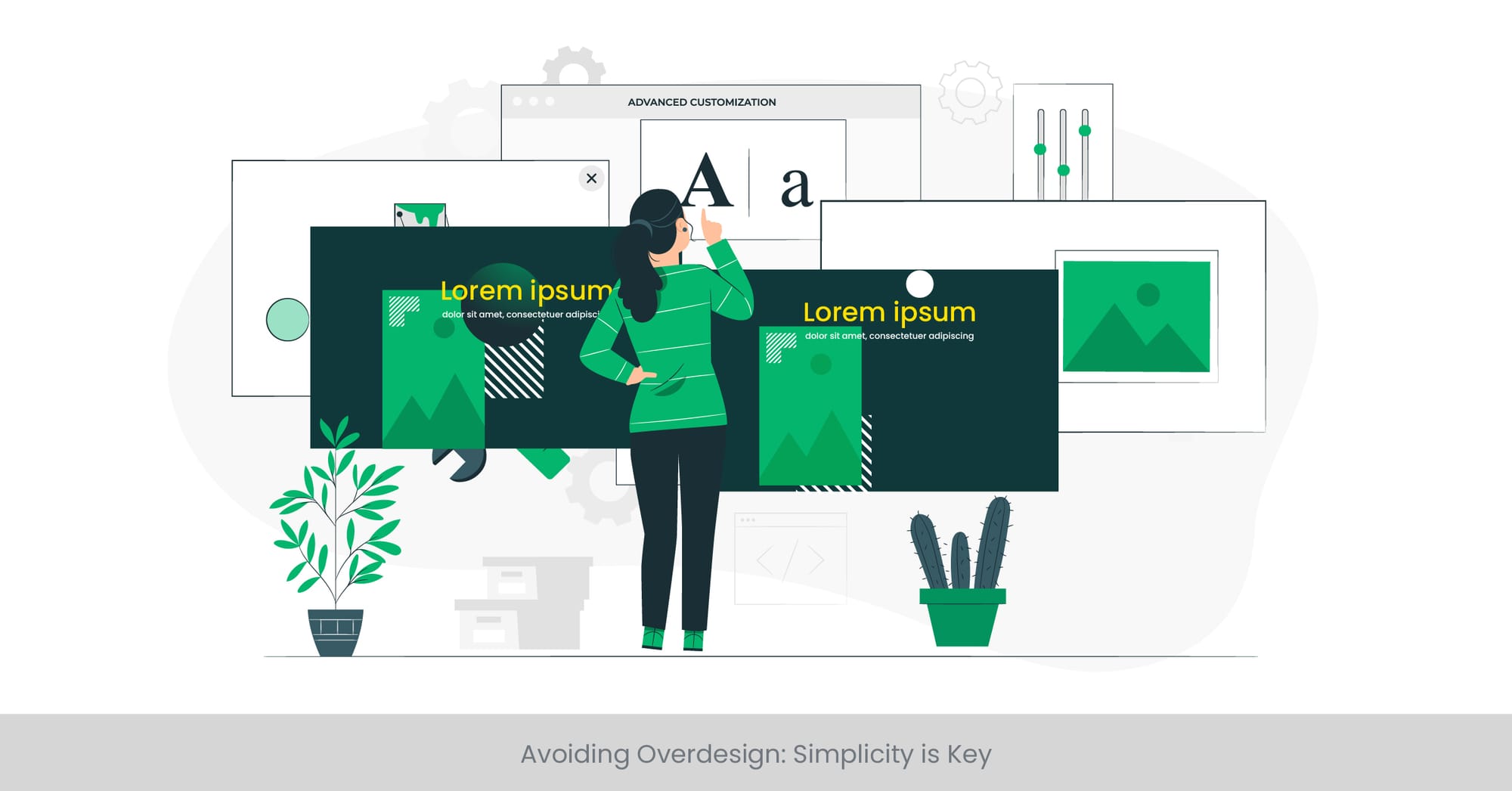
Embracing Minimalism for Maximum Impact
In the world of poster design, less can often mean more. Avoiding overdesign by embracing simplicity ensures that your message is not lost amid excessive elements. This principle is about focusing on the core message and using only the necessary design elements to convey it effectively. Simplicity in design doesn't mean the absence of creativity; rather, it involves making every element serve a purpose, enhancing the poster's ability to communicate clearly and directly.
The Philosophy of Less is More
The minimalist design philosophy, encapsulated by the "less is more" mantra, has been influential across various design disciplines, including poster design. This approach advocates for the removal of superfluous features, focusing on what is essential to convey the message. By stripping down designs to their fundamental components, designers can achieve a clean, uncluttered look that prioritizes content and message over decorative elements. This not only improves legibility but also makes the design more accessible and impactful.
Case Studies in Simplicity
Historically, some of the most memorable poster designs have adhered to minimalist principles, proving that simplicity can be striking and effective. For instance, the iconic work of designers like Saul Bass and Paul Rand demonstrates how minimalism can be powerful, with simple shapes and limited color palettes creating unforgettable visual experiences. Modern examples include social awareness campaigns and tech product advertisements that use minimal design to cut through the noise and grab people' attention.
Supporting Evidence and Expert Opinions
Research in visual perception and communication supports the effectiveness of minimalism in design. Studies have shown that simple designs are often perceived as more honest and reliable, making them more effective in building trust with the audience. Design experts emphasize that overdesign can dilute the message and distract the viewer, advocating for a balanced approach that respects the viewer's ability to interpret and appreciate the essential message. In embracing simplicity, designers find a powerful tool for enhancing the clarity and impact of their poster designs.
Interactive Elements in Poster Design
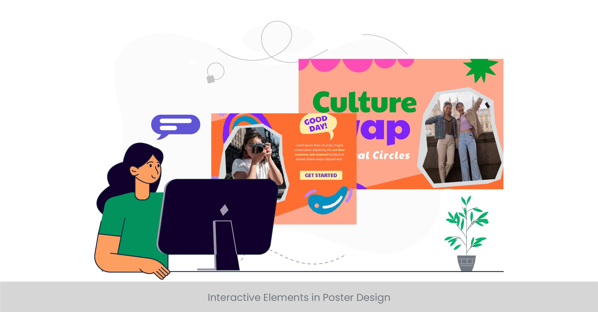
Engaging Audiences Beyond the Visual
The inclusion of interactive elements in poster design represents a paradigm shift towards creating more engaging and participatory experiences for the viewer. By transcending traditional static visuals, interactive posters invite the audience to engage through actions such as scanning QR codes, augmented reality (AR) features, or digital touchpoints that extend the conversation beyond the poster itself. This section delves into how interactivity can transform posters from mere announcements to immersive experiences.
The Evolution of Interaction in Poster Design
The evolution of technology has brought about new opportunities for creativity and engagement in poster designs. Incorporating interactive elements not only captures attention but also enhances the memorability of the message by creating a hands-on experience. From educational posters that use AR to bring content to life to event posters that allow viewers to register or learn more through a simple scan, the possibilities are endless. This evolution signifies a shift towards a more dynamic and user-centered approach to poster design.
Real-World Examples of Interactive Posters
Examples of interactive poster designs are increasingly common in various sectors, including entertainment, education, and marketing. Movie posters with QR codes that reveal trailers, educational posters that offer interactive learning experiences, and marketing posters that direct users to exclusive content or offers are just a few instances where interactivity has been successfully implemented. These examples demonstrate the potential of interactive elements to create a more engaging and memorable poster experience.
Expert Insights and Emerging Trends
Design and technology experts agree that the future of poster design lies in the integration of interactive elements, predicting a continued rise in the use of technology to create engaging viewer experiences. Research into user engagement and interactive design highlights the effectiveness of interactive elements in increasing viewer attention, engagement, and information retention. As technology evolves, so too will the ways in which posters can become interactive, offering new opportunities for designers to innovate and captivate audiences.
Design Trends in Poster Presentations
Capturing the Zeitgeist: The Evolution of Poster Aesthetics
The landscape of poster design is perpetually evolving, influenced by cultural shifts, technological advancements, and artistic innovation. Staying abreast of design trends is crucial for designers seeking to create impactful and relevant posters. This section explores the current trends in poster illustration and presentations, highlighting how these trends reflect broader societal changes and technological possibilities, and offering a glimpse into the future of poster design.
Current Movements in Poster Design
Several key trends have emerged in recent years, shaping the design of posters across various fields. Minimalism continues to dominate, with designers opting for clean, uncluttered layouts that communicate messages more effectively. The use of bold typography and vibrant color schemes has also seen a resurgence, catering to the viewer's desire for visually striking and memorable designs. Additionally, the integration of digital and interactive elements signifies a trend towards more dynamic and engaging posters, reflecting the increasing influence of technology in design.
Examples That Define the Modern Poster
Modern poster designs that embody these trends can be seen in a wide array of applications, from movie and event posters to advertising and social campaigns. For instance, the minimalist movie posters that reimagine classic films with simple, iconic imagery have gained popularity for their ability to convey complex narratives through minimal design elements. Similarly, event posters and logos featuring bold, expressive typography and dynamic color palettes capture attention and evoke emotion, demonstrating the power of contemporary design techniques.
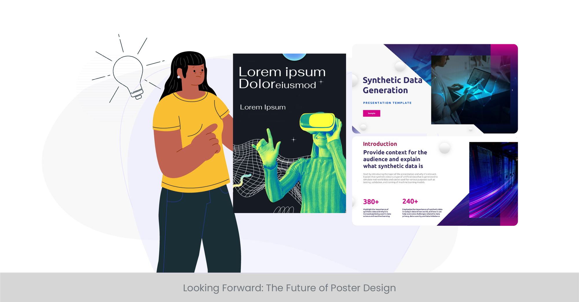
Looking Forward: The Future of Poster Design
As we look to the future, it's clear that the trends in poster design will continue to evolve, influenced by emerging technologies, societal shifts, and environmental considerations. Sustainable design practices, for example, are beginning to impact the materials and methods used in poster production, reflecting a growing consciousness around environmental issues. Furthermore, the exploration of virtual and augmented reality presents new frontiers for interactive poster design, suggesting a future where poster presentations may transcend physical boundaries entirely.
FAQs
How do I design my poster?
Begin by defining your poster's objective. Utilize design principles such as contrast, alignment, and use of white space to guide your layout. Choose a color scheme and fonts that align with your message. Incorporate visual elements like photos or icons sparingly to enhance rather than clutter. Tools like free poster templates can be a great starting point.
Where to get templates for posters?
Numerous online platforms offer free poster templates. These templates provide a versatile starting point and can be customized to suit your specific needs. Look for websites specializing in design resources or use design software that offers built-in template collections.
What website is good for making posters?
Websites that offer design poster templates and interactive tools for customizing your design are ideal. Look for platforms that provide a wide range of free poster templates and design elements like images, icons, and typography tools.
What is poster design ideas?
Poster design ideas refer to the creative concepts and themes that underpin a poster's visual and communicative strategy. Drawing inspiration from current trends, effective poster design incorporates elements like bold typography, dynamic color schemes, and engaging layouts to convey its message.
How do I make a poster design?
Start with a clear concept and objective for your poster. Select a poster design template as a foundation. Customize it by choosing appropriate colors, fonts, and visual elements. Ensure the design is cohesive and aligns with and follow the principles of contrast, repetition, alignment, and proximity for maximum impact.
Does Microsoft Word have a poster template?
Yes, Microsoft Word offers basic poster templates which can be customized for simple projects. While not as comprehensive as specialized design software, Word's templates can be a good starting point for basic poster designs.
Where can I get free poster templates?
Free poster templates can be found on various online platforms and design websites. These sites often offer a wide range collection of templates catering to different styles and themes, allowing for customization and creativity.
What is the best free online poster maker?
The best free online poster maker is one that offers a user-friendly interface, a wide selection of free poster templates, and a variety of design elements. Look for platforms that allow for easy customization and export options.
What is the best free app to make and upload a poster?
The best free app for making posters offers an extensive library of templates, design elements, and intuitive editing tools. Opt for apps that provide a lot of flexibility in design and are compatible with various devices for convenience.
How can I make a poster on my computer for free?
Utilize free online poster makers that offer a range of templates and design tools. These platforms allow you to create custom posters using your computer, providing options to edit, customize, and download your design for printing or digital use.
What is the layout of a poster?
The layout of a poster refers to the arrangement of its visual and textual elements. An effective layout uses hierarchy, size, alignment, and balance to guide the viewer's eye and convey the poster's message clearly and attractively.
What is the format for a poster?
The format of a photo on a poster typically refers to its size, orientation (portrait or landscape), and the distribution of content areas. Popular formats vary depending on the purpose but should always prioritize clarity and impact.
What is a poster template?
A poster template is a pre-designed layout that provides a framework for creating a poster. Templates can offer a convenient starting point, allowing for easier customization of elements like color, font, and imagery to fit the specific message or theme.
What is the general rule for poster layout design?
The general rule for poster layout design emphasizes clarity, hierarchy, and visual interest. Start with the most critical information at the top or center and use design elements consistently over time to guide the viewer through the content.
How do I make a poster layout?
Begin with a clear understanding of your message and audience. Use a grid system to organize content, employing visual hierarchy to prioritize information. Incorporate design principles and elements thoughtfully to create a cohesive and engaging layout.
What is the best layout for a poster?
The best layout for a poster effectively communicates its message through a clear hierarchy, balanced line composition, and thoughtful use of space and design elements. The ideal layout varies based on the poster's purpose and content.
Is there a poster template on Word?
Yes, Microsoft Word offers a set of basic poster templates that can be accessed through its template gallery. These templates provide a simple starting point for creating posters for various purposes.
How do you structure a poster?
Structure a poster by defining a clear hierarchy of information, using design principles to guide the viewer's eye, and incorporating visual elements to support the message. Balance text and imagery to create a cohesive and engaging design.
What is the format for an e-poster?
The format for an e-poster typically includes digital dimensions suitable for display on screens or monitors, interactive elements for engagement, and links or QR codes for additional background information. The design should be optimized for digital viewing.
How do you design a poster effectively?
To design a poster effectively, focus on clear communication of the message through a well-structured layout, engaging visuals, and concise text. Employ design principles to create a visually appealing and impactful poster that resonates with the intended audience.
What are the five qualities of a good poster?
Clarity, impact, visual appeal, effective communication, and audience engagement are essential qualities of a good poster. These elements ensure that the poster not only attracts attention but also conveys its message effectively.
How do you draw an effective poster?
Drawing an effective poster involves combining engaging visuals with clear, concise messaging. Utilize design principles to create a balanced print and visually appealing layout that effectively communicates the poster's purpose.
What is the best layout for a poster?
The best layout for a poster is one that effectively communicates its message through a strategic arrangement of elements, creating a visually appealing and easily read and understandable design. It should prioritize the most important information and use design to enhance readability and impact.
%20(1).jpg)