
Presentation Typography and Color
Unleashing the Power of Visual Storytelling: Our Success Stories.

May 23, 2024
6 min read
%20(1).jpg)
Most teams treat typography and color as finishing details. Fonts are selected once the slides “look complete,” and colors are pulled from brand guidelines without testing them in real viewing conditions. That mindset creates predictable failures: people squint, scan unevenly, miss the point, and ask clarifying questions that should never be necessary.
In high-stakes environments, the role of presentation typography and color is operational. It determines whether information can be processed quickly and whether your message feels trustworthy. When typography is inconsistent or color choices lack discipline, the deck may look polished but still perform poorly under pressure.
This topic focuses on typography and color for slides as a performance system. It shows how the right font choices, correct presentation font color, and strong color contrast in presentations improve comprehension, keep attention stable, and protect credibility across formats.
Understanding Typography and Color in Presentations
In a presentation, typography and color play a functional role. Slides are not meant to be read like a report. They are meant to be visual aids to support spoken communication and to facilitate efficient understanding by the audience.
Presentation environments are diverse. Slides may be displayed on large screens in a conference room, on a laptop screen in a virtual meeting room, or on a mobile screen if shared asynchronously. As a result, typography and color used in presentation slides must prioritize functionality over artistic freedom.
When applied correctly, typography and color:
- Reduce cognitive load
- Improve comprehension
- Guide attention
- Reinforce message hierarchy
- Enhance perceived professionalism
If used badly, typography and color create difficulties. The audience must struggle to understand their meaning. As a consequence, the presentation is less effective despite its content.
Presentation Font Color Must Be Chosen for Legibility First
Color is one of the fastest ways to communicate hierarchy, but it is also one of the easiest ways to destroy readability.
The first rule of presentation font color is simple: select it for contrast, not preference. Dark text on light backgrounds or light text on dark backgrounds remains the most reliable approach across screens and rooms. Mid-tone combinations may look refined in design tools, but they often fail in real meeting conditions.
A practical system for presentation font color includes:
- One high-contrast body text color is used consistently
- One accent color reserved for emphasis
- One muted color for supporting detail that remains readable
This is where typography and color for slides become a system rather than a collection of choices. When the audience sees the same treatment repeatedly, they learn how to read your deck quickly. That is the core value of a consistent slide layout.
Use color as a reinforcement mechanism. Do not force color to carry meaning alone. When emphasis relies only on color, comprehension becomes fragile, especially for fast scanning or accessibility constraints.
Color Contrast in Presentations Is a Credibility Issue
Color contrast for presentations is a measure of whether the information can be scanned at a fast pace. If the information cannot be scanned at a fast pace, then the audience will not be able to pay attention. If the audience is not able to pay attention, then the quality of the discussion will suffer.
Use this as a practical contrast test:
- If the text is readable only when zoomed in, contrast is insufficient
- If the projected text feels thinner than on a laptop, contrast is insufficient
- If headings do not stand out instantly, contrast is insufficient
In good presentations, the issue of contrast is considered non-negotiable. Color contrast for presentations ensures the information is understood at a fast pace, even when the lights change or when the audience asks questions.
This is also the section of the presentation where the presentation of a disciplined color palette comes into play. If the color palette is disciplined, then the contrast will be good. If the color palette is not disciplined, then the contrast issues will add up.
Typography and Color Create Hierarchy Only When They Work Together
Teams often attempt to “fix hierarchy” with either font changes or color changes alone. That usually produces clutter: too many weights, too many colors, and no clear reading path.
Hierarchy is effective when typography and color are used thoughtfully together.” A model of an effective hierarchy is:
- Primary message: largest size, strongest contrast, simplest wording
- Supporting explanation: smaller size, neutral color, short lines
- Detail: smallest size that remains readable, limited quantity, clearly grouped
When typography and color in a presentation are aligned, “the audience knows what to look at first, even though they are not told to.” This is beneficial to decision-making because a leader can verify the headline, and then drill down if necessary.”
This is what typography and color in slides are really for. It “reduces interpretive work. It makes reasoning visible.
A Color Palette Presentation Should Behave Like a System
A professional deck does not need more color. It needs fewer colors with clear roles.
A disciplined color palette presentation typically includes:
- One primary brand color is used for key signals
- One secondary color is used for categories or grouping
- One neutral family for text and backgrounds
- One accent color reserved for priority emphasis

The goal is not branding for its own sake. The goal is consistency that speeds comprehension. When your palette is stable, your deck becomes faster to read and easier to trust.
Such system-based thinking is also evident in the case of Signify by INK PPT, in which colors, typography, and graphic elements were made consistent in a variety of decks. Modular templates and organized layouts helped in keeping a consistent design for presentations related to business segments.
The colors of the presentation fonts have to be consistent with the palette. If the palette is brand-related but not well-executed, the presentation could end up being well-branded but poorly designed.
Using the same color scheme to reinforce your message across slides also helps to promote harmonious layouts, so viewers can focus on your message rather than remembering different layouts.
See how structured typography, disciplined color systems, and clarity-first layouts are applied in real leadership presentations.
What “Consistent Slide Layout” Actually Means in Practice
A consistent slide layout is not just “using a template.” It is enforcing repeatable reading mechanics.
Consistency means:
- Headline location stays fixed
- Body text size and line spacing stay consistent
- Color usage follows rules, not preference
- Graph and chart treatments stay uniform
- Callouts appear in predictable positions
This is the reason why readable fonts for presentations are effective. Without consistency in layout, the typography choices will not have the intended effect. The audience will not have the chance to learn, and therefore, it will not improve their reading.
Consistency does not mean that it will hinder creativity. It means it will improve clarity. Consistency will also save time because it will eliminate the need to keep re-creating the presentation.
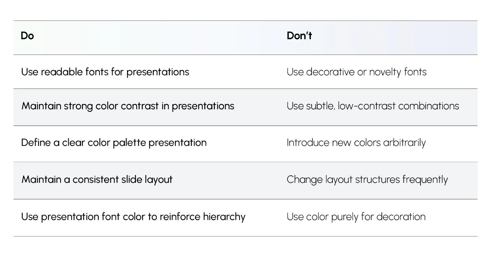
Practical Application Checklist for Typography and Color
Use this checklist before finalizing any deck:
- Are your readable fonts for presentations consistent across slides?
- Is the presentation font color high-contrast on every slide type?
- Does color contrast in presentations hold up on a projector or shared screen?
- Is your color palette presentation limited and role-based?
- Does the deck feel like one system due to consistent slide layout?
- Do typography and color for slides reinforce hierarchy, not fight it?
If you hesitate on any item, the design system is not stable yet.
Applying Typography and Color Principles in Practice
Applying typography and color principles in practice involves enforcing clarity-first design standards that support readability, hierarchy, and comprehension at scale.
These actions make typography and color for slides predictable, fast to scan, and easier to trust.
Outcome of This Topic
By the end of this topic, the reader will have the ability to consider presentation typography and color as a business performance system. You will have the knowledge of how to choose readable fonts for presentations, how to set presentation font color, how to maintain clarity through good color contrast in presentations, and how to create a stable color palette presentation.
Most importantly, you will have the knowledge of how to use presentation typography and color in a consistent manner that will improve clarity, reduce misinterpretation, and promote faster decision-making.
%20(1).jpg)