Principles of Effective Slide Design
Unleashing the Power of Visual Storytelling: Our Success Stories.

May 23, 2024
5 min read
%20(1).jpg)
In business environments, slides are used to explain ideas, align stakeholders, and support decisions. Their purpose is functional. Slides are not visual assets created for appearance; they are communication tools designed to help an audience understand complex information quickly and accurately.
Many professionals invest significant effort in formatting, templates, and visual polish. However, when slides are designed without clear intent, they often distract rather than clarify. This is where effective slide design becomes critical. Good design reduces cognitive effort, highlights what matters, and supports the presenter’s reasoning.
This topic exists to clarify how slide design principles directly influence clarity. Rather than focusing on visual style or software techniques, this section explains how design choices affect comprehension and decision-making. Understanding these principles allows professionals to design slides that actively support thinking.
Attention Comes Before Understanding
Before the audience can process the content, they need to notice the content first. Attention, therefore, represents the main constraint for the audience during business meetings, especially for senior management, where time is of the essence.
Presentation slide design plays a central role in managing attention. When slides contain too much information or lack structure, attention spreads across multiple elements. This forces the audience to interpret the structure on their own, which reduces comprehension. Visuals are processed 60,000 times faster than text.
Presentations are processed 60,000 times faster than text. Effective presentation slide design, therefore, starts by recognizing that not all information on the presentation slides needs equal attention. The guides for the audience represent a critical principle for all effective presentation design principles.
Visual Hierarchy Determines What Gets Noticed
Visual Hierarchy refers to the way in which the audience intuitively understands the order of the ideas: first, second, third. What this means is that the audience doesn’t see the slides as random collections of words, shapes, or data points. Rather, they see a map of priorities. A cognitively efficient slide design answers the question:
- What is the main message?
- What supports the main message?
- What context matters, but only as support?
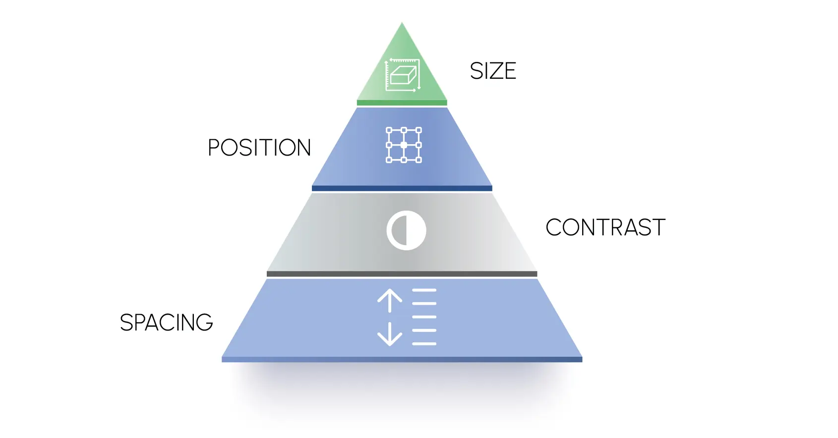
Hierarchy is established through deliberate design decisions, such as:
- Size: Larger elements appear more important
- Position: Top or center elements get attention first
- Contrast: Differences in color or weight signal priority
- Spacing: Grouping or isolation highlights relationships
Consider how leaders analyze information in real time. First, they look for patterns, then they validate with detail. This is why most good slide design principles place the core message where the eye goes first, not buried.
But when the visual emphasis on the slide design also emphasizes the logical priority of the ideas being presented, comprehension happens much faster and with much less mental effort. The audience doesn’t have to try to understand what you want them to understand. They see it.
One Idea per Slide Improves Comprehension
One of the biggest mistakes people make in their slide design is the problem of too many ideas. The problem is that professionals try to cram too many conclusions, visuals, and data points into a single slide to be efficient. The problem with this is that comprehension becomes fragmented.
The way the human brain works is sequentially. That is to say, no matter whether you are cognizant of it or not, the human brain processes ideas sequentially. When you try to present too many ideas on a single slide:
- The audience’s attention splits
- Messaging clarity erodes
- The presenter must constantly refocus attention
The one idea per slide rule is therefore not stylistic; it is cognitive.
Applying this principle means:
- Placing one clear insight or argument on each slide
- Organizing ideas into a logical sequence that builds momentum
- Reserving supporting detail for visuals or follow-up slides
For example, rather than combining a key insight, supporting graph, and recommendation all on Slide 3, a more effective sequence would be:
- Insight slide
- Evidence slide
- Recommendation slide
This type of sequencing uses space as a tool to help the reader think instead of making the reader struggle with multiple variables. Many of the executive presentations designed by INK PPT take this approach into consideration so that the slide helps in clarity instead of confusion.
White Space Helps the Audience Focus
The misunderstanding of white space as space is common. In reality, structural space is a design tool that keeps the audience’s attention from working against itself.
Slides that are cluttered or packed with information require the audience to do too much work. Rather than understanding one piece of information, the audience must figure it out for themselves
Purposeful use of white space:
- Separates unrelated ideas
- Accentuates the most important elements
- Reduces visual noise so the main point stands out
White space is not “minimalism for beauty.” White space is used thoughtfully for clarity. Well-designed slides don’t feel sparse; they feel confident, like the author has thoughtfully considered the audience’s processing abilities.
In the slide transformations that INK PPT has helped leadership teams with, white space has consistently helped with clarity and reduced discussion time because the audience doesn’t struggle with interpreting the layout.

This approach can be seen in INK PPT’s work on the HPE MD Vision Deck, developed for a Managing Director–level leadership forum. Although the strategic content was sound, the original slides were visually dense and difficult to scan during discussions.
The presentation has been redesigned with one idea per slide, and white space has been used thoughtfully to separate the important from the context. This has helped leadership teams move away from interpretation and towards evaluation of the strategic direction, all without changing the fundamental message.
Take a look at how INK PPT can assist with structured presentation design, visual hierarchy, and clarity of thought to ensure that complex information can be confidently and efficiently communicated through critical business discussions.
Applying Effective Slide Design Principles in Practice
Below is a practical snapshot of effective slide design tips in action:
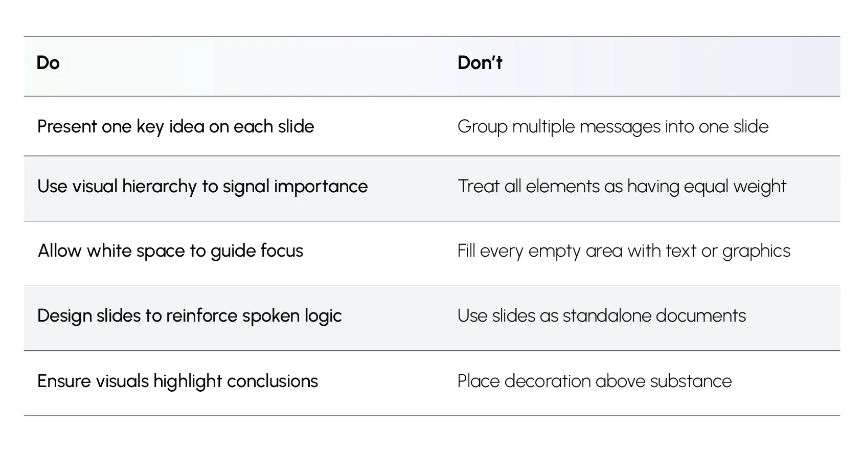
These table entries represent effective presentation design principles that are widely adopted and utilized in decision environments where decisions are made. As such, they are simple but not easy.
Check out how INK PPT can help organizations overcome common issues with presentations through effective presentation design solutions for leadership, sales, and high-stakes presentations.
Why These Principles Improve Clarity, Not Style
When slide design reflects disciplined thinking rather than decorative intent:
- Explanations become shorter
- Clarification questions are reduced
- Discussions focus on judgment rather than interpretation
- Decision cycles become tighter
This is the difference between presentations that are seen and presentations that are understood.
In the context of leadership presentations, understanding is the first step towards action. Presentations that are designed using effective presentation design principles enable audiences to follow logic and respond without needing to decipher a presentation’s structure.
This discipline is where credibility is built, where rework is minimized, and where decisions are accelerated. Presentations are not static documents; they are decision support mechanisms.
%20(1).jpg)