

Contact Us
Let’s Partner for Your Next Big Presentation
Consult with our Business Advisor
.webp)
Thank you! Your submission has been received!
Oops! Something went wrong while submitting the form.

Your 2024 deck is already costing you credibility. Here is what the world's best brands are doing instead in 2026.
It's quite popular nowadays to write about the newest trends in presenting and to illustrate this by providing some visual examples. However, our guide is aimed at people who approve the presentations of CXOs, CMOs, and heads of marketing of Fortune 500 companies.
Based on the analysis of 10+ design blogs, over 100,000 downloads of our templates, Adobe Creative Trends Report 2026, the EU Accessibility Act, and the consultation with the best agencies in the designing industry, we will provide you with the full picture of the presentation trends for this year.
From all the above-mentioned, we will speak about trends in the design, mistakes you should avoid making, outdated design techniques and how to implement them in your presentations considering your audience.
Before we explore in detail PowerPoint presentation trends 2026, let us dwell on the fundamental difference between the presentations in the two years described.
Executives analyze their decks in iPhones at night. The board of directors distributes slides irrespective of their context. Investors look through their decks in a 9:16 ratio format on mobiles without your presence. Your slides have to be understandable even to a person other than yourself otherwise, there is a problem with your slides.
Everything stems from the idea stated above and is focused on the latest presentation design trends 2026.
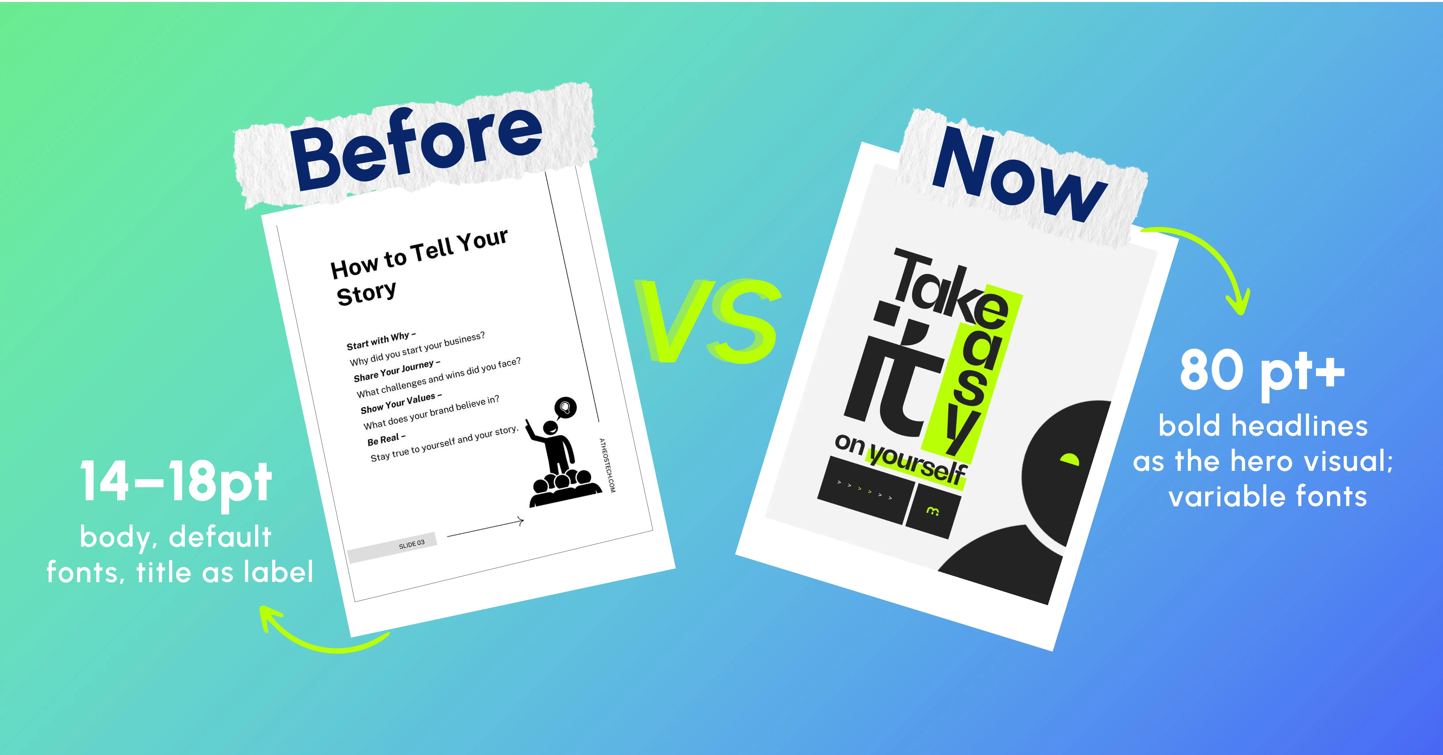
No more captioning your visuals. It is time to make the text the visual itself.
Big, bold sans-serif font faces 80pt+ take up to 50% of a slide. One bold, impactful headline conveys the main concept, according to current presentation trends 2026. Everything else builds up around it. Font weights and widths may change throughout a deck as another way of conveying changes in pace or mood.
Investor pitches, keynote speeches, product introductions, and boardroom opening speeches.
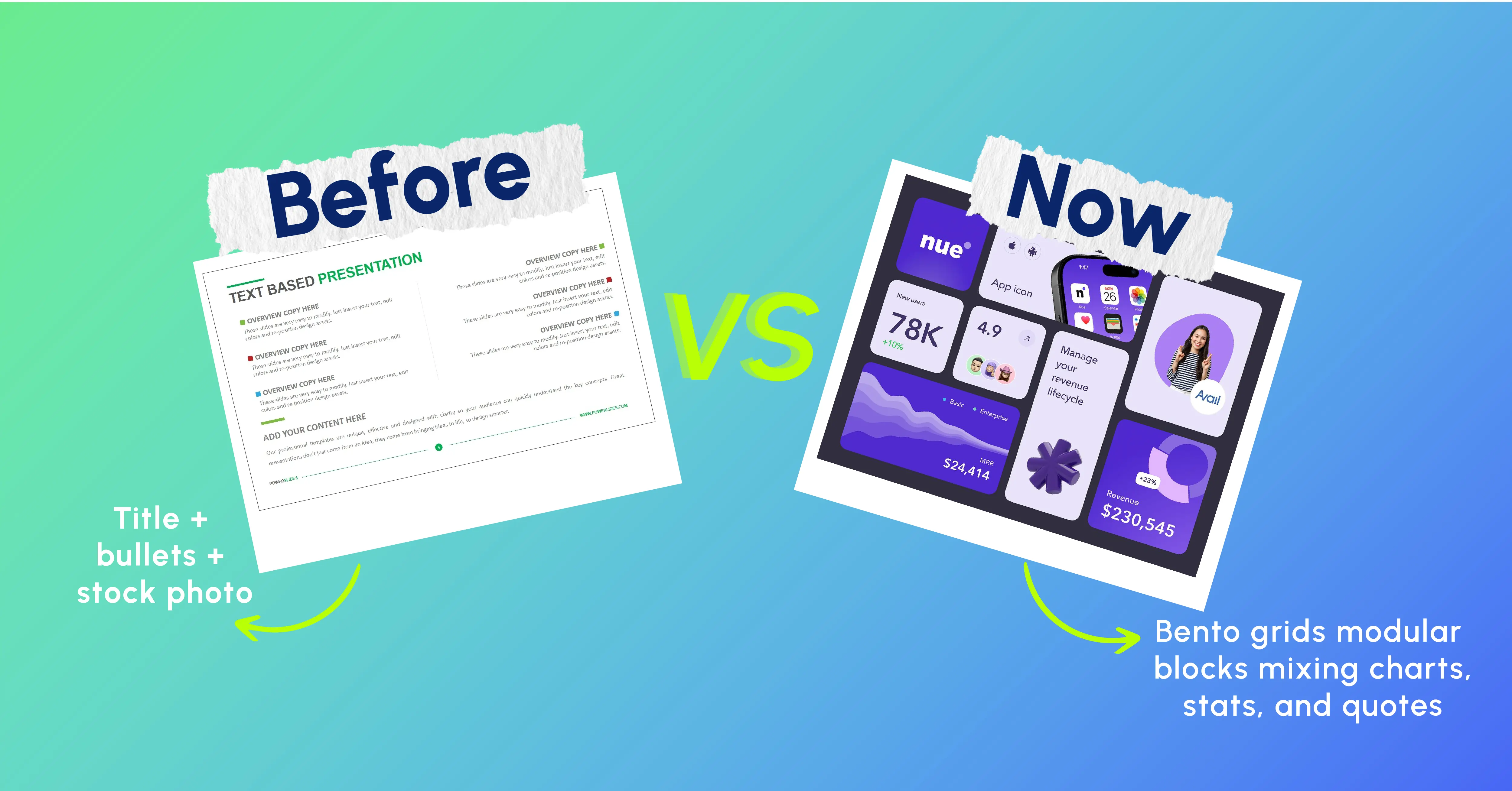
Popularised by Apple Inc., now an essential part of any good-looking corporate presentation.
The Bento Grid implies that you split a slide surface into a few modular rectangles of different sizes. The largest rectangle is reserved for a hero metric. The second-largest zone will have a supporting quote. Other zones include additional metrics.
It is a nice solution for arranging data-heavy slides.
Business analysis presentations, investor update presentations, product overview presentations, and marketing performance presentations.
From preference to a staple element in contemporary presentation design and one of the current presentation trends 2026.
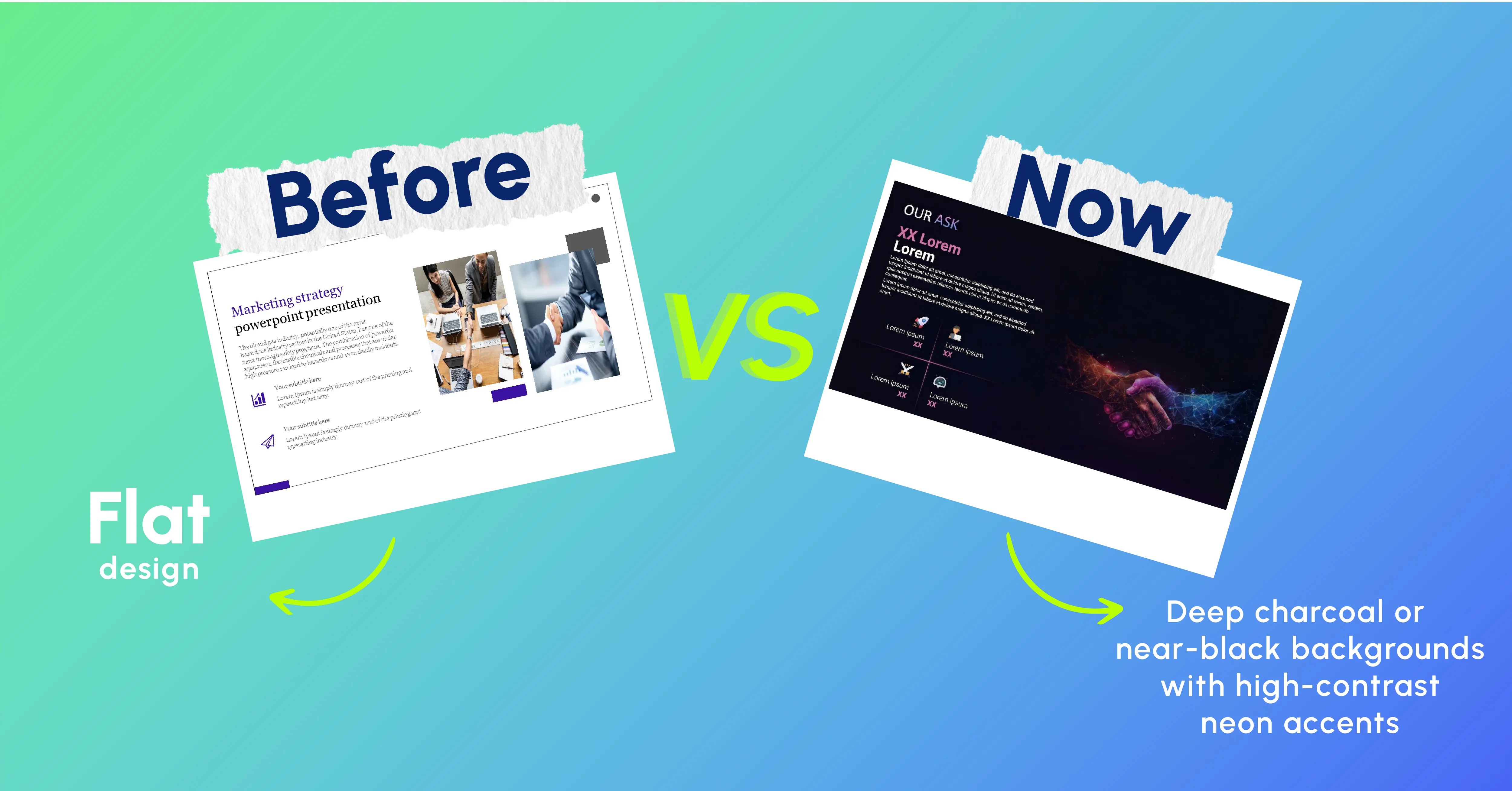
Dark mode with a deep charcoal background and high-contrast neon accents is kinder to eyes in the dark boardrooms and ensures crisp data visualisations on OLED screens.
Tech pitches, boardroom sessions, strategy presentations, and finance reviews.
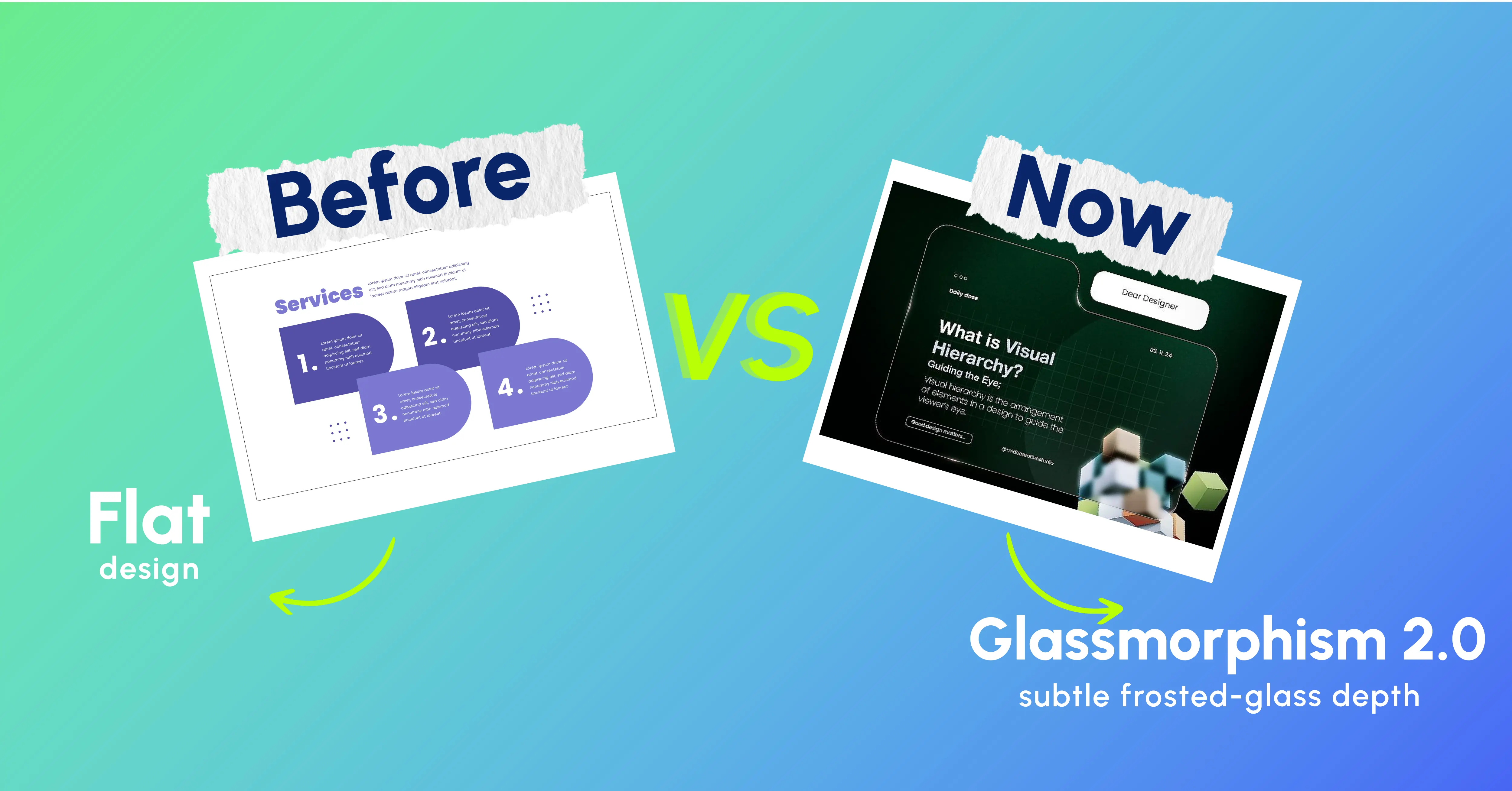
Frosted-glass elements have long been in fashion but have evolved into much more than decorative effects in 2026.
Glassmorphism is used as an effective design element in modern presentation trends 2026 to establish visual hierarchy and inform your audience of their whereabouts in the flow of your presentation without having to resort to additional colors or graphic design details. Used judiciously one or two elements per deck will do.
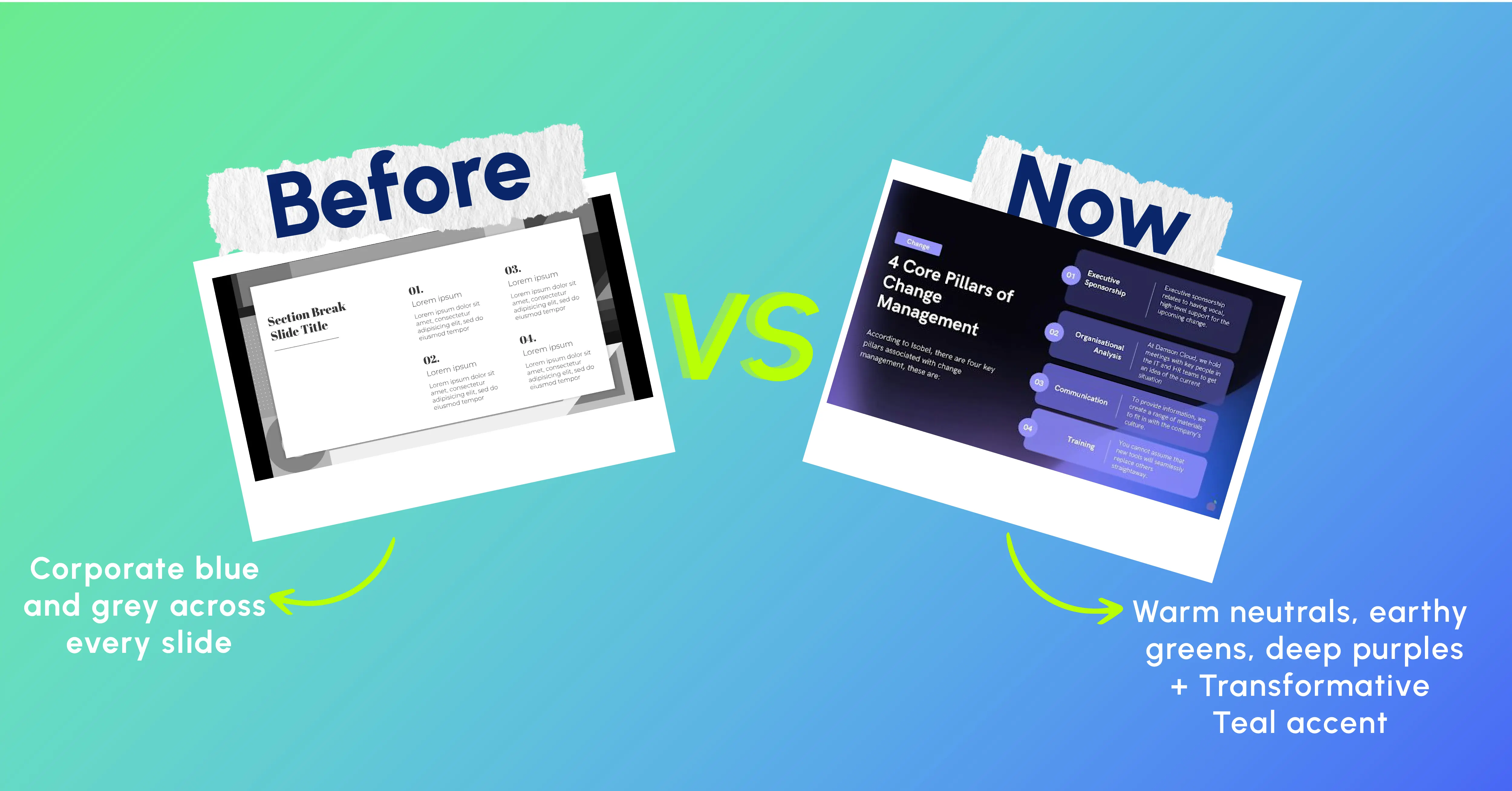
The era of cold corporate blue is behind us.
Earthier shades dominate the palette in 2026 earthy greens, deep purples, terracotta, and neutral tones form the base color palette. The accent shade of choice, Transformative Teal, stands out on KPIs, calls to action, and the only number per slide that you need your audience to remember.
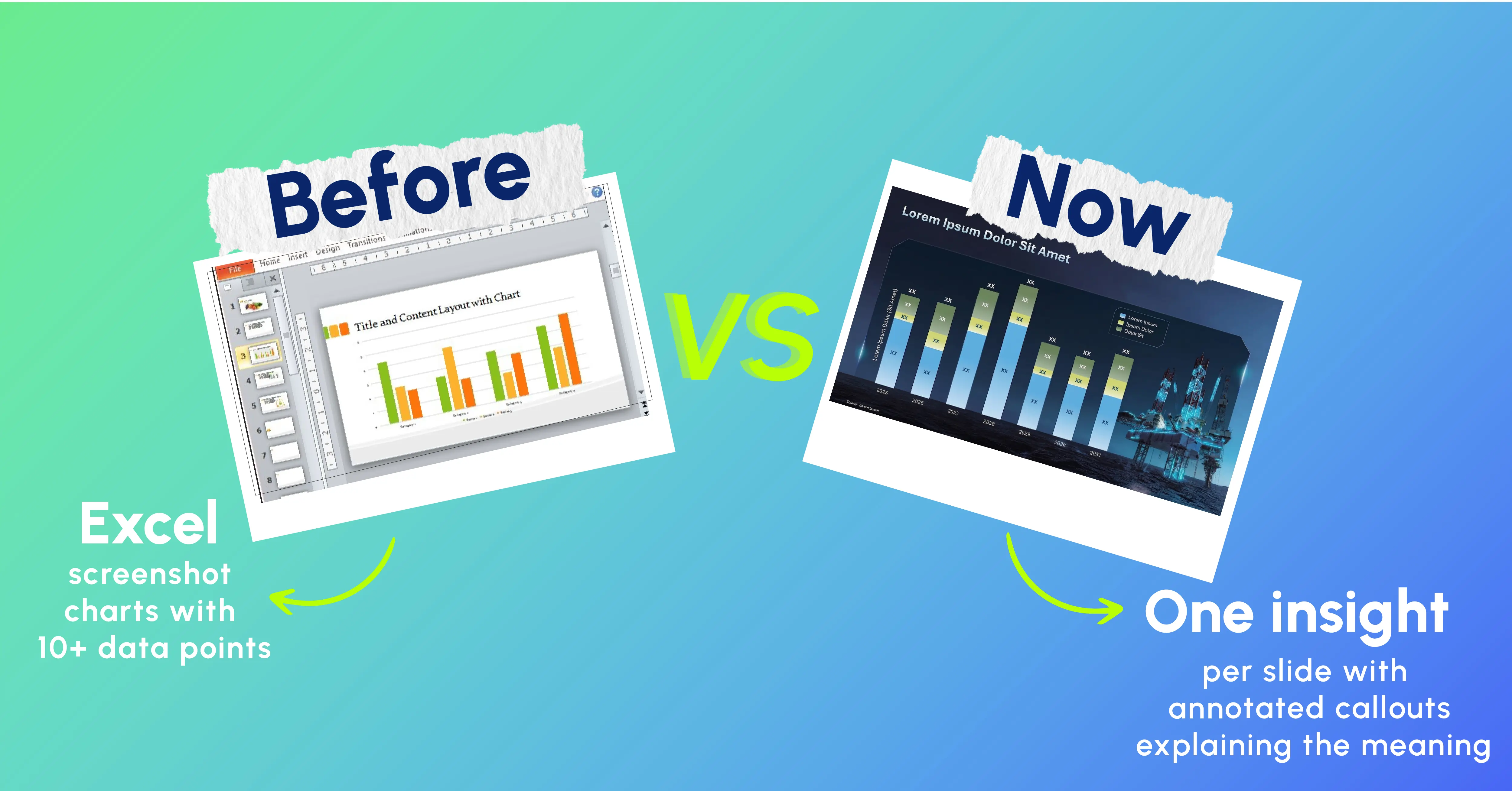
Using a copy-and-paste approach for transferring an Excel graph to a slide is considered a 'crime of presentation' in 2026.
The difference between visualising data and narrating data is clear moving from the former (visualising the numbers) to the latter (narrating what those numbers actually mean). Every data slide needs to make the point: So what?
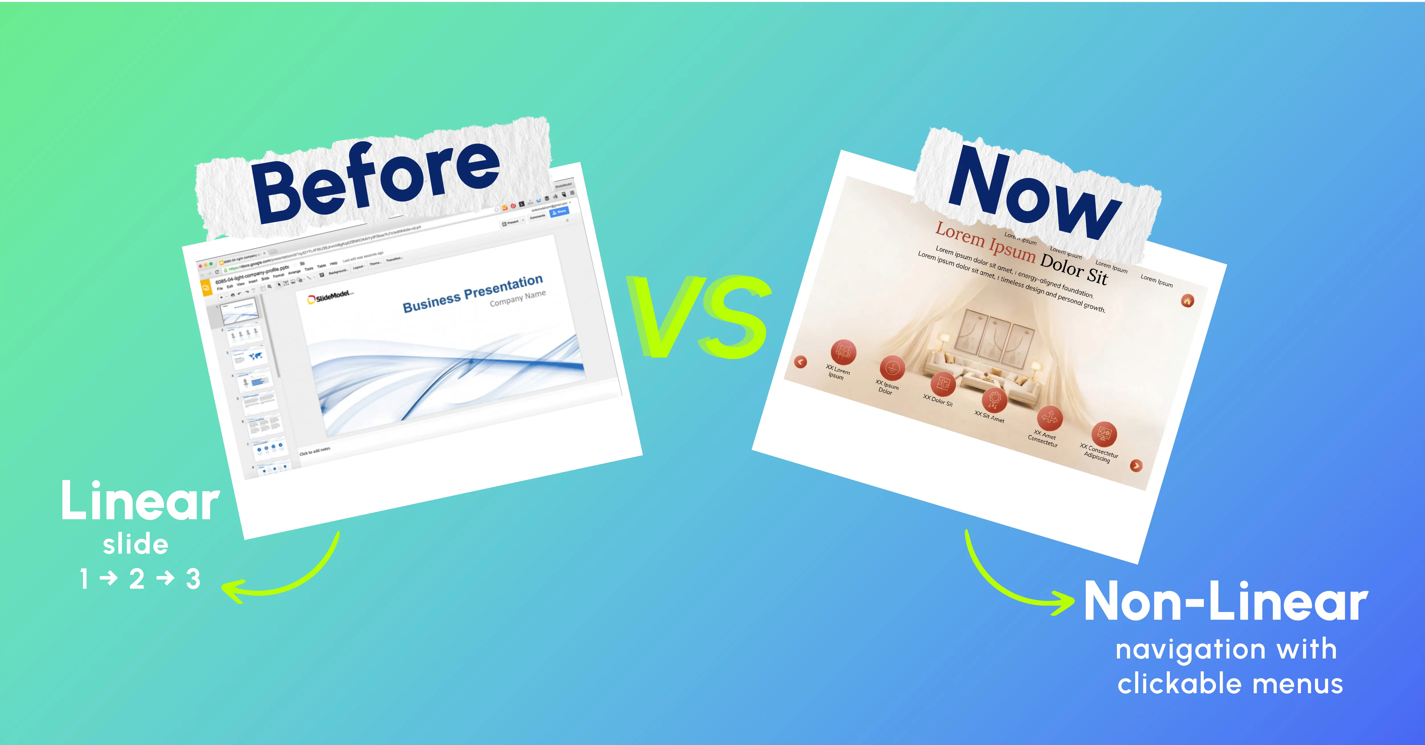
The old format of linear decks, where slides are followed sequentially from 1 to 2 to 3 regardless of content is dying out.
2026 presentations include clickable section menus that allow the presenter to jump to any part of the deck depending on audience interest. Include a 'home base' slide containing a menu, section cards with links, and return buttons on the end of each section.
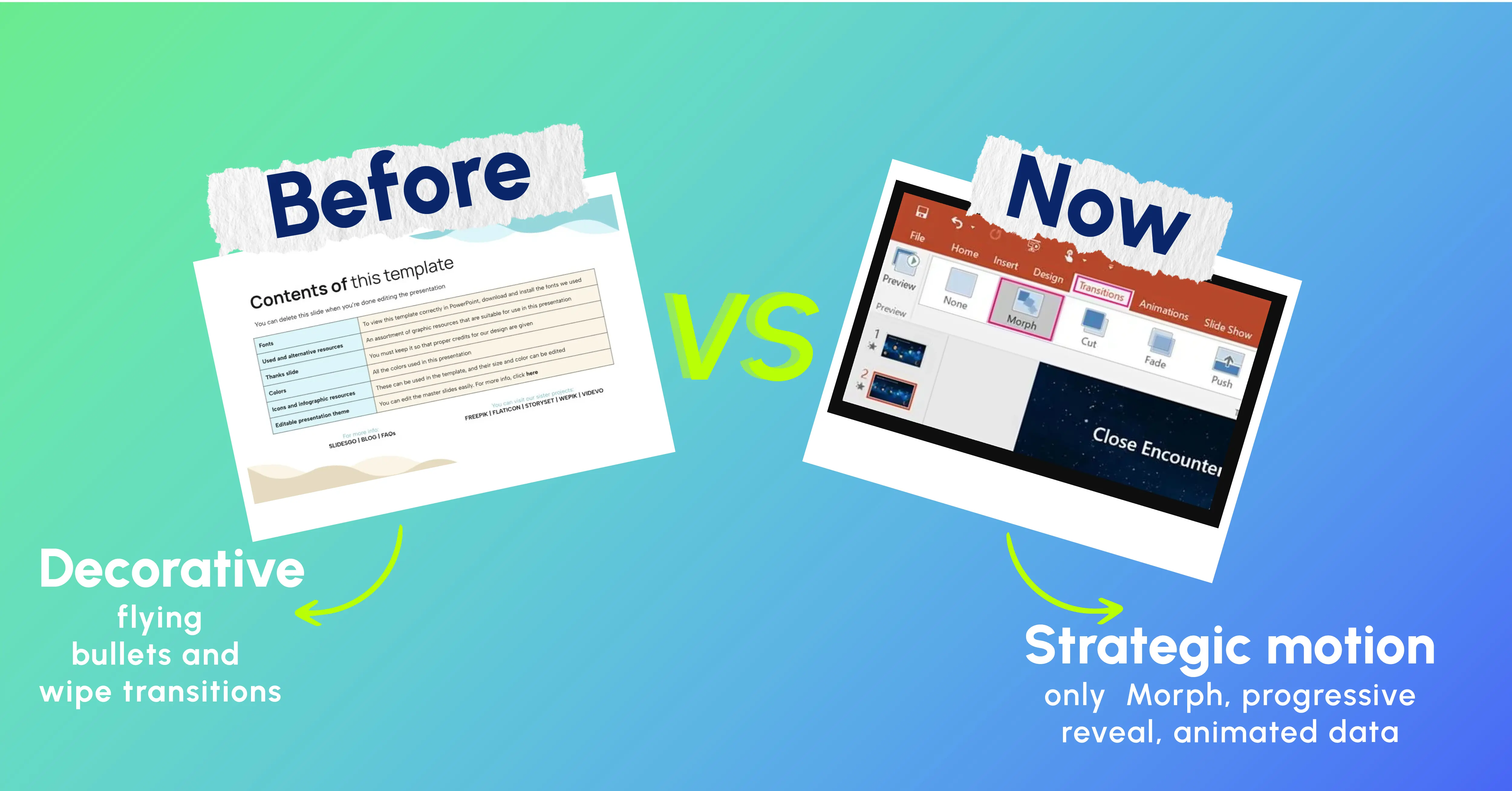
In 2026, each transition must serve a purpose related to the idea being conveyed. Otherwise, the transition doesn't belong.
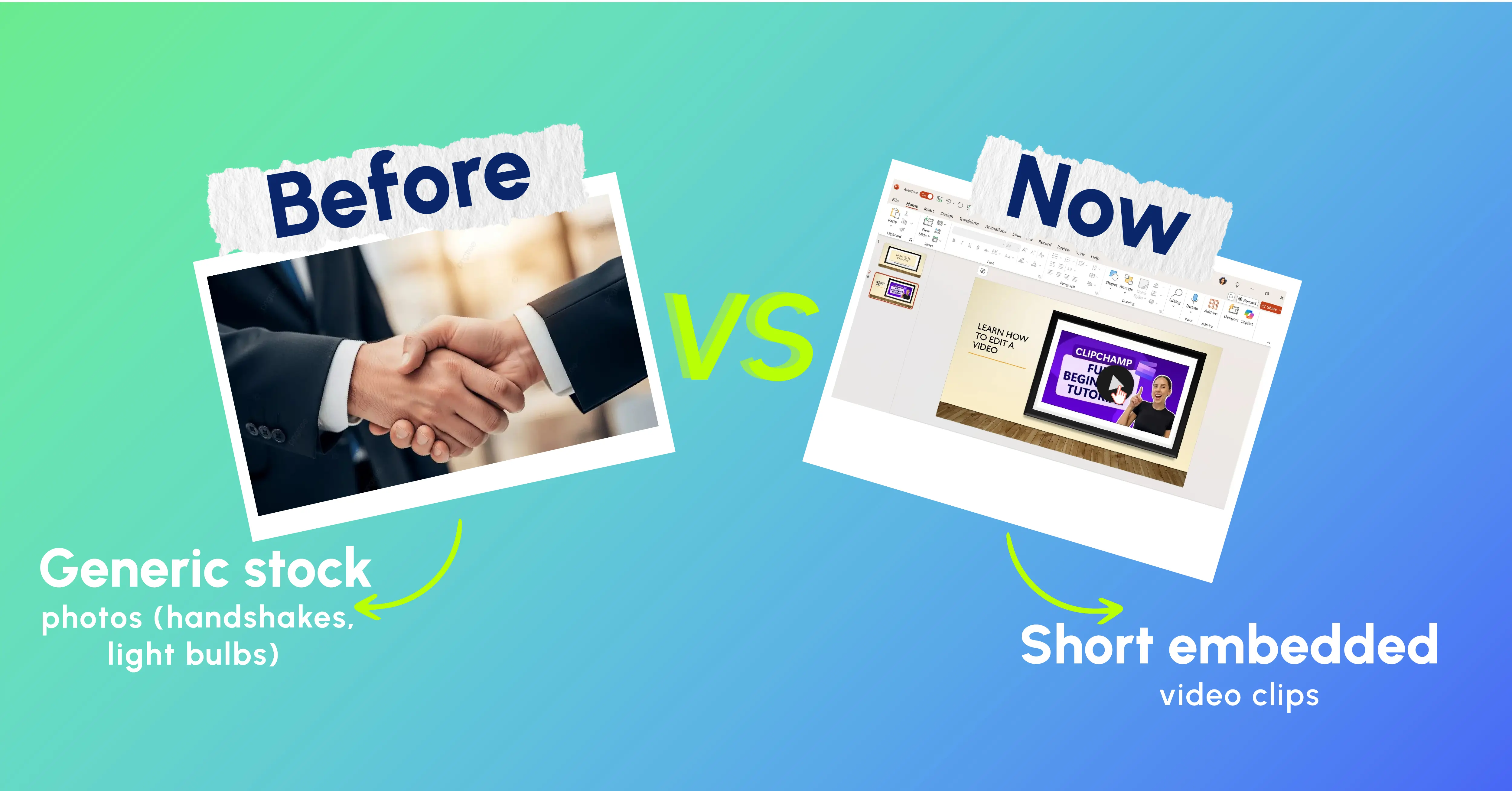
Short clips of video are replacing static hero graphics for all critical deck formats.
The product demonstration in a 15-second embedded video clip on slide 3 conveys your point better than a half-minute of bullet-point description. A narrated recap at the end of the board deck in 30-second increments makes sure that the takeaway gets through even when the deck is shared without context.
Structure formula: three beats - setup, insight, conclusion. Clip lengths should fall between 10 and 60 seconds. There are many tools available for video creation, including Google Vids, video generation engines from AI companies, and no-cost alternatives.
It might seem counter-intuitive at first glance, but it is the most potent 2026 trend.
With AI creating perfect content across every medium, the audience has become allergic to perfection. The use of hand-drawn elements, collaged graphics, textured drawings, or other mixed media techniques communicates something that perfectly composed stock photography cannot create something authentic and human.
For brand and marketing decks as well as storytelling-based pitches, imperfection equals authenticity.
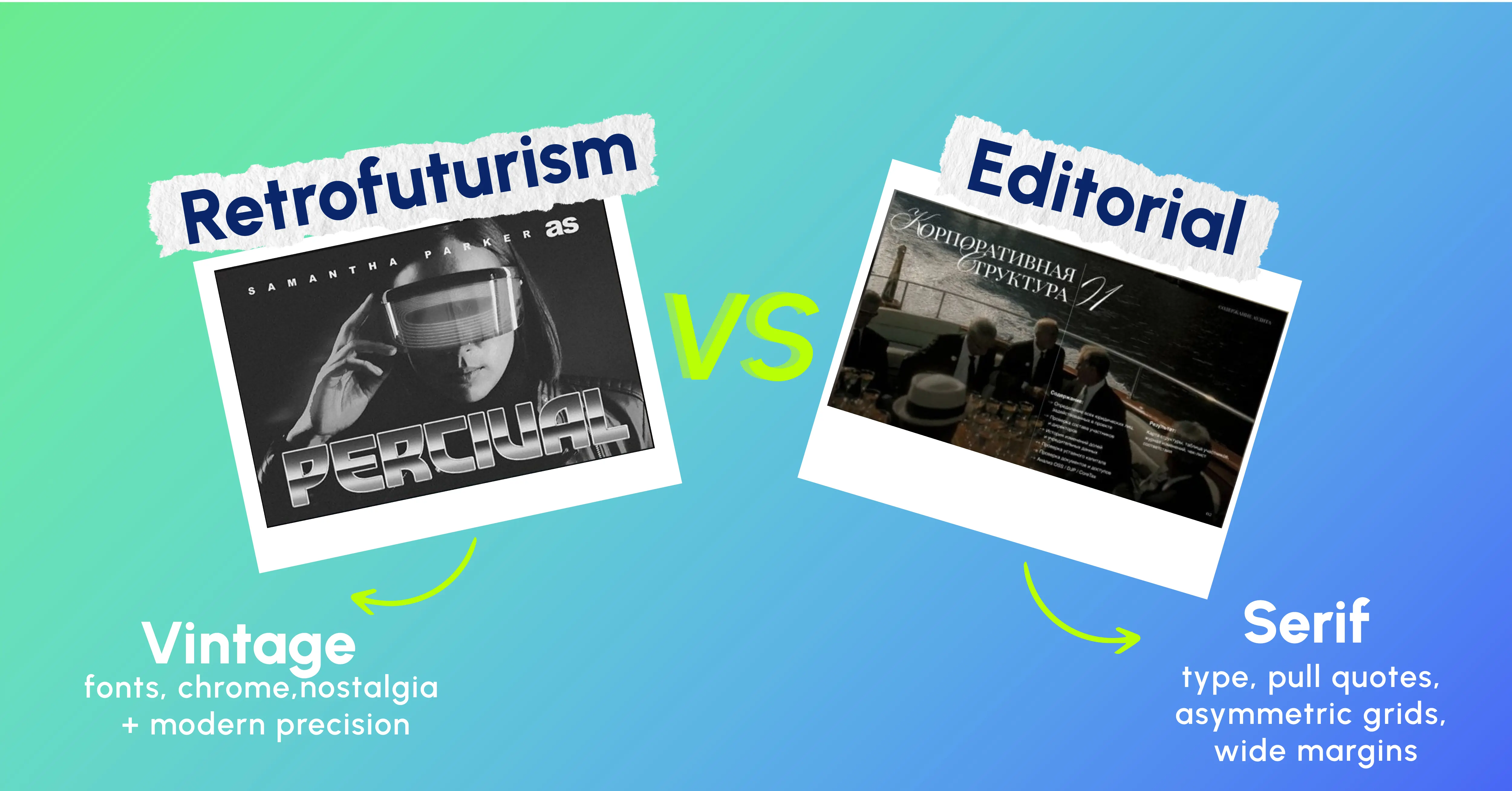
Two distinct styles are gaining fast traction in brand and marketing decks.
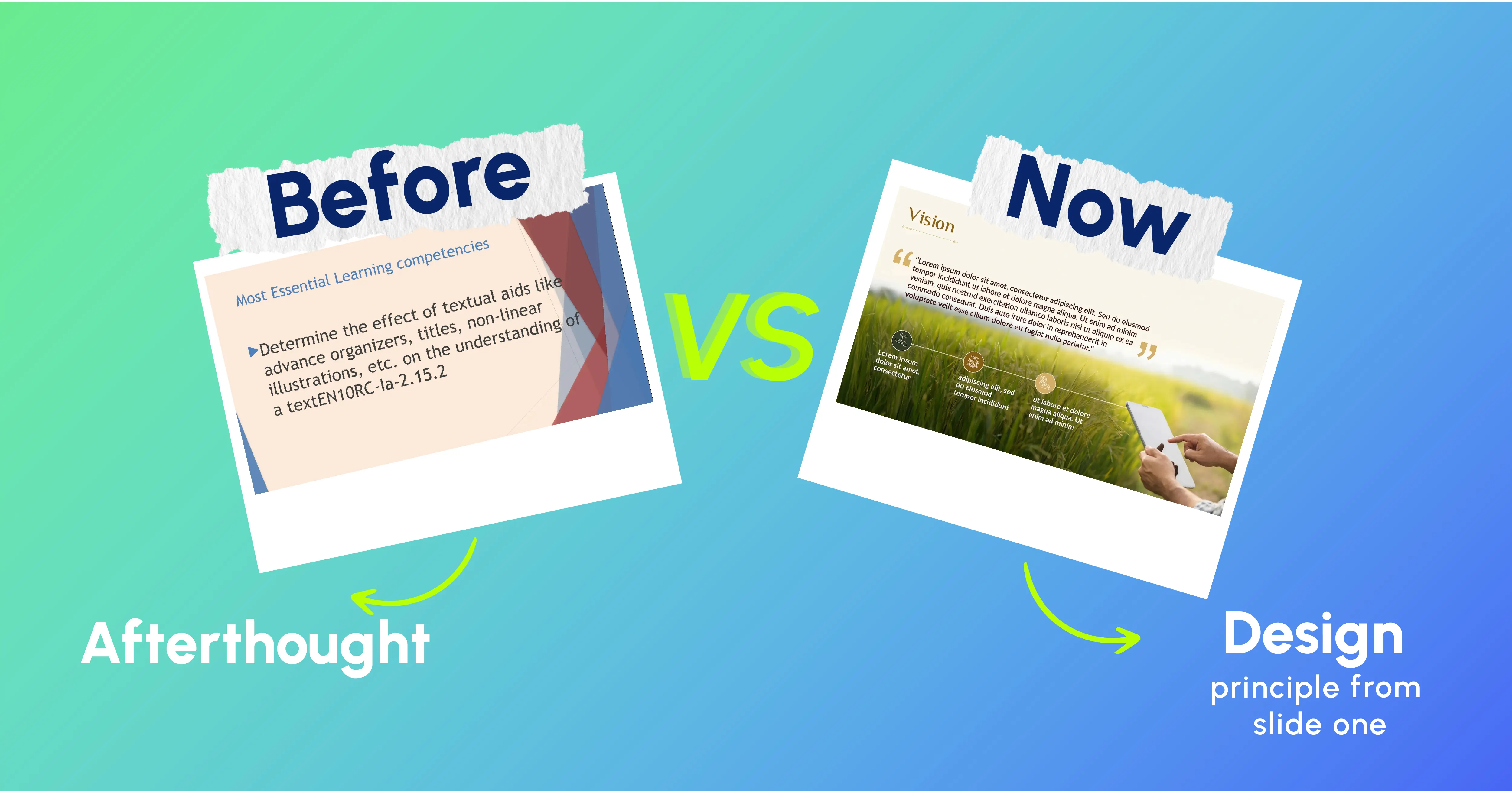
Accessibility has become a need from being a want ever since the implementation of the EU Accessibility Act in the year 2025. This phenomenon is also observed in other countries like the USA, Australia, Canada, and India.
Accessible design = good design.
High contrast, large fonts, and visual hierarchy help everyone.
One very good example of this is our IHCL Annual Business Conference 2025 initiative, in which we have successfully converted the strategic vision into compelling and effective stories through two different leadership decks along with 90-plus custom slides.See how we shaped IHCL’s leadership story into a high-impact conference deck.
A perfect demonstration of the current trends in presentations is the Aditya Birla Capital Day, wherein our 35 slides modular leadership presentation was crafted with structured storytelling, animation-led clarity, fast iterations, and rigid branding alignment that meets the requirements of a board report presentation.
Explore how we simplified complex leadership communication for Aditya Birla Capital Day.
That same boardroom discipline shaped our Tata Sierra project; we focused on creating a visually cohesive brand system that balanced retro 60s-80s nostalgia with contemporary production values. Large serif fonts and image collages emphasized the editorial aesthetic, while a filmic video intro and smooth scroll motion enriched the storytelling experience.
Discover how we built an immersive brand-led launch presentation for KIA.
The message is evident in our recent launch projects for Vivo’s X200FE and XFold 5, in which over 300 slides, unique ultra-wides, smooth animations, and storytelling techniques were used to provide that highly immersive experience that modern technology presentations need.
Uncover how we applied modern presentation trends 2026 for Vivo’s product showcase.
A more sophisticated way to express the current presentation trends 2026 is through our HPE MD Vision Deck, which used over 25 slides to turn a complicated growth road map into an inspiring story using the power of message hierarchy, compelling imagery, and storytelling.
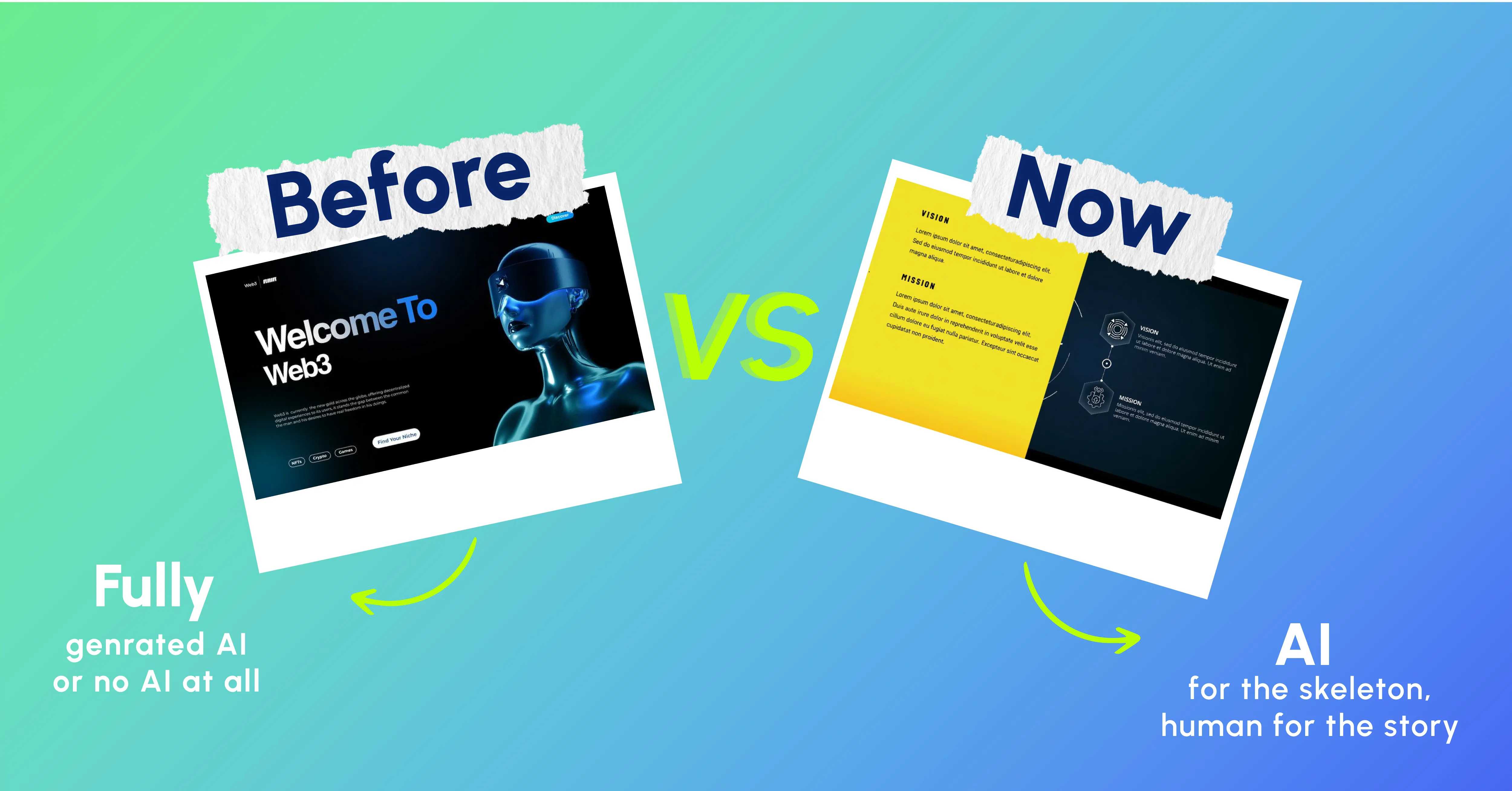
AI software is now able to make a whole deck from one prompt. The outcome is usually generic.
The formula: The AI generates the body, the layout, the icons, information presentation, and the body. Afterward, the human adds the soul – the emotional hook, storytelling through visuals, crafting the story, emotions, and the final message. This is how you go from building a deck to presenting it.
It is the single factor here that would have the greatest impact on leadership teams.
A presentation created in 2026 is not something thrown together. It’s an asset for your brand. All these different teams in London, Mumbai, Singapore, and New York are building their own slides. Without a proper design system, your brand identity will look very disjointed to everyone.
There has never been a greater standard set for presentation design nor a more severe consequence for overlooking its importance. A presentation that appears to have come from an outdated PowerPoint template is a clear indicator to everyone present that the ideas within it could be just as out of date.
Presentation design 2026 is not about visual appeal. It’s about clarity, self-sufficiency, and brand consistency everywhere you look. Bold fonts, bento grids, dark mode, narrative data, and accessibility are critical elements of modern presentation trends 2026. It is the minimum expectation for any company that prioritises communication.
The only question isn’t if you will upgrade your presentation standards. It is when.
At INK PPT, we create presentations for Fortune 500 organisations, C-suite executives, and brand leaders around the world. If you need help creating a presentation that packs a punch, get in touch with us.
As a passionate explorer, I see crafting the perfect story as embarking on a refreshing Himalayan journey. Every narrative is an adventure, a voyage of imagination, meticulously molded into captivating presentations. I'm here to guide you, ensuring your story becomes an unforgettable odyssey, with each creation as a vibrant landscape ready to captivate eager audiences.

About the Author

.webp)

Consult with our Business Advisor