

Contact Us
Let’s Partner for Your Next Big Presentation
Consult with our Business Advisor
.webp)


PresentationPanda.com is now part of INK PPT. We are committed to enhancing and building on the valuable content that PresentationPanda.com has always provided. Our blog will now offer even deeper insights, comprehensive guides, and innovative strategies to elevate your presentations. Expect enriched content designed to help you create more engaging and effective presentations. With INK PPT, you’ll have the tools and knowledge to captivate your audience and deliver outstanding presentations. Stay tuned for expert tips, creative ideas, and practical advice to take your presentations to the next level.
A well-designed PowerPoint template ensures consistency and professionalism, helping you communicate your message effectively and keeping your audience engaged. Understanding your specific needs is essential before choosing a template. Are you looking for templates to showcase your latest marketing campaign or present quarterly business results? Identifying your primary objective helps narrow down your options.
Graphic River is an excellent resource for high-quality PowerPoint templates created by top graphic designers. It offers a variety of styles, from minimalistic and modern templates to elaborate designs. When using Graphic River, match the template with your presentation's theme, customize it to fit your brand, and ensure you download any required custom fonts.
Other great resources for PowerPoint templates include Microsoft Office Templates and TemplateMonster, both offering a wide range of customizable templates for various business and marketing needs.
Choosing the right fonts is also crucial for effective presentations. Combining fonts that complement each other, establishing a visual hierarchy, and creating contrast can enhance readability and engagement. Avoid using too many fonts to maintain a clean and professional look.
FAQs and a strong call to action can further enhance your presentation, encouraging audience interaction and feedback. By following these tips, you can create compelling and visually appealing PowerPoint presentations that captivate your audience and effectively convey your message.
In today’s competitive business environment, having a visually appealing and professionally designed PowerPoint presentation is crucial. Whether you're presenting a new marketing strategy, pitching to investors, or leading a team meeting, the right font combination can make a significant difference. This blog will guide you through the process of selecting the best fonts for your PowerPoint presentations, focusing on creative font choices, complementary fonts, and effective PowerPoint font tips to enhance your presentations.
A well-designed PowerPoint presentation serves as the foundation for your presentation, ensuring consistency and professionalism. Fonts play a critical role in this, as they help communicate your message effectively, keep your audience engaged, and make your points clear. With the right complementary fonts, you can focus on the content of your presentation rather than worrying about the design elements. This is essential for creating a memorable presentation that stands out.
Before diving into the selection of fonts, it's essential to understand your specific needs. Are you looking for creative font options to make your slides stand out? Or perhaps you need complementary fonts that align with your brand’s identity? Identifying your primary objective will help you narrow down your options and select fonts that align with your goals.
Installing a font in PowerPoint is fairly straightforward. To install a font in PowerPoint, take the following steps:
Choosing the right fonts can make or break your design! If you're unsure about typography, head over to INK PPT’s YouTube channel, where we've curated the best videos to help you master font selection. From pairing tips to design tricks, our expert insights will guide you in creating visually stunning presentations and graphics. Whether you want a professional, modern, or playful look, we’ve got the perfect resources for you. Don’t let font confusion hold you back.

A classic challenge for anyone creating a PowerPoint presentation is pairing fonts that complement each other instead of competing for attention. Similar to humans, fonts have different moods and personalities. And sometimes, these moods and personalities can clash. For example, some fonts can be serious while others are playful, elegant, or professional.
When picking the fonts for your slides, think about the purpose of your PowerPoint presentation. For example, a rounded and bubbly font may be appropriate if you're creating a baby shower invitation but not for your serious board meeting presentation. Mixing fonts’ moods or personalities can draw attention to the typography instead of the message, resulting in a poor presentation.
When you're playing around with different fonts, make sure to keep things simple. In other words, don’t use too many fonts. Just as mixing in too many colors into your slides will likely result in a nauseating rainbow, mixing too many fonts on a page will probably result in a confusing message.
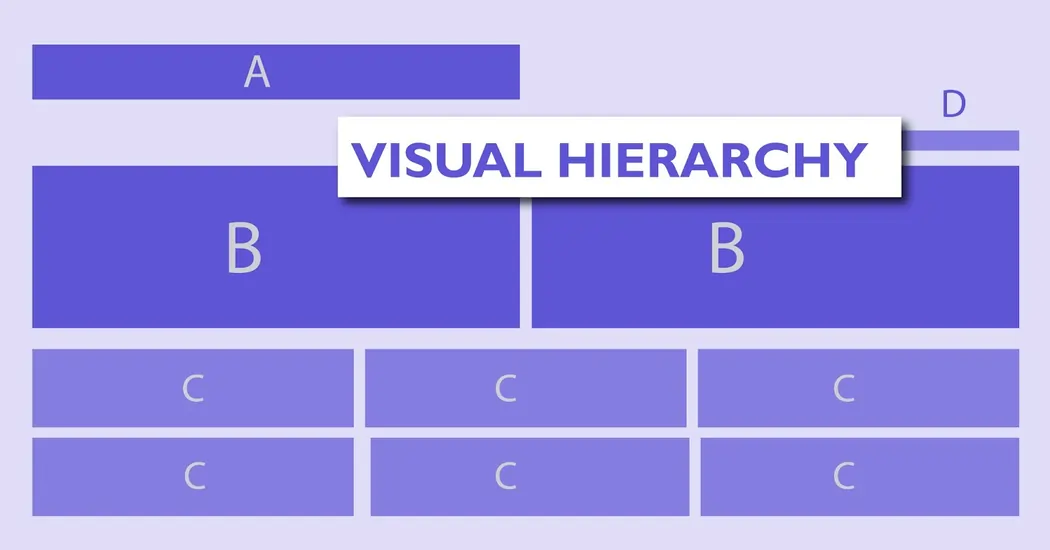
Visual hierarchy is an important element in presentation design. It tells people where to look first and what is most important. There is no one-step solution to creating visual hierarchy. However, visual hierarchy can be achieved with size, weight, color, texture, orientation, and space, or any combination of these tools.
Traditional printed media like newspapers and magazines offer good examples of how to apply a visual hierarchy to fonts. They combine fonts in a way that visually separates different textual elements like headlines, sub-headlines, body copy, and captions.
When you’re picking fonts for your next PowerPoint presentation, simply think about what part of the slide you want your audience to pay attention to first. What keywords are essential? Then, make your font style, size, and arrangement choices accordingly. Generally, the most important textual element is the largest and the weightiest.
For presentation design, font combinations based on contrast are better equipped to clearly establish hierarchy. Using contrasting typefaces makes it clear which texts are headings and subheads and which are body copy. It’s also clear that you want to draw your reader’s attention first to the heads.
In an effective combination, a bold, chunky font is paired with a small script font — and they work nicely together in large part because they are so different. The differences help create distinct roles for each font, allowing them to stand out as individual pieces of information.

Your audience should help you determine what fonts will work for your presentation. In addition to size, font styles also affect readability. One way to choose fonts that fit the context of your presentation is to match the attributes of your intended message with the perceived traits of a typeface.
Part of the process will be deciding whether display typefaces or more neutral fonts (or some combination of the two) are most appropriate for your project. Sometimes you’ll want something that really pops, and other times the context will require a font that’s not distracting.
One of the most popular ways to combine fonts effectively is to pair a serif and a sans serif. This is a classic combination and it’s almost impossible to get wrong. Serif fonts have the small nubs on the ends of the different strokes of the letters. Sans serif fonts do not have these little nubs.
The key to pairing serif with sans serif is readability. Sans serif fonts are generally better for PowerPoint presentations because they are easy to scan. In contrast, serif fonts are traditionally used for printed media, such as newspapers or magazines.
Achieving proper combining of fonts requires concord and contrast, and not conflict. The fonts need to work well together and share similar qualities. That way, your pairings are most likely to look harmonious together. Conflicts between fonts happen when the fonts look too similar or too different.
Fonts that share the same weight, size, and decoration can become too alike. They’re performing very similar roles, but the small differences are conflicting, which makes for an awkward overall effect.
Choosing fonts that are too similar can become problematic. You’ll most likely have trouble establishing a hierarchy because the fonts aren’t visually distinguishable from each other.
Font combinations that are too similar can often look like a mistake—as if you’d been experimenting with different fonts and had forgotten to clean up after yourself. As with any good comedy duo, there needs to be a straight man. If you have a typeface with a strong, extroverted personality, try combining it with something neutral, reserved, and trustworthy.
This may sound like a contradiction of the last method, but another avenue to harmonious type combos is to stick with a single font family. Just be sure to choose a font family that comes in a variety of weights, styles, and widths. Extended typeface families with enough variation let you easily differentiate one level of hierarchy from the next while assuring you that the shared DNA of the family members means they can sing in perfect harmony.
To pair fonts that come from the same family, plan carefully to create contrast, varying things like font size, weight (such as light, regular, and bold), and case (upper, lower, small caps).
As mentioned before, it is generally wise to stick to only two or three fonts. However, there is no explicit rule that says you can’t use more. Do keep in mind that consistency and readability are essential to good PowerPoint design. Too many fonts can distract and confuse your audience. Make your font choices carefully and consider the overarching message of your presentation.
If your presentation requires the use of a variety of fonts, remember that the overall effect should be harmonious, not conflicting or cluttered.
See how we’ve transformed presentations!
Check out our past collaborations and success stories. Get inspired and create your own impact!
Effectively combining fonts is a skill best learned through practice and trial and error. There’s no foolproof formula for finding the perfect font combination for your slides. Fonts have a strong influence on the look and tone of your presentation. So remember, choose fonts that accurately reflect your key message and theme.
Mixing fonts is a skilful way to create an appealing design for your PowerPoint slides. Here are some of the best font pairings that can make your presentations visually engaging and easy to read:
Important guidelines when mixing fonts in PowerPoint slides:
INK PPT is a leading presentation design agency that guarantees that your font choices will enhance readability, branding, and engagement. Here's why you should increase trust towards them:
At INK PPT, we craft high-quality, custom presentations tailored to your brand and objectives. Our services include interactive elements like animations, multimedia, and data visualizations, along with editable file access for quick updates. We provide end-to-end event support, professional voiceovers, and multilingual solutions to engage global audiences. Our advanced 3D animations simplify complex concepts, while secure solutions with NDA-backed data protection ensure confidentiality. With a seamless collaborative process and an 8-step quality check, we guarantee top-notch results. As your business grows, our scalable solutions evolve with you, ensuring impactful presentations that leave a lasting impression.
I hope the above guidelines have provided some insight on how to best combine fonts for your PowerPoint presentations. If there’s one important rule you should take away from this, it’s “You won’t know until you try!” So, be adventurous and play around with different fonts until you find a combination that works!
There are tons of free fonts available for download from places like Font Squirrel. As presentation designers, we have an ever-growing repository of fonts available for use in our presentations. Consider the fundamentals, then experiment. You’ll undoubtedly be surprised by what you find.
I hold the conductor's baton for every task within our dynamic team. My dedication knows no departmental bounds as I wholeheartedly dive into the intricacies of planning and execution, ensuring that INK PPT operates with seamless efficiency. I'm here to make the magic happen, where every project, every detail, and every moment counts.

About the Author




Consult with our Business Advisor


