

Contact Us
Let’s Partner for Your Next Big Presentation
Consult with our Business Advisor
.webp)
Thank you! Your submission has been received!
Oops! Something went wrong while submitting the form.

What would happen if the presentation slides helped sell ideas as advertisements do?
Frankly, most presentations are like the wallpaper we are only subconsciously aware of.
Click - next - yawn.
However, what if your presentation presented more than just a source of information?
Imagine every one of your presentation slides was able to lead people to take action, changing their minds, or even convincing them that your argument was the right one.
Avoid bullet points and corporate speak. Persuasion in 2026 is the new design currency.
So, the top presenters?
These presenters are not just speakers. They are mind architects who use behavioral psychology, visuals that are forgettable, and emotional cues to influence decision-making.
If at first you are making presentations mainly to “share updates,” then you are missing the whole thing. Because nowadays, you are not only presenting to people, but you are presenting to their brains.
Let’s see how we can cooperate with those brains instead of against them.
It is essentially the scheme of a persuasive presentation, one of the structured communication formats. The point here is not to provide information but to change people's minds and thus have them make a certain decision. Actually, the structure of a persuasive presentation is very different from that of a normal business deck because it is always prepared with a certain aim, e.g., to raise an investment, to get the client's approval, or to accelerate the internal agreement process.
They include a mixture of:
They are essentially the architects of thought, and if speaking is the main vehicle for delivering persuasive presentations effectively.
On top of that, persuasive presentation examples encompass presentation for investors decks, strategic vision decks, or product launches where the success is contingent on the buy-in of both emotions and reasoning. Whether you are picking persuasive presentation topics for a sales pitch or creating persuasive presentation slides for a stakeholder review, it is always behavioral: what do you want your audience to do when the presentation is over?
Great persuasive presentations look fabulous and, at the same time, are a delight for the eye and a joy to the brain. That difference means a whole lot.
After you understand the audience deeply, you figure out the core message which genuinely touches them. Your presentation is aimed at providing a single, clear, succinct, and persuasive message that meets the needs and interests of your audience perfectly. The message is the core of your presentation that must be powerful to grab the attention and clear enough to lead to action.
You can make your message more memorable by telling stories, illustrating with real-world examples, and supporting with relevant data. These resources facilitate the audience's emotional and intellectual connection with the content. Also, do not hesitate to speak the same language and use the same style as your audience; it will foster a sense of familiarity and trust.
Your message will be powerful not only because of the content itself but also in terms of how effectively it creates the desired impact on your audience. When your presentation is a result of careful content crafting that is supported by a genuine understanding, it transcends the level of mere information and turns into an impulse for action.
You are exposed to persuasive design consistently in such cases as: Netflix, push notifications, or even when you browse Kindle recommendations. They’re not simply features, but rather discreet tactics to lead your behavior.
The same principle carries on with persuasive presentation slides. In addition to informing, they may also direct decisions through the use of contrast, emotional visuals, and a clean structure. The elements of persuasive presentation slides apply persuasive design principles that influence the audience’s thinking without their awareness.
Do you want persuasive presentation examples?
A pitch that raises funds. A demonstration that makes things clear. A vision presentation that leverages buying.
And while persuasive design may be able to gently influence decisions, it is all about first capturing attention. Because if your audience has never looked, then they won’t act.
If you want your message to be remembered, don't just say it, but show it. Allan Paivio's Dual Coding Theory explains that people learn more efficiently when they get information both visually and verbally. This idea is one of the main reasons why persuasive presentation slides are so effective.
When visuals and words are combined, the brain interprets the message in two different ways. This double encoding results in stronger memory, quicker comprehension, and more emotional impact.
To bring persuasive design principles to life through dual coding, perform the following:
Slides that adhere to this technique don't just convey the message. They produce a visual as well as a verbal synchronization that facilitates quicker and longer retention by the audience. It isn't about bombarding the senses, it's about purposefully activating them.
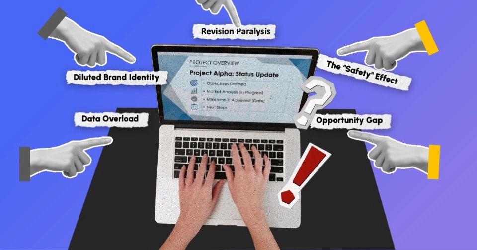
Have you ever found yourself mentally drained in the middle of a presentation? That is the effect of cognitive load. It is the total amount of mental effort that one has to put in to comprehend what is being presented. And when it gets too much, the effect of persuasion is lost.
In fact, according to Nielsen Norman Group, an average human being is able to remember in his or her working memory only 3–5 pieces of information at a time. Most presentations exceed that limit with dense slides, noisy visuals, and a nonstop stream of talk.
To reduce load and increase clarity, it is useful to:
Effective persuasive presentation slides don’t seem to be loaded. They present the material so that it is easy to follow. If your audience members have to exert too much mental effort simply to keep track, they are not going to hear the key message.
Besides, clarity is the first step to success but persuasion is the one that leads you through it. Once cognitive friction is removed, it’s time to guide belief and behavior.
The majority of decisions do not come from the logic. Rather, they are influenced by trust, urgency, and the fear of missing out. Psychologist Robert Cialdini found these six emotion-based persuasion triggers: reciprocity, commitment, social proof, authority, liking, and scarcity.
These tactics are not dishonest. They correspond to the mental processes and decision-making of people.
But it all loses its effectiveness if it seems fake. The true strength comes when these signals are so naturally a part of your structure, story, and the way things are presented that, before your audience can realize it, they already trust you.
Because sustainable influence is not about putting more pressure on a person. It is about smarter designing, i.e., collaborating with human psychology rather than opposing it.
Attracting attention, reducing resistance, and fostering trust are all part of a great job You've done well. The often-downplayed part of a persuasive presentation design is helping your audience to take the next step.
Persuasion is not over when the presentation is done, and the audience leaves it at its height when a person makes a choice. Your talk should be structured similarly to a story. Every chapter should deepen the understanding, raise the confidence, and stir the feelings.
This isn’t about coercing people to say “yes.” It’s about creating a
pathing, through attention-grabbing, memory optimization, emotion framing, and other psychological tricks, sounds perfectly powerful in theory. But how do they deliver tangible results? Here’s how INK PPT utilized them, stepping out of a mere presentation into an experience that touched people.

MG Motors teamed up with INK PPT to create their 2023 Auto Expo booth presentation, and the goal went beyond simply listing features. They wanted to arouse interest, establish confidence, and stimulate the decision to buy. The challenge was crystal clear: how to create a presentation that would not only educate but also persuade?
The results were tangible:
This was definitely not a presentation. It was a persuasive journey that was very carefully designed to speak not only to the audience but also to the way their minds work. In case you are interested in seeing how strategy and psychology come together in action, check out our work and see how we create decks that produce results.
If the only purpose of your slides is to convey information, then they are not going to be memorable. However, presentations that truly touch the audience start happening when design gets aligned with psychology, and emotion is mixed with structure. Each component, from the first glance to the final decision, is meant to lead belief and motivate action. This is not about decoration. It is about persuasion. And that is what separates noise from real influence.
Therefore, when you present next time, design so that people will remember you.
INK PPT is a place where we create the kind of business presentations that not just look good but also make a real impact. We have worked with MG Motors and Fortune 500 companies to help them integrate psychology, storytelling, and visual strategy to grab and keep their audience's attention and trust.
Need a presentation that will make the audience act on your message?
Our experts can help you change your presentation into a powerful tool of influence rather than just a source of information.
As a passionate explorer, I see crafting the perfect story as embarking on a refreshing Himalayan journey. Every narrative is an adventure, a voyage of imagination, meticulously molded into captivating presentations. I'm here to guide you, ensuring your story becomes an unforgettable odyssey, with each creation as a vibrant landscape ready to captivate eager audiences.

About the Author


Consult with our Business Advisor