
Contact Us
Let’s Partner for Your Next Big Presentation
Consult with our Business Advisor
.webp)
Thank you! Your submission has been received!
Oops! Something went wrong while submitting the form.

Failure in product launches typically isn't because of poor product performance. Failure happens when the deck failed to answer the one question that all stakeholders ask: why do I care about this?
Product launch presentations are strategic documents delivered at events or internally which provide all stakeholders with the same information regarding what is being launched, why it matters, who the target audience is, how it will get to market, and what constitutes success. This is not a deck used for fundraising, press releases, or feature lists. This document's purpose is alignment.
Your product launch presentation is your product's first impression outside of your organization. Long before anyone uses the product, reviews it, or sees any advertisement for it, your deck speaks for it. It establishes belief or lack thereof.
Here you'll find the complete playbook. You'll learn what a product launch presentation should look like, how it should be structured, what great presentations look like in the real world, what failure looks like, and the universal rules all Fortune 500 launch decks must follow.
According to recent research, 87% of attendees agree that discovering new products is the most valuable part of attending a live event. If your product launch presentation fails to convey value you've already lost your audience.
The audience is not interested in your product; rather, they are concerned about the problem they face. It is imperative to portray the problem vividly and explicitly before presenting the solution. This helps create an emotional connection, which makes the product seem indispensable.
Apple, Adobe, Nike all do this
A demonstration of your product or service is far more valuable than numerous slides highlighting its features. If you cannot present a demonstration, then it is a problem of readiness, not presentation. Embedding short video clips (15-30 seconds) is now commonplace in internal decks as well.
Demo beats description
The most common issue with internal decks: too many insights per slide. Each slide must convey one point, highlight it with a supporting image, and proceed with the next slide. If a slide requires an explanation, then it is time to break it down into two separate slides.
Clarity over completeness
“24hour battery” is a feature. “You'll make it through a whole day of back-to-back meetings without searching for a charger” is a benefit. Internally, you have to train your sales team to use benefit language. Externally, the deck should never speak in features.
Outcome language always
Each product has an obvious objection – price, switching costs, competitor's edge, and market timing. The worst thing you can do in a launch deck is avoid it. Address it explicitly in a dedicated slide. Be candid in your response. It's much more convincing than any testimonial.
Google Glass ignored this
Internally, the deck is circulated, screenshot, and read off a phone at 11 pm. If the message conveyed on a slide depends on someone explaining it, then you've made a mistake. Each internal launch deck needs to convey its entire message without an anchor.
Asyncfirst design principle
With the opening line: "Today, Apple is going to reinvent the phone." There was no mention of any product specifications. Steve Jobs started with the problem and showed how the phone solves the problem by making the audience feel their frustration. He made no simulations and did the live demonstration of face identification. Only one concept on each slide was conveyed with bold white text on a black background.
Problemfirst opening Live realtime demo One idea per slide Nostalgia → future arc
Lesson: The presentation was as much a product as the phone itself. Every slide, every pause, every word was rehearsed to the millisecond.
Dark room with futuristic vehicle moving to the scene, accompanied by minimalistic yet bold visuals. Elon Musk's personality was perfectly in sync with his product, showing himself as a bold, non-conformist leader who isn't afraid to step out. Instead of running away when the armour glass broke, Tesla doubled down on the live failure to prove the audience their brand personality.
Product matched presentation style Owned the live failure Bold type, minimal colour
Lesson: Authenticity outperforms perfection. A raw, confident presentation can build more trust than a flawlessly polished one.
It is crystal clear about the problem, solution, the market, revenue model, and a niche in the market. It is not a buzzword-filled deck; it is just what it should be. All the questions a stakeholder would ever have were addressed via a single slide. The data slides were annotated and featured some key insights. This presentation is taught at the world's best business schools now.
Problem → solution → market Annotated data slides Zero internal jargon
Lesson: Clarity is the most underrated feature of any internal deck. If a new joiner can understand the product in 10 slides, you've done your job.
No tech language was used at all; the entire presentation was dedicated to various scenarios related to AirTag usage. Such scenarios as searching for your wallet under the couch or finding your backpack in the taxi included in a presentation in under 30 seconds. Thanks to such simplicity, it became evident that the Bluetooth tracker is something everybody needs.
Relatable use cases only Under 30s per scenario Zero technical jargon
Lesson: Show the product integrated into daily life. The audience should see themselves in the demo, not watch a feature list.
It hit the market five years after the iPod made its debut. It began with comparing the features of both gadgets. But there was no compelling reason to switch from the iPod. Even though wireless sharing and social playlist options were unique, it never became a core message for the presentation. It felt like a product launch and nothing more than that.
No clear USP 5 years too late Featurefirst not valuefirst
Lesson: If you can't answer 'why switch?' in the first 60 seconds, your launch is already lost.
The presentation of Google Glass was built around making it a fashion product worth $1500. However, it was impossible to define its use case as an everyday product that would fit the needs of common people. The launch presentation focused on capabilities of Google Glass and ignored "Who is the target audience and what is the benefit for them?"
No target audience defined Ignored the main objection Price without justification
Lesson: Before writing slide 1, answer this: who is this for, and what problem does it solve for them today? If you can't answer that, delay the launch.
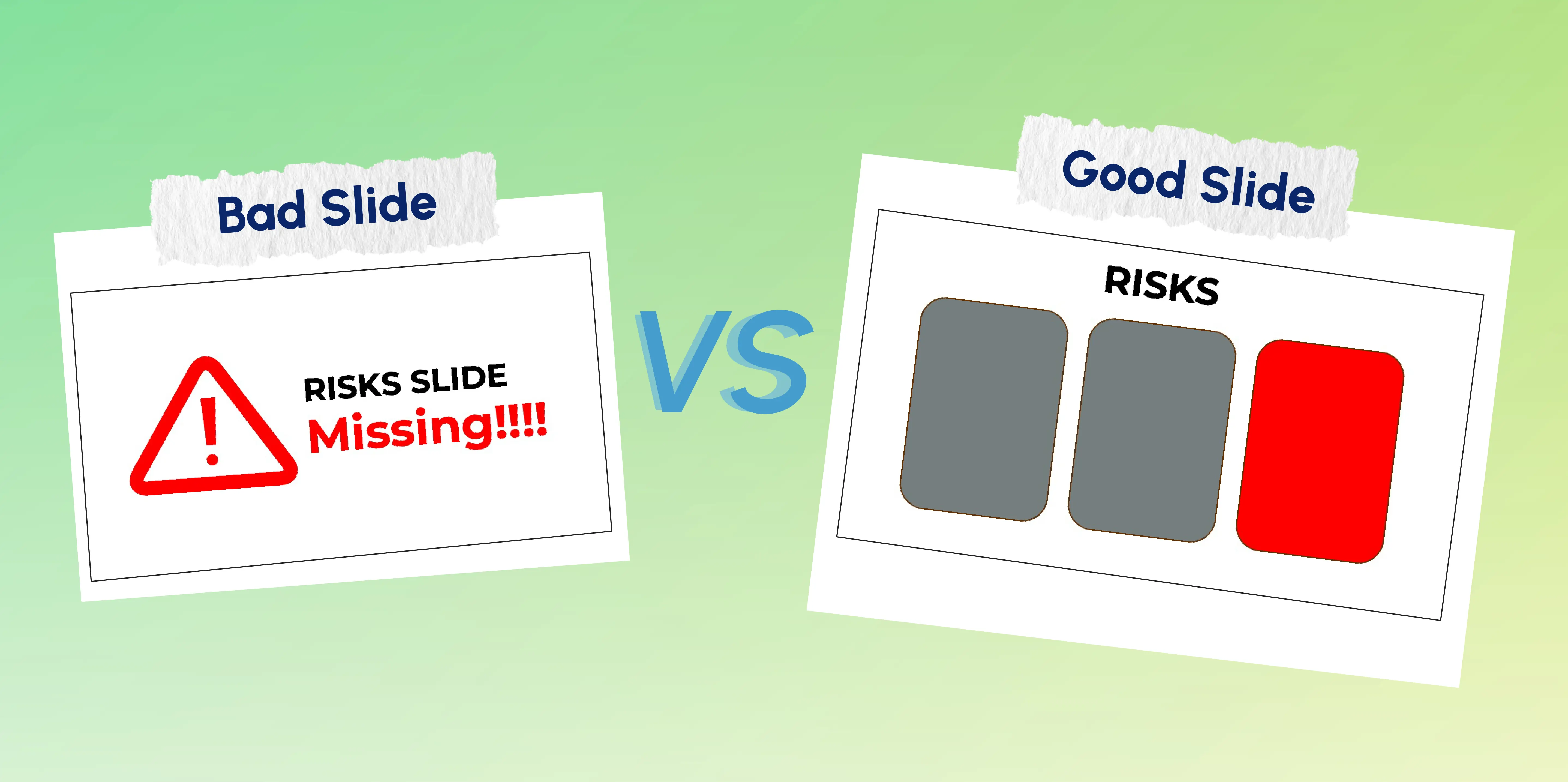
The external presentation was impressive enough, but internally Samsung failed. Its internal presentation did not have a single slide regarding the risks associated with using the phone. The risk slide was not mentioned even though it should have been addressed as Samsung always reviews its product before an external launch.
Risk register absent Internal deck failure $5.3B recall cost
Lesson: The internal launch deck must include a risk slide. A missing risk slide is not a small oversight it is a governance failure.
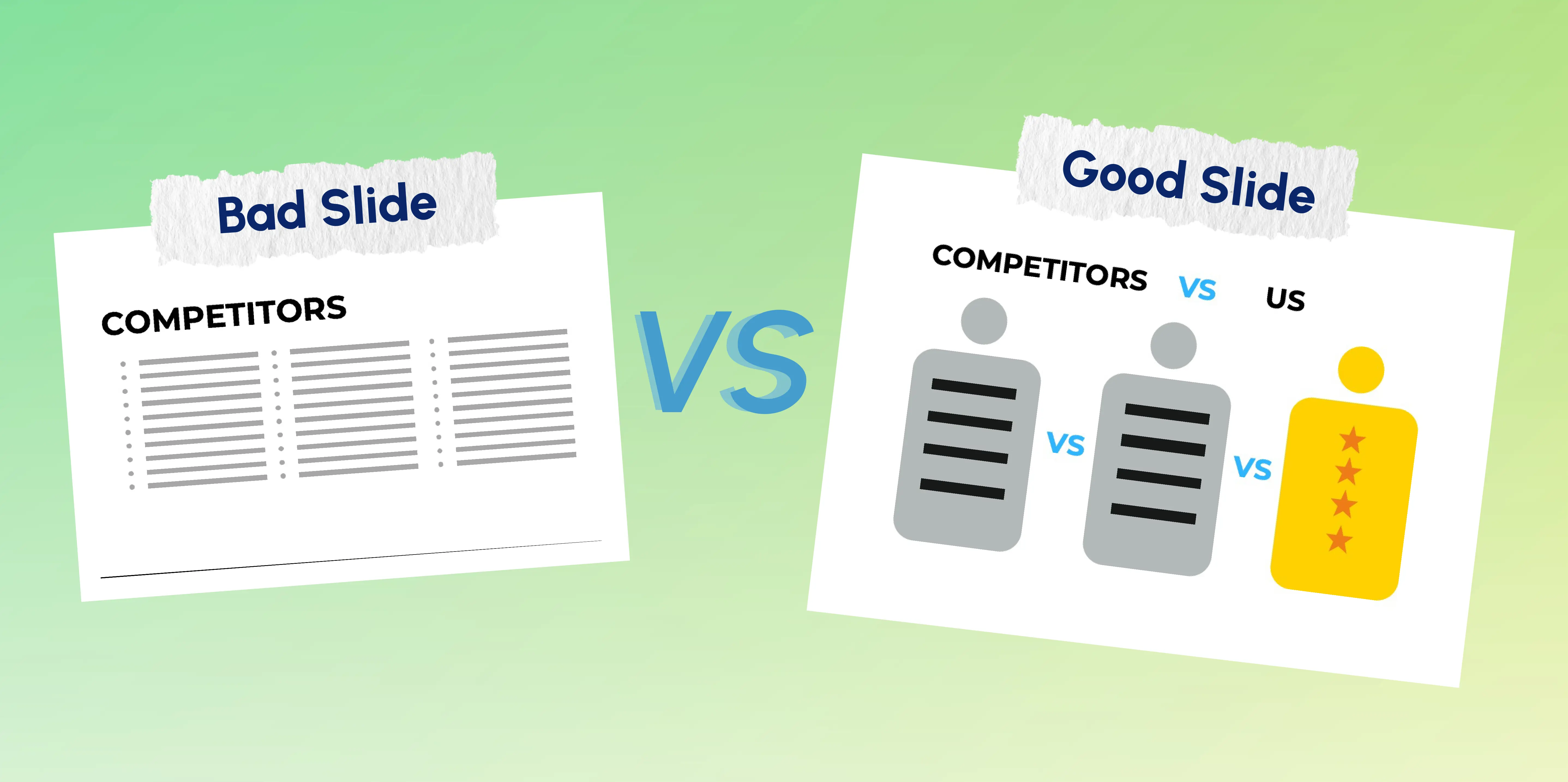
The entire deck focused on a proprietary feature, 'Dynamic Perspective', that offered a 3D user interface. Not only did it not solve any consumer pain points, but it had no Google ecosystem, no compelling reason to switch, and aggressive pricing for a non-established operating system. The deck addressed 'what is possible' exceptionally well but failed to address 'so what'.
Feature showcase not value prop No competitive positioning Wrong audience insight
Lesson: Audiences don't buy features. They buy outcomes. 'Dynamic Perspective' is a feature. 'You'll never lose your place again' is an outcome.
The same product, the same launch, different audiences. What the deck leads with must shift based on what each stakeholder cares about.
The distinction between a landing slide and an ignored slide almost always lies in its structure. The following slides present the same information in a product launch presentation, structured in two different ways.


Design communicates a message to viewers. A presentation created according to a template used several years ago shows everyone that the thinking behind it could be just as outdated. The following design rules will be applied to creating launch decks for Fortune 500 companies in 2026.
What gets launches right? Apple, Nike, Adobe recognize that it isn’t just about the product; the presentation is the product too. What gets it wrong?
Zune, Google Glass, Fire Phone; all of which had amazing products that were never properly explained by an insight-free, poorly crafted presentation.
A good presentation isn’t just an afterthought at the end of months of development; it’s one single document that decides whether everything else works or not.
Create clarity first. If your own team doesn’t have an answer to ‘why switch?’ after looking at the deck, then nothing else be it a marketing campaign, event, or public relations can salvage the launch.
INK PPT creates launch presentations for product launches to some of the most respected brands in the world, Fortune 500s, C-suite executives, and global brand teams alike.
As a passionate explorer, I see crafting the perfect story as embarking on a refreshing Himalayan journey. Every narrative is an adventure, a voyage of imagination, meticulously molded into captivating presentations. I'm here to guide you, ensuring your story becomes an unforgettable odyssey, with each creation as a vibrant landscape ready to captivate eager audiences.

About the Author


Consult with our Business Advisor