
Contact Us
Let’s Partner for Your Next Big Presentation
Consult with our Business Advisor
.webp)
Thank you! Your submission has been received!
Oops! Something went wrong while submitting the form.

How many times during a presentation did you agree silently while your mind was elsewhere?
You had to face pages of raw data, heavy spreadsheets, and charts that looked more like pieces of abstract art than insights. You knew that the data was significant, maybe even revolutionary, but it was like trying to drink from a firehose. The main points were there, buried under the numbers, waiting to be uncovered. So, data storytelling and visualization can amazingly improve the way we get insights from data.
It is a typical situation that happens in boardrooms, sales meetings, and strategic planning sessions all over the world. We collect data at an incredible rate every day – from customer behaviors to market trends, from internal operations to financial performance.
Still, just having a lot of data at hand is only half of the problem. The bigger challenge, and to put it simply the real magic, is how you take this complex data and create understandable, relatable, and most importantly, actionable insights.
Data storytelling enters the scene here, not just as a trendy word but as a fundamental skill to craft data-driven stories that change the way businesses operate. It serves as a bridge between raw data and genuine human understanding, thus transforming complicated data analysis into a captivating story that results in attainment.
Have you ever been overwhelmed by a spreadsheet?
Endless rows and columns of raw data, an almost infinite number of data points, and a gut feeling that there is an important message hidden in the data if only it could be decoded. This is a problem that a lot of people face when complicated data becomes a barrier rather than a help, especially when there is a lack of proper data visualization.
And this is precisely where data storytelling comes in – you can think of it as a lifeline being thrown out. It's the powerful process of transforming raw, and sometimes downright intimidating, data analysis into a compelling story that moves the audience and gets them to react. It goes beyond just presenting the numbers; it's about giving those numbers a voice, a character, and a reasoning. This is the core of a data-driven narrative.
So, what is data storytelling really all about?
It means the perfect mix of the following three key aspects:
1) The data itself
2) A clearly well-defined storytelling and
3) Eye-catching data visualizations.
Simply put, while simple data visualization only presents the data (for example, a line chart showing a dip in sales), data storytelling illustrates why and what the outcomes are. It creates a narrative out of the data by making connections, offering explanations, and guiding your audience from the discovery of data to the making of decisions.
The truth is, you create visuals that narrate a story such that a nobody, whether a data analyst or a C-suite executive, could easily understand complicated metrics or even the most complex information. It converts a state of confusion into one of shared understanding, thus making your data a very powerful instrument for change, especially in the case of a data storytelling PowerPoint.

The reality is a little harsh: our brains simply aren't designed to handle overload from sheer data quantity alone. According to the latest research, 65% of decision-makers are so overwhelmed by raw data that they freeze up, and their confidence in decision-making goes down. Imagine a data analyst who has been digging for insights for weeks, only to find that their presentation is a flop because the audience simply cannot connect the dots. It’s like the data just screamed but was unheard, and a chance was wasted.
Think of a seasoned executive who is fantastic at strategizing but lacks data scientist skills. Giving a thousand-row-and-column spreadsheet to such a person is almost like asking them to start learning a new language instantly. They don't necessarily need to know all the statistical intricacies; what they need is to be able to understand the implications of the data, the story it tells about their business.
Thus, the whole data storytelling world is critically important. It is a method of explaining complex data through simple and understandable figures so that even those who are not data-oriented can comprehend it. Instead of one-way information, a shared, participatory experience arises through which the audience in the main role becomes the story's co-creator, rather than its passive receiver. These essentially are the components of the art of data storytelling at its best.
Transformations like these are accompanied by various advantages:
It is an error of understanding that has been held commonly. Many people confuse data visualization with data storytelling. Although both aim to communicate information visually, they are actually used for different purposes. That is why it is important to understand the interaction of data storytelling and visualization.
Data visualization is basically a visual presentation of the data through different graphical formats such as graphs, charts, diagrams, and so on. It gives a quick glance at the data and reveals the kinks and twists, making it easier to batch the data sets that go together. As an illustration, a data visualization may point out a sudden plunge in sales in the Q4 period. Thus, it reflects the sales figures.
However, a follow-up of the data storytelling is essential. Incorporating that data visualization with a story that is clear, gives the context and lays out the reasons for the respective drop. Was it because of a new player in the market? Was there a change in customer experience? Or perhaps there were issues with the supply chain?
The story provides the numbers with a context and thus elaborates not just on what but also on why these points matter, and also, most importantly, what can be done to accomplish the desired outcomes. Moreover, it instills an indispensable emotional touch, turning people who are merely observing into participants actively engaging by narrating a meaningful story.
Bring Your Data to Life with INK PPT's Data Visualisation Expertise
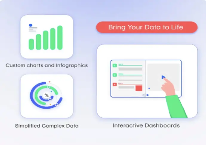
We at INK PPT recognize that outstanding data storytelling depends on exceptional images. We are experts in providing visual representations of data that are attractive and engaging, thereby helping decision makers simplify their reasoning and helping the audience to get a better grasp of the message. Our data visualisations are designed to highlight your main insights in a manner that, first of all, is visually accessible, and secondly, you can hardly find a way to ignore them. To begin with, they give you:
Your data insights shouldn't just be pretty pictures that no one notices. If you wish to go further than just basic data visualization and dive into impactful data storytelling, get in touch with us, and together, we'll craft your compelling narrative.
Effective data storytelling always depends on three elements:
Moreover, when these three major elements are aligned, you are offering data in the form of a compelling story instead of just showing it.
And how is a spellbinding narrative data experience created from a spreadsheet, you ask? Below are some live examples of successful transitions.
That's where the rubber meets the road. While many companies may get the idea of data storytelling, the actual use of it in high-stakes presentations can be really scary. Actually, creating a genuinely successful data story that touches people and motivates them to act is like mixing data science skills, design mastery, and an innate understanding of human psychology. That is where companies like INK PPT storytelling with data PPT are really good at these things.
Try to figure out what kind of problems the leadership teams and presenters actually experienced when preparing leadership presentations: a CEO keynote pulse, a launch of a new product line at maximum impact, a condensation challenge of extensive hard data into something that can be memorized and inspired. They are often in a dilemma of:
These are not imagined problems; these are the situations faced by data-driven stories every single day as they try to make sense of so much data while really achieving the desired effect. That is when data storytelling PowerPoint skills are going to be extremely helpful.
INK PPT's data storytelling method takes on the challenge head-on and turns it into a winning moment. Below are just two powerful examples showing how they manage to pull off an unbelievable storyline in data:
Here’s a glimpse at how for Deloitte's SAPM 2025 CEO Presentation:

Likewise, Carrier Business Meet 2025 aimed to introduce their new product among the employees and partners worldwide under the slogan, "Soar to Roar," and motivate them through that. INK PPT helped them to overcome problems such as multiple versions of the presentation, long approval processes, and low-resolution assets.
What was their approach? A more efficient content production, the use of the latest design techniques, and, most importantly on-site production and real-time reviews. This gave the confidence and a great impact to every presenter that their presentation was targeting the event’s goals.
The result? A stunning visual story that communicated clearly Carrier's growth goals and received great compliments for its creativity and accuracy.
These illustrations not only convey an essential truth but also challenge the preconceived notions: data storytelling is more than just the mastery of data analytics or data science tools. It is about integrating those skills with the art of design, strategic insights, and a profound knowledge of human communication to produce a truly revolutionary piece.

Trust is the most important factor when it comes to sharing sensitive data and important presentations with a partner. At INK PPT, we take you through a step-by-step journey of data storytelling that is not only smooth but also successful by:
The arena of business intelligence is in a state of flux. In the wake of developments in AI and automation, finding data insights is getting quicker. Nevertheless, the human factor – the capacity to create a captivating narrative out of those insights, especially when one has to refer to complicated metrics for the context, to address both emotion and logic – is still beyond replacement.
Going on, the spotlight will always be on empathy-driven insights, interactive experiences, and employing data to spin stories that really resonate. Whether it is marketing campaigns, internal strategy, or investor relations, the power of data storytelling guarantees that your data won't just be stored in a dashboard; it will be alive, lead to action, and have a lasting impact.
Therefore, if you get a large amount of numbers in front of you, do not only present data.
Tell a story.
A strong data story doesn't only convey information; it also inspires, persuades, and changes the world.
What narrative is your data longing to express?
Stop drowning in raw data and start telling a compelling story. If your data isn't driving the decision-making, it should, let’s discuss how INK PPT can empower your team with effective data storytelling.
As a passionate explorer, I see crafting the perfect story as embarking on a refreshing Himalayan journey. Every narrative is an adventure, a voyage of imagination, meticulously molded into captivating presentations. I'm here to guide you, ensuring your story becomes an unforgettable odyssey, with each creation as a vibrant landscape ready to captivate eager audiences.

About the Author


Consult with our Business Advisor