Strong slide design makes presentations clearer, more engaging, and easier to act on. These 20 slide design ideas show how creative slide layouts, engaging slide visuals, and thoughtful slide formatting can reduce confusion and help business presentations communicate ideas more effectively.
Many presentations contain valuable insights, yet they fail to communicate them effectively. The challenge rarely lies in the idea itself; it lies in how the slides present that idea. When slides are overcrowded, poorly structured, or visually inconsistent, audiences spend more time interpreting the design than understanding the message.
Thoughtful presentation design removes this friction. Clear hierarchy, structured slide formatting ideas, and intentional creative slide layouts help guide attention and make complex information easier to follow. Similarly, well-chosen, engaging slide visuals and purposeful slide transition ideas can strengthen the narrative without distracting from it.
Modern presentations increasingly rely on modern slide aesthetics that prioritize clarity, readability, and visual balance. Applying strong slide design ideas ensures that each slide supports the story rather than competing with it.
This guide presents 20 effective slide design services that enable presenters to deliver their messages through clear visual communication while keeping their listeners engaged.
Why Professional Slide Design Matters in Modern Business Communication
In the context of the modern business environment, presentations play an important role in the way ideas are interpreted and decisions are made. Whether the presentations are intended for investors, strategy meetings, or product launches, the role of the slide in the presentation cannot be overemphasized. This is the main reason why the use of effective slide designs and creative slide layouts assumes critical importance in the way the content of the presentation can be easily interpreted by the target audience.
Modern presentation design combines visual storytelling with structured messaging.
Engaging slide visuals help transform complex information into clear and memorable insights.
Clear layouts and an organized structure improve readability and audience focus.
Meaningful visuals and graphics support the key message of each slide.
Consistent design and branding maintain professionalism across the presentation.
Well-designed slides increase audience engagement and comprehension.
When presentations are designed with the objective of providing clear and effective messaging, the complex information of the business environment can be easily interpreted and acted upon by the target audience. Effective presentation slide designs not only ensure effective communication, but the presentations also become more effective and persuasive.
Whether your team requires the services of powerpoint presentation designersand developers to work on critical presentations, INK PPT helps in the development of presentations with the objective of turning complex ideas into clear and effective presentations, including investor presentations, product presentations, boardroom presentations, and event presentations.
20 Foundational Slide Design Ideas for Professional Presentations
These principles guide how slides should be structured, formatted, and visually organized to support clear storytelling and better audience comprehension.
1. Design Every Slide Around One Clear Message
What This Means: Each slide should have one idea to communicate. When there are many ideas on one slide, the audience will not know which idea to focus on and will not understand the key idea. Clear communication is the key to good slide design ideas and helps avoid information overload.
Why This Matters: This principle is the center of any good slide design idea. A single idea on each slide helps with memory, cognitive overload, and makes creating creative slide layouts much easier. This principle also helps with narrative flow and makes engaging slide visuals work with the idea, instead of against it.
How to Apply This Principle: Before designing the slide, think of one sentence that summarizes the idea. If the text, image, chart, or any element on the slide does not directly relate to the sentence, then remove the element or place the element on its own slide.
2. Turn Slide Titles into Clear Takeaways
What this means: Slide titles should explain the conclusion of the slide, not just the topic. Titles like “Market Overview” describe content but do not communicate insight or direction. A clear takeaway title immediately tells the audience what the slide is saying.
Why it matters: The audience receives instant message comprehension through takeaway-driven titles, which decrease their need to interpret the content. The audience can easily navigate through presentation decks because the titles serve as essential content indicators. The method represents an effective slide formatting technique that enhances both clarity and visual structure.
How to apply it: The presenter must use conclusion-based titles that describe the outcome instead of using topic-based titles that describe the subject matter. The presentation achieves a better understanding through this minor adjustment, which also enhances the flow of information.
3. Build a Strong Visual Hierarchy
What this means: The visual hierarchy of a slide controls how viewers direct their attention. The system establishes the sequence of audience viewing, which starts with the most critical content and concludes with less important materials.
Why it matters: The absence of visual hierarchy results in slides that create overwhelming mental demands because they present too much information. A strong visual hierarchy enables readers to understand content faster while maintaining engaging slide designs, which create an intuitive experience for viewers through modern design standards.
How to apply it: The designer should use size and contrast, spacing, and placement as deliberate design elements. The headline should dominate, visuals should support it, and secondary details should never compete for attention or visual weight.
4. Use White Space as a Design Tool
What this means: White space refers to the areas between content that remain unoccupied. The empty area between elements functions as a fundamental design component which creates visual separation between concepts while helping viewers remain focused on the main content throughout the presentation.
Why it matters: The cognitive burden increases for viewers when slides contain too much content because they need to process multiple elements. White space provides two benefits because it enhances understanding through its ability to showcase vital information while producing a serene and self-assured modern slide design which creates an atmosphere of purposefulness and professionalism.
How to apply it: The designer should eliminate all text and graphic elements which do not support the main purpose of the design. The designer needs to expand both margins and element spacing because each concept requires space to breathe while maintaining balance throughout the design.
5. Align Content Using a Consistent Grid
What this means: A grid system establishes uniform alignment for text, images, and charts, which creates orderly visual patterns that are present throughout the entire presentation.
Why it matters: The audience experiences visual discomfort because of misaligned elements, which creates an unprofessional presentation appearance that they cannot articulate. Grids bring structure and professionalism to creative slide layouts, which show their full benefit through long or complex presentation materials.
How to apply: All slides must use identical margin settings and alignment standards, which must be maintained throughout the presentation. The grid system of Figma enables users to create neat layouts that maintain uniform slide presentation through its layout design capabilities.
6. Stop Treating Slides Like Documents
What this means: Slides serve as visual tools for communication instead of written document reports. Audience members lose their ability to pay attention because paragraph-heavy slides require them to read instead of listening to the content.
Why it matters: People understand less when they attempt to read while they simultaneously listen to spoken information. People should use slides to show their ideas through visual methods instead of relying on complete text explanations. The method enables visual elements of slides to work with transition concepts for seamless operation.
How to apply it: All detailed information should be moved to either speaker notes or supporting documents. Slides must remain brief while using visual content to show essential information that supports the spoken material.
7. Increase Text Size for Easy Reading
What this means: Presentation slides need to show text that people can read from any location in the room and through virtual meetings. The audience needs to read all content because the presentation slides contain information that requires extended reading, which small text makes impossible.
Why it matters: The audience needs to work hard to read small text, which causes them to lose interest and experience exhaustion. The larger text size enables better accessibility while making important slide content visible through visual design elements. This principle serves as the main requirement for effective slide design because it determines how fast people will understand the content.
How to apply it: The appropriate text size for presentation purposes becomes visible when designers perceive text as overly big. The text needs to be reduced through content elimination instead of text size reduction. The design process requires designers to establish readability standards while allowing spacing and layout elements to function as design elements.
8. Limit Fonts to Maintain Consistency
What this means: The usage of multiple fonts throughout slides creates visual disturbances, which prevent viewers from maintaining a consistent visual experience. Fonts should support communication, not draw attention to themselves.
Why it matters: Typography consistency is a core slide formatting idea. The professional appearance of slides disappears when multiple fonts are used because their design becomes unorganized. The use of limited font options enables a better reading experience because it creates visual continuity which matches contemporary slide design standards that achieve a tidy look.
How to apply it: The document needs one main font for headings and another font which will serve as the body text. The text design needs to achieve different effects through size, weight and spacing without using extra font styles. This method maintains design consistency throughout the presentation through its creative slide design.
9. Replace Bullet Lists with Structured Statements
What this means: Bullet lists divide complete thoughts into smaller parts which create difficulties in understanding the presentation material and reduce its effectiveness. They encourage scanning instead of understanding the text.
Why it matters: Structured statements deliver complete information, which results in more effective communication. The combination of these two elements establishes effective visual connections, which enable particular elements of each design to deliver a single distinct message instead of displaying unconnected information. This enables better storytelling and keeps the audience's attention intact.
How to apply it: Convert bullet points into short, clear sentences. If a list becomes too long, split it across multiple slides. Each slide should present one central concept, which should be shown through both its design and its visual elements.
10. Use Color to Direct Attention
What this means: Color should be used to guide attention, establish hierarchy, and reinforce meaning not to decorate slides randomly.
Why it matters: Too many colors in a design create multiple visual elements, which makes it difficult for viewers to focus. The deliberate application of color creates a visual hierarchy that helps to define slide design elements and establishes contemporary slide design standards that appear both sophisticated and intentional.
How to apply it: Use neutral tones for most content and introduce one accent color to highlight insights, key numbers, or decisions. Design the use of color in such a way that it helps the audience to determine their focus points.
11. Maintain Consistent Color Meaning
What this means: Color meanings should remain consistent throughout a presentation. If a color is used to depict growth, risk, or decline, it should not change its meaning from slide to slide.
Why it matters: When color meanings are inconsistent, it requires the audience to constantly decipher the meaning of the information being displayed. Consistent color meaning is important to increase clarity, speed, and trust, especially in a data-driven presentation where ideas about slide design are important to increase comprehension of data.
How to apply it: Define color meanings early (for example, green for growth, red for risk). Apply those meanings consistently across charts, icons, and highlights to support clear and predictable interpretation.
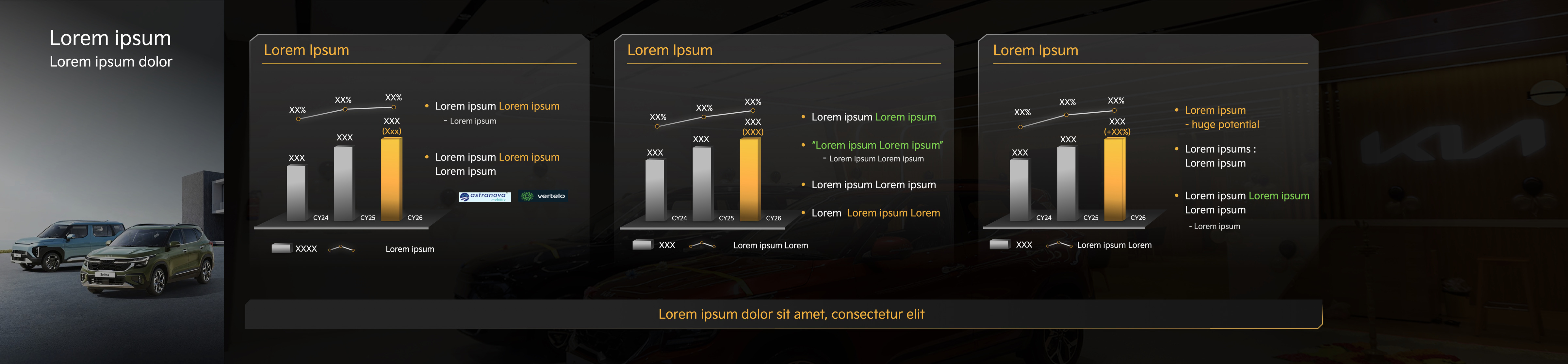
12. Use Images Only When They Add Meaning
What this means: Images in a presentation should have a purpose, such as to help explain a concept or idea, to reinforce a point being made, or to provide context to a concept or idea. Images are not added to a presentation to simply “fill space” or to make a presentation look nice or pretty.
Why it matters: Purpose-driven imagery improves understanding and credibility. Decorative or generic stock photos distract attention and weaken the effectiveness of engaging slide visuals. Strong slide design ideas prioritise visuals that reduce explanation time, not increase it. When images are meaningful, creative slide layouts feel intentional rather than ornamental.
How to apply it: Before adding an image, ask whether it helps the audience understand the idea faster or more clearly. If the image does not add clarity, insight, or context, remove it and rely on layout, typography, or color instead.
13. Use Visual Metaphors for Abstract or Complex Ideas
What this means: Visual metaphors use familiar imagery to explain abstract concepts, which include strategy and growth, transformation, and process change. Metaphors enable the audience to visualize the concept through their performance in front of them instead of receiving textual descriptions of the concepts.
Why it matters: Abstract ideas create challenges for quick understanding because they require more time to comprehend. The visual metaphors make explanations faster, and they help people remember information better while creating distinctive slide designs that people will remember. The method proves successful in leadership and strategy and vision presentations because these fields require both clear explanations and convincing arguments. Metaphors create engaging slide visuals that transform abstract concepts into understandable visual narratives.
How to apply it: Choose simple, universally understood metaphors which include journeys, ladders, bridges, paths, and mountains. The metaphor needs to stay the same throughout the slides because it should support the main message instead of diverting attention from it.
14. Crop Images to Focus Attention and Reduce Visual Noise
What this means: Wide, generic images often lack emphasis and allow the viewer’s attention to wander. Cropping images helps direct focus to the most relevant detail, making visuals more intentional and impactful.
Why it matters: Focused imagery reduces visual noise and improves clarity. It supports modern slide aesthetics by favouring precision over excess and helps engage slide visuals to reinforce the message instead of competing with it. Cropped images feel deliberate, confident, and aligned with professional slide design ideas.
How to apply it: Instead of placing full images on slides, crop them to highlight the most meaningful area. Use the cropped image to support the headline or key point, and avoid including visual details that do not contribute to understanding.
15. Use Illustrations for Processes and Frameworks
What this means: Using illustrations instead of photographs can be more effective, particularly if the process, system, or framework has to be explained. Unlike photographs, illustrations enable the elimination of any information and the focusing of attention solely on the structure and relationships of interest.
Why it matters: Processes are logical, not real. Illustrations simplify, clarify, and enable the understanding of flow quickly. They are useful in creating effective ideas for slide designs, which are important in the presentation of processes. They are also useful in creating creative ideas for slide designs and effective slide visuals in strategic presentations.
How to apply it: Use diagrams, flowcharts, or custom illustrations to explain workflows and models. Keep shapes simple, labels clear, and layouts consistent so the audience can follow the logic easily.
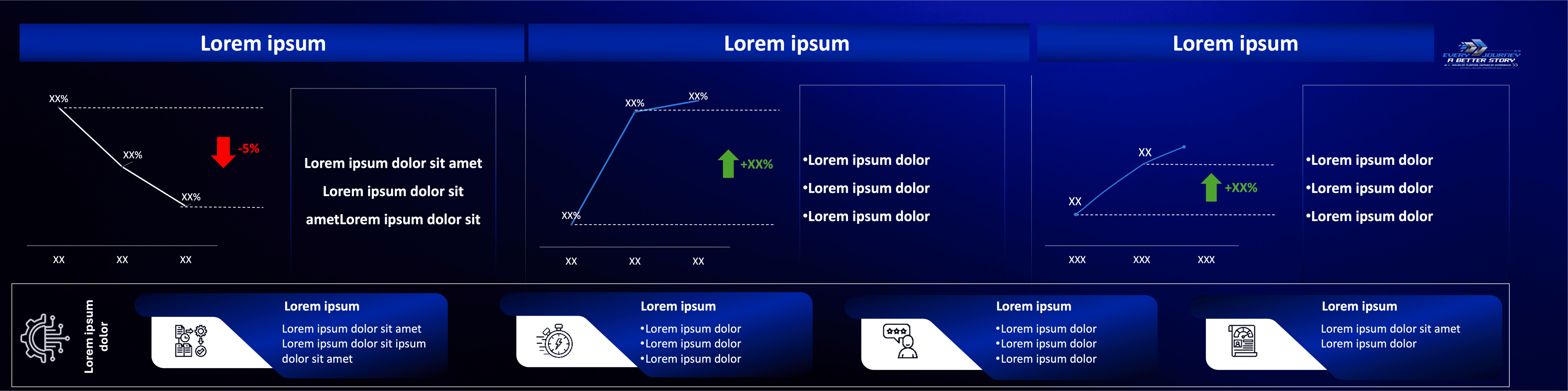
16. Design Charts Around One Clear Insight
What this means: Every chart in a presentation should communicate one primary insight. Charts should exist to explain what the data means, not to display everything that is available.
Why it matters: When charts attempt to show multiple insights at once, they confuse the audience and weaken the discussion. Focused charts improve clarity, speed up comprehension, and support stronger decision-making. This is one of the most critical slide formatting ideas for analytical presentations and aligns closely with modern slide aesthetics that favour simplicity and intent.
How to apply it: Define the takeaway first, then design the chart to support only that message. Remove data points, labels, or comparisons that do not directly reinforce the insight you want the audience to remember.
17. Simplify Charts by Removing Visual Noise
What this means: The visual elements of gridlines, excessive labels, duplicate legends, and multiple color displays create visual noise, which distracts from the actual insights. The elements create a distraction that prevents the viewer from understanding the information.
Why it matters: Cluttered charts increase cognitive load and make interpretation slower. The simplified charts present a professional appearance, which people find easier to read because they match current slide design trends. The audience can better understand the content when visual elements become less distracting because visual noise reduction creates engaging slide visuals.
How to apply it: The core insight of the project needs protection from all elements which do not provide direct support. The message becomes obvious through the process of reducing gridlines and decreasing color usage while showing only essential data points.
18. Use Slide Transitions Purposefully
What this means: Slide transitions should facilitate the narrative flow and should not distract from the content. The objective is to facilitate the smooth transition of ideas from one point to the next.
Why it matters: Excessive and dramatic slide transitions are distracting and draw attention to themselves. Purposeful and creative ideas for slide transitions are essential to facilitate the smooth and continuous flow of ideas and content, so the narrative flows naturally and is easily followed by the audience.
How to apply it: Utilize subtle and uniform slide transitions throughout the presentation. It is recommended not to use multiple slide transitions. Transitions should facilitate the smooth and continuous flow and should not be used as a visual element on the slide.
19. Open and Close with Intentional Slides
What this means: The opening and closing slides are essential to determine the perception and interpretation of the entire presentation. These slides should be designed with the same level of care and attention as the content.
Why it matter: Strong openings and closings are critical to ensure clarity and action. These are essential creative ideas for presentations that help to improve the entire presentation and content.
How to apply it: Avoid generic opening slides and default “Thank You” endings. Start with a clear framing idea or question, and end with a strong takeaway, summary, or call to action that reinforces the message.
20. Design Every Slide for the Audience
What this means: Effective slide design is rooted in empathy. Designers must create their entire visual presentation to meet their audience's required needs and specific context details.
Why it matters: Audience-first design establishes better trust relationships while improving understanding and increasing audience participation. The design concepts for the slides include all elements that combine to create a complete visual experience through their creative and formatting, and visual and transition elements.
How to apply it: The presentation should show the audience members who will attend and their main interests, and their preferred ways of watching the content. Designers should create their slides to make work easier for viewers instead of showing their personal design choices.
How INK PPT Helps Businesses Create Impactful Presentations
At INK PPT, presentation design goes beyond simply arranging slides. The focus is on turning complex ideas into clear visual stories that audiences can quickly understand and remember. Whether a presentation is used in a boardroom discussion, a client pitch, or a conference setting, the goal is always the same: make the message easier to follow and more impactful.
We work across different types of presentations, including:
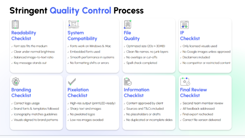
To ensure every presentation meets professional standards, the team also follows a structured 8QC process(Readability, System Compatibility, File Quality, IP, Branding, Pixelation, Information, Final Review) before delivery. This process reviews slides for clarity, brand alignment, system compatibility, file quality, intellectual property compliance, visual precision, information accuracy, and final export validation.
By combining clear storytelling, thoughtful slide design, and a rigorous quality process, INK PPT helps businesses present ideas in a way that is easier to understand, more engaging for audiences, and ready for real-world presentations.
Last Note
Effective presentations require more than flashy visuals and complex animations because their success depends on clear and structured slide design, which shows specific goals for each slide. The 20 slide design ideas in this guide show how designers can create powerful communication tools through their use of thoughtful layouts and clear messaging, together with engaging visuals and intentional transitions. When slides reduce cognitive friction, audiences spend less time interpreting information and more time focusing on insights and decisions.
The application of these principles will show better results in understanding and remembering your ideas for leadership updates, investor pitches, or strategic presentations. Strong slide design ultimately helps ideas travel further and influence decisions faster.
The presentation improvement service provided by INK PPT enables you to create visual stories from complex concepts, which will connect with your audience while delivering business success.
1. Why are creative slide layouts important for presentation delivery?
Creative slide layouts help present information in a straightforward manner that people can easily understand. The use of different slide designs enables better audience engagement and storytelling through the presentation. The method enables better identification of essential data points together with their specific relationships and sequential data elements.
2. How does slide formatting create a better understanding for people who watch presentations?
Effective slide design elements enable people to read through content that they can easily digest. The audience can understand the message better because the presentation uses consistent typography, together with aligned content, balanced spacing, and clear color design elements.
3. What effect do attractive slide graphics have on presentation effectiveness?
Attractive slide graphics enable viewers to understand complicated topics through straightforward visual representations. The presenters can use charts, diagrams, icons, and illustrations to show relationships, patterns, and insights to the audience because these elements convey information more effectively than text alone.
4. What are the proper methods for using slide transitions in business presentations?
The effective slide transition ideas should extend the narrative flow while protecting the presentation materials. The audience can better understand new concepts through gentle transitions, which maintain their attention on the main content being shared.
As a passionate explorer, I see crafting the perfect story as embarking on a refreshing Himalayan journey. Every narrative is an adventure, a voyage of imagination, meticulously molded into captivating presentations. I'm here to guide you, ensuring your story becomes an unforgettable odyssey, with each creation as a vibrant landscape ready to captivate eager audiences.

.webp)