
Contact Us
Let’s Partner for Your Next Big Presentation
Consult with our Business Advisor
.webp)
Thank you! Your submission has been received!
Oops! Something went wrong while submitting the form.

Ever looked down the slide of numbers and wondered, “Gosh, I need a coffee… and a magnifying glass”? Me too.
When I was first given the mission of crafting presentations, I would dig out some bullet points, a pie chart, maybe a stock photo for good measure, and call it a day. The end product? My eyes glazed faster than my grandma's donuts.
That's when the power of infographics hit me.
They’re not trendy visuals, they’re game-changers. Consider them the cheat code to effective communication. You’re trying to close a deal, instruct a client, or impress a conference audience. A quality infographic is able to do what the power of language alone so frequently cannot: reach out and touch someone, clear the air, and persuade.
So, let's discuss why the infographic is now imperative, not optional.
With the digital era in full swing, the market is saturated, and the attention span is shrinking. The ordinary person is bombarded with 6,000 to 10,000 ads every day, reports Forbes. Top that with research that demonstrated the average human attention span is 8 seconds, and you're in a struggle for people's time.
That is exactly the specialty of infographics.
Visual content is 94% more likely than text-only content to be consumed, according to HubSpot. And in Venngage's 2024 Visual Content Marketing Report, 65% of marketers identified the infographic as their most effective content.
The kicker here is that not only do Infographics attract eyeballs, they also improve retention. The Social Science Research Network found that 65% of people are visual learners, so they’re far more likely to understand and retain your message if you give it to them in a visual format.
In short: if you're not using infographics, you're already behind.
Here's the deal: our brains are slackers. They love video because video is fast. Research shows we absorb visual information 60,000 times faster than text. And 65% of people? You guessed it, visual learners.
When you set a paragraph of text in front of your readers, you’re asking them to do mental backflips. But when you set a tidy, fascinating infographic in front of them? You’re presenting them with the answer on a visual platter.
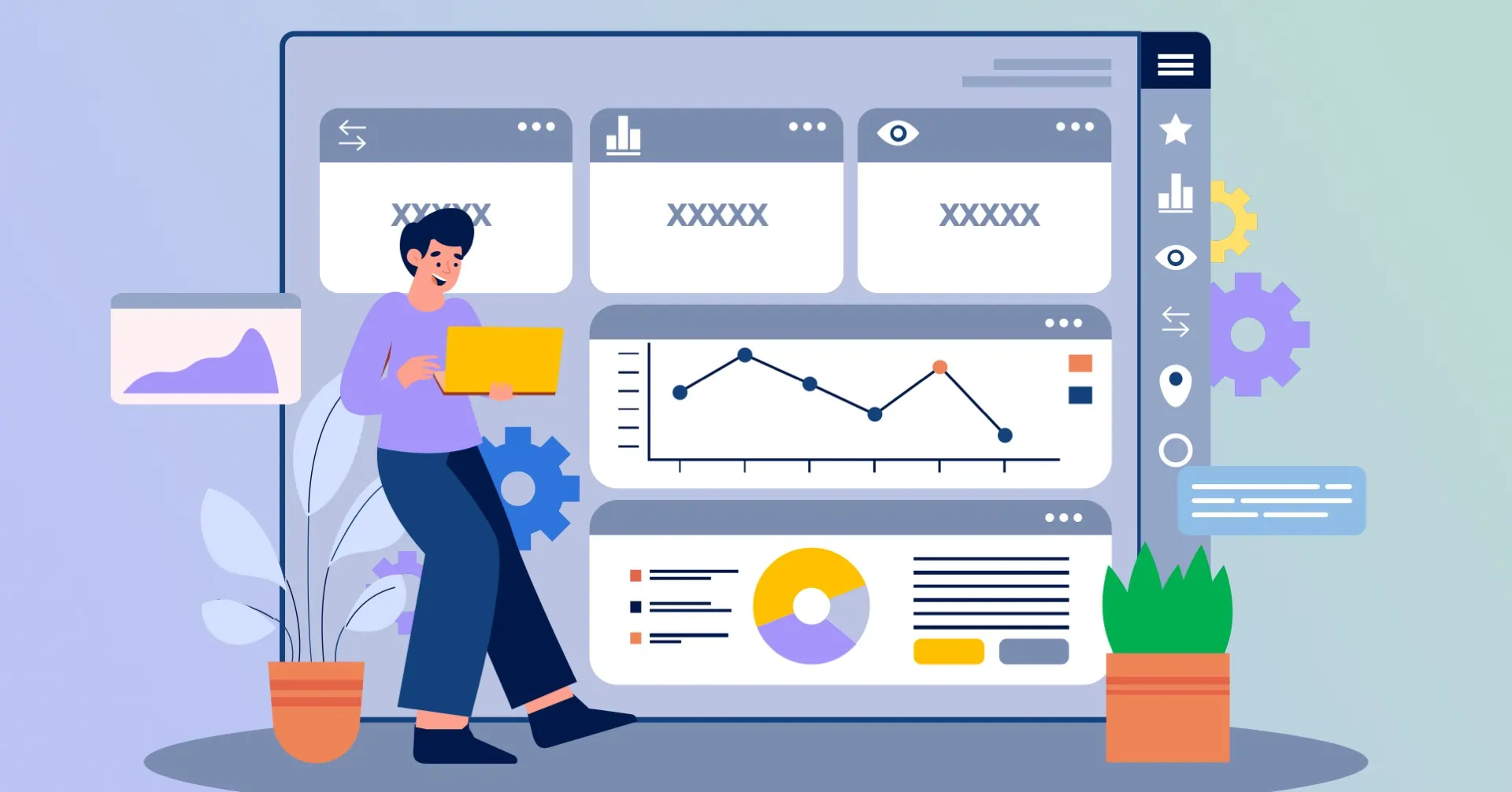
How is a good infographic designed?
It's not a matter of fitting in all the facts. A good infographic is a narrative, it guides the viewer through the facts with organization, concision, and style.
Use it for
Like you're sharing the adult equivalent of a children's illustrated book, and everyone is the beneficiary of that implicitly.
Today, we're in the TikTok generation, 8 seconds is being liberal. Everybody's swiping, scrolling, texting, and you're presenting. To reach through the background noise, you need something that is snappy. Something bite-sized. Something like. an infographic.
Infographic traits that are most important?
Your slide should not be homework. It should be insight in a glance.
Tip: Divide lengthy infographics in parts and segue them in sequences. This will ensure that the flow of your storytelling is even, and individuals will be interested, not bored.
Data is everywhere. Reports. Tweets. Slack messages. It's no surprise that your audience comes to your meeting already burned out. If you're going to ask them to care about what you're making, you'd better make the caring convenient.
Why are infographics important in all this chaos?
Because they filter the noise. They condense intense data into clear graphics that proclaim, “Don’t worry, I’ve done the thinking for you.”
Wondering what a good infographic would even constitute?
It should
Infographics are the shot of espresso in your presentation, strong, concentrated, and not to be skipped.
Overwhelmed with so much data and so few eyes? We're here to help. We are experts in taking hard content and turning them into stunning infographic form that speaks more than text.
You know what they dislike? Complexity.
They love being made to feel smart.
Infographics strike that elusive balance. They turn difficult concepts into bite-sized, simple chunks. As if they're transforming spaghetti into beautifully rolled sushi.
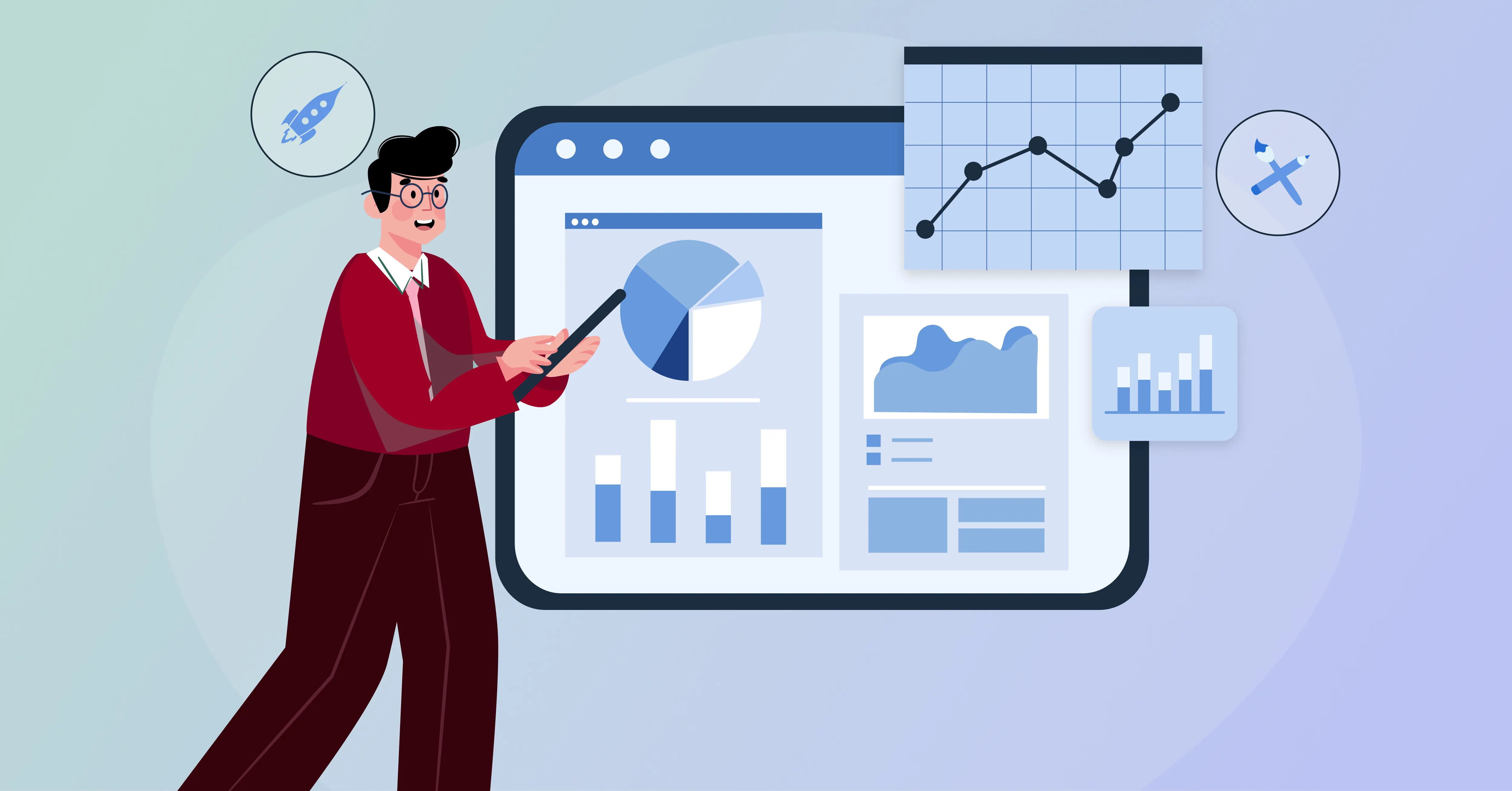
How to make a good infographic
Think of your infographic as the translation of the expert-level of knowledge to accessible information, that is understood by all.
Great infographic idea: Compare “before and after” scenarios. It is applicable to results of marketing, user experience upgrades, product upgrades, or even internal processes.
Did you know that people remember only 20% of what they read. but up to 90% of what they see?
That's right, images stick.
Infographics boost memory retention
Whether you’re displaying a comparison chart, flow diagram, or market-share donut chart, if it's graphic, then it's memorable.
Keep in mind the next time you're defining customer journey stages or the value of your new product. Instead of bullet points, how about a map, an icon path, or a comic-strip timeline?
Infographic design composition elements include
When design is thoughtful, the message is memorable.
Let’s face it. Most presentations? Boring.
Bar charts. Pie charts. Arial text. Grey backgrounds.
If your listeners come in expecting a sleeping-inducing event, and then you wham them with graphics that jump, you’ve already won half the battle.
How is a good infographic designed?
Rather, it's labeled, assertive, and filled with attitude.
And from the content marketing end of things? Infographics are sharable. Everyone re-shares them on LinkedIn, uses them in blog posts, and shares them on Pinterest. They even help you with SEO.
That's why infographics = smart marketing + smart presenting.
Excellent question! Let's proceed step by step.
Elements of an infographic
If your infographic is actually a nicely composed, easy-to-scan magazine spread, you’re on the right track.
Infographics are not novelties or flashy horsemen, they’re stalwart strategies. In a sea of data, of attention, of slide after slide after slide, they allow you to cut through the fray. They summarize the complex into the clear, make boring facts compelling graphics, and make your message not only heard but remembered.
And no, you're not compelled to be a designer to get going. Simply swap out that bullet list for an icon grid. Turn that step-by-step how-to into a flow diagram. Trade that congested chart for an easy timeline that's visually driven. These small moves can produce huge audience response.
Trust me, I’ve seen firsthand how infographics turn “meh” decks into “wow” experiences. They do more than make your slides attractive, they make your communications smarter, tighter, and better.
So, rather than including another piece of text in your next slide, pause and ask yourself:
“Should this be described in pictures instead?”
If the response is affirmative, and most of the time it is, then the time has come to learn the skill of infographics.
Your listeners will appreciate you. And your message will now endure.
Need your next presentation to leave a mark and actually be remembered?
Partner with INK PPT to deliver effective storytelling in compelling visuals that move, convert, and capture and stick with your audience.
Co-founder of INKPPT, I specialize in transforming complex ideas into refined, visually striking presentations. With a deep belief in the power of storytelling and design, I help brands communicate with clarity, purpose, and impact. Every slide is crafted to inform, inspire, and leave a lasting impression.

About the Author


Consult with our Business Advisor