

Contact Us
Let’s Partner for Your Next Big Presentation
Consult with our Business Advisor
.webp)
Thank you! Your submission has been received!
Oops! Something went wrong while submitting the form.

You get about two minutes. Maybe less.
That is how much time the average venture capitalist or angel investor spends looking at your pitch deck before deciding whether he or she wants to go further. In a world where investors are constantly bombarded by hundreds of pitch decks per month, your deck isn’t just a presentation; it’s your first, and possibly last, shot at engaging in a conversation that might change everything.
We've been at the center of this conversation for over a decade now. At INK PPT, we’ve created pitch decks for startups looking for seed money, for founders raising a Series A round, and for CXOs making a case to boards, strategic partners, and global investors. Having analyzed and created hundreds of decks everything from early-stage startups to nine-figure fundraisings we've learned something that isn't usually included in the pitch deck advice guides out there.
The challenge isn’t with the elements themselves. It's about putting them together in the right story, structure, and design.
Here are the ten must-haves for any successful pitch deck. And, more importantly, here is what we know works (or doesn’t).
First things first. Here is our fundamental advice learned after designing pitch decks in diverse industries, funding stages, and geographically spread areas.
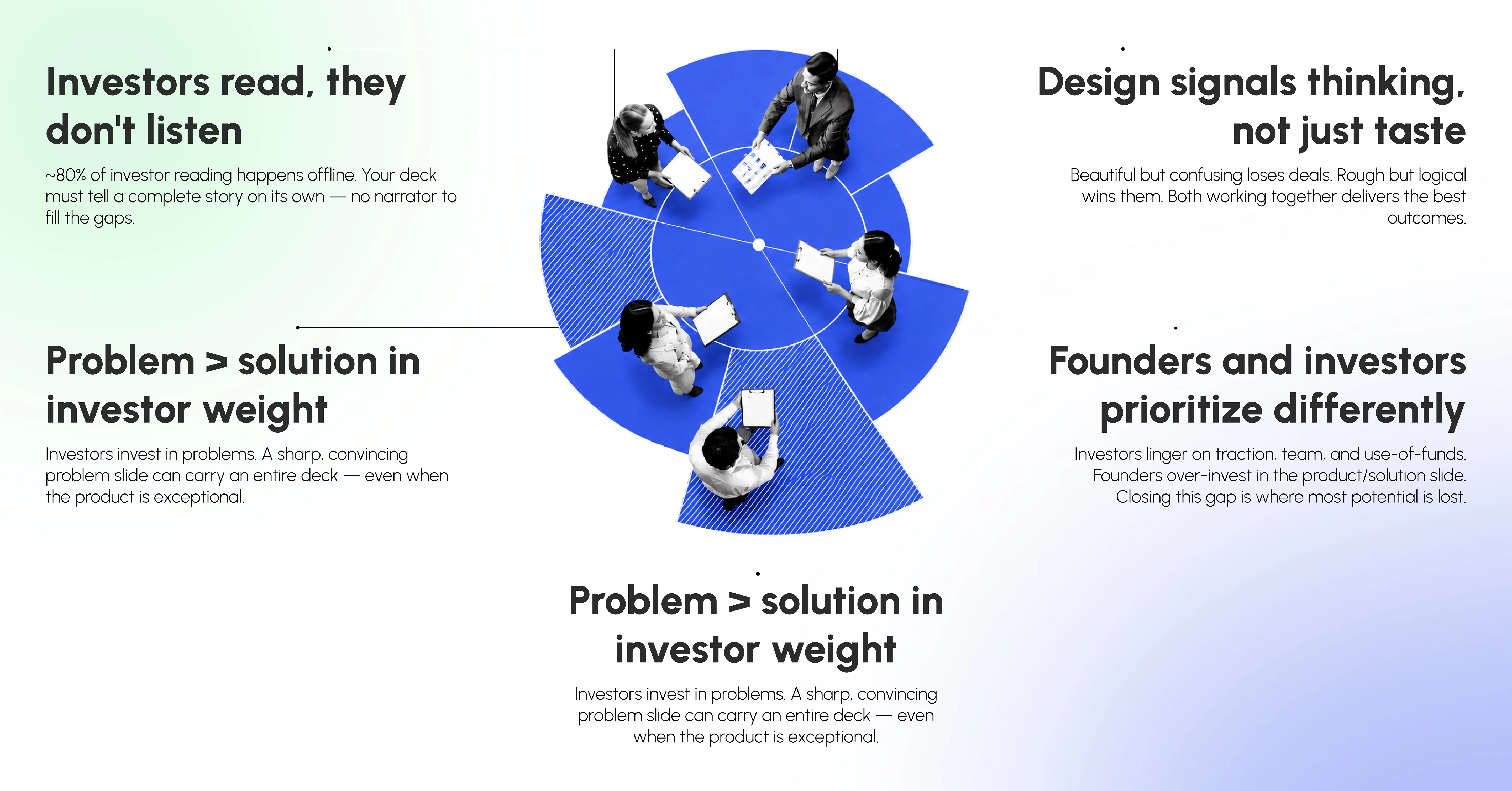
Many founders write a pitch deck assuming it will be used in a presentation where they speak to their audience. However, around 80 percent of investor reading happens offline without you even being there. Your pitch deck needs to tell a compelling story by itself without you talking to fill in the blanks.
Founders love their solutions, yet investors invest in problems. We've seen many pitch decks where one slide explaining a problem beautifully and convincingly is all it takes for the whole deck. And other decks, where a product is awesome yet the problem is never clearly explained.
We've seen beautiful-looking decks lose investors' interest because of confusing design structure, while rough-looking but logical decks win investment deals. If both the structure and design work great, you get the best results. As noted by Aayush Jain, founder of INK PPT and Microsoft MVP: "Defining clear objectives at the very beginning of the presentation design process allows you to think not only of the aesthetics of your slides but rather focus on creating a decisive persuasive moment."
On all the projects we've worked on, investors always spend disproportionately long time on the traction slide, the team slide, and the use-of-funds slide. On the other hand, founders spend too much time on the product/solution slide. This misalignment between priorities leads to the loss of potential in many cases.
"We are targeting a $50B market" without a detailed breakdown of the number, "We have strong traction" without any numbers, "Our team has decades of experience" without a concrete list of qualifications all of this kills credibility. Experienced investors have seen too many decks and can easily tell that some due diligence was not done.
The purpose of the cover slide is simple: motivate the investor to go to the next slide.
It should have a few elements: company name/logo, one line tagline (one sentence explaining what you do, who your target customers are), and round, if applicable.
Think of the tagline as a tweet-length pitch. Specific enough to raise questions, but clear enough for everyone to understand.
The INK PPT take: Over the years, we have seen many founders spend significant amounts of time building complicated cover slides with multi-layer graphics, animated logos, and complex designs. In practice, the best cover slides are often the simplest: clean, bold, consistent with your branding, and with a strong tagline.
Ineffective: "Disrupting the X industry". Effective: "Helping D2C brands cut down returns by 40% through AI-based fit prediction". This tagline gives all necessary information - target customers, solution offered, benefits of working with you - in one sentence.
INK PPT principle: Your cover sets up the emotional stage. A cluttered cover slide might make an investor subconsciously think the underlying idea is disorganized.
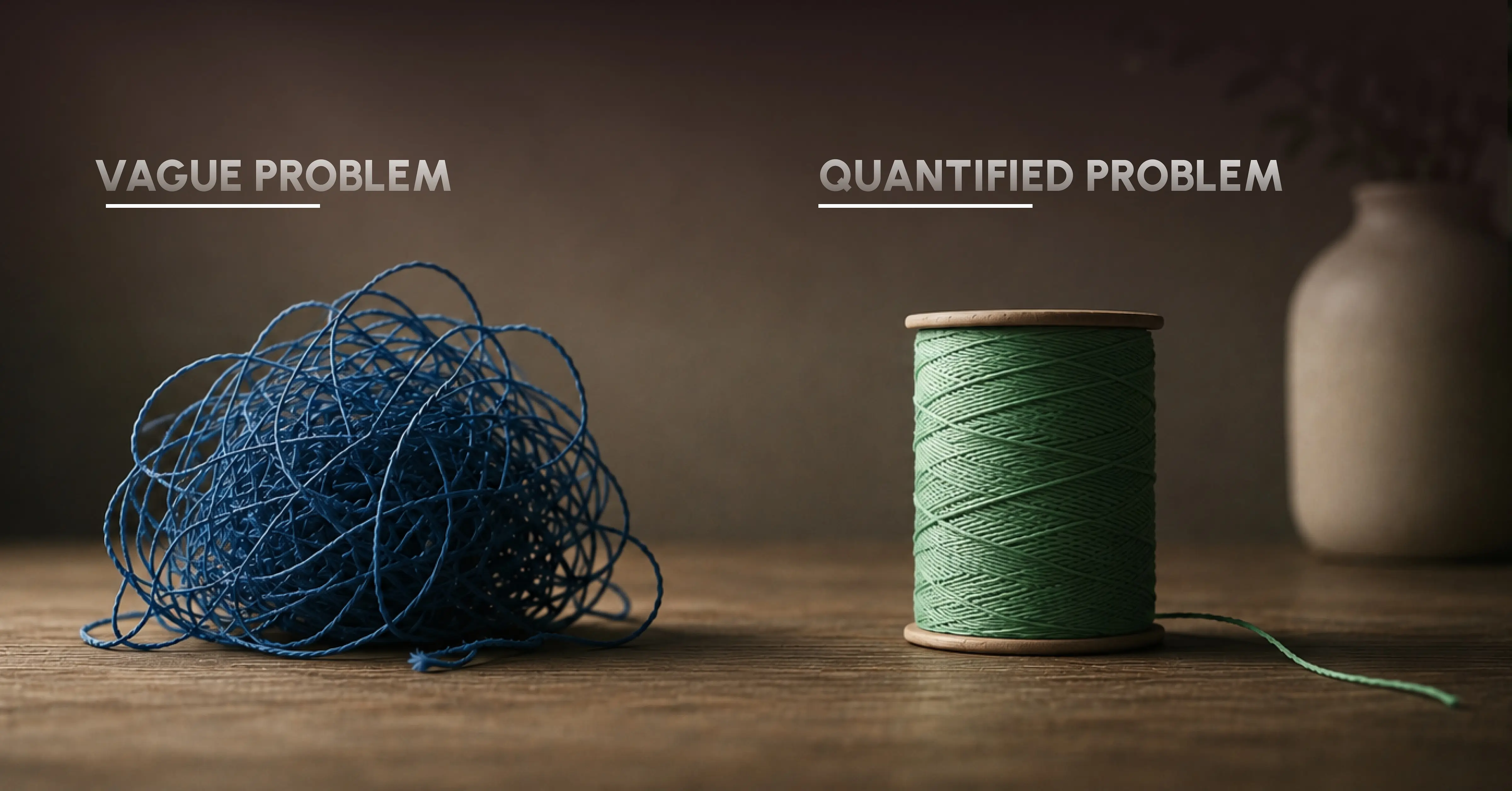
No investor will fund a solution to a problem they don't see as significant, urgent, and sizeable.
Your problem slide should answer one key question: Why should the problem be solved right now?
Over 10 years of working in this field, we've learned that the main mistake people make is in not making a real problem engaging and memorable. "SMEs face issues with cash flow management" is true, but doesn't create tension. "A manufacturing SME in India waits 72 days for an invoice to be paid, while its raw material supplier needs to be paid within 14 days" now you see the issue, measure it, and connect with it emotionally.
Rule of thumb: If you remove the problem slide and the presentation remains coherent, you haven't done your job well.
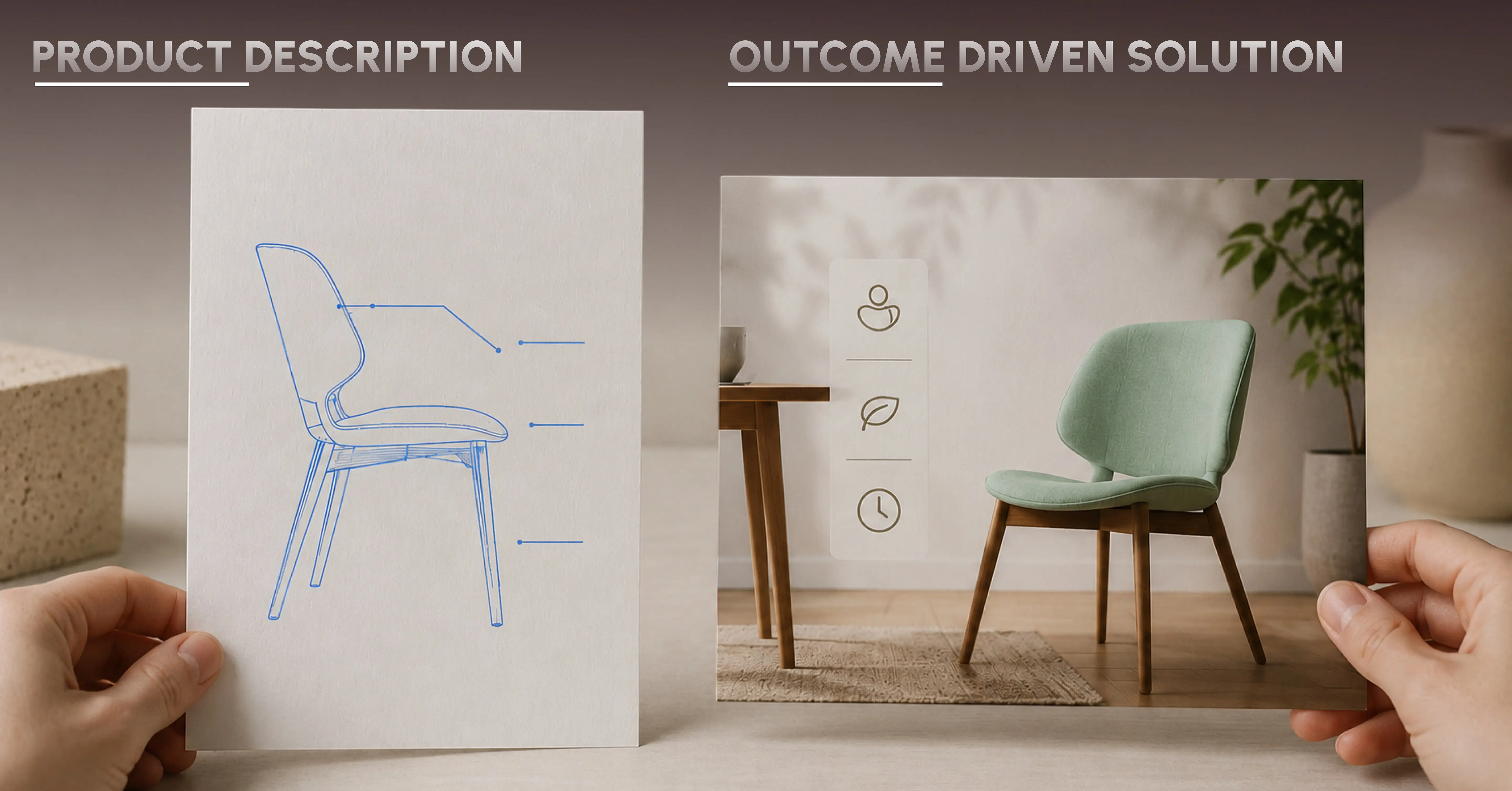
Founders usually make this mistake consistently. They describe the product, not the solution.
There is a difference between the two. A solution slide should tell investors what kind of change you made for your target customers. A product description should show the technical side of your product. Investors care about the former.
How we coach our clients: Start with the change, not the product development. "Our platform leverages natural language processing and machine learning algorithms to monitor customer sentiment in real-time" - a product description. "Our platform lets your support team know exactly which of your customers are about to churn, and allows you to act before they do" that is a solution.
The most engaging solution slides focus on a single visual concept - whether it's a before/after diagram, a workflow illustration, or a product screenshot that shows the message clearly. If your solution slide cannot be described in a few words and supported by visuals, then it needs to be refined further.
When investing in startups, venture capitalists are putting their money not into an idea, but into the potential of the opportunity.
This slide must address two questions: how big is your market and is it growing?
The conventional approach to market analysis with TAM/SAM/SOM values is known by all investors. Which is precisely why they expect you to explain how did you get to your conclusions.
Based on our 10 years of experience, founders who use TAM figures above $100 billion based on a general industry classification will probably find it hard to persuade investors of their vision. The only way to get them on board is by creating a bottom-up model:
identify your target customer, estimate their quantity in the market, calculate their WTP (willingness to pay), figure out your initial market segment.
Moreover, the speed of growth of your market should be considered when choosing a target market. A $5B market with 40% growth rate will look more promising than a $20B market that stays flat year after year.
There is a reason that the best and most memorable pitch decks always feature the product somewhere. There is nothing more effective than seeing what has been created when moving from the abstract to the concrete.
From experience with our clients: Even a few annotated screenshots showing the customer journey provide greater comfort to the investor than an exhaustive list of product features. Again, the goal is not to show everything, but to show that the product works, that it has been thoughtfully built, and that the experience takes the customer into consideration.
For pre-product or early-stage founders: A thoughtful product prototype or a wireframe journey is an excellent sign of seriousness. It shows that thinking about the problem has moved beyond the idea and onto the execution.
There is one slide where many early-stage founders get too vague at the worst possible time. Saying, "We will monetize using a combination of subscriptions and enterprise contracts" tells the investor nothing. The important part is showing the economics.
What an investor wants to see on this slide:
- Your pricing model (what your customer pays and how often)
- Your revenue streams (which one is the biggest)
- Your unit economics (at least CAC and LTV or gross margin)
- How your business scales (are margins getting better the larger you get)
One element we have seen repeatedly: decks that lack unit economics usually mean that the founders haven't done all their homework yet. Smart investors will catch this. A founder who says, "We achieve an LTV/CAC ratio of 4 currently, but we believe we'll be able to bring it up to 8 within 18 months due to declining acquisition costs" immediately gets much more attention.
If the model is very complex, simplify it to one key number that really tells whether the business works.
In my experience, this is the most powerful slide a startup can show after speaking to hundreds of startups. Traction allows the data to speak for itself rather than having to argue its point.
Traction means (or does NOT mean): By its definition, traction does not mean a list of milestones you've achieved. Traction is proof that the market responds to you. The question you are trying to answer is: What is the proof that there is market demand for what you're creating, and people want to pay for it?
The different types of traction depending on your stage include:
- Revenue (ideally with growth rate, not just a raw figure)
- Customer or user growth (month-to-month growth tells a story numbers cannot)
- Retention figures (showing a stronger product-market fit than just acquisition)
- Letters of intent or enterprise pilots
- Industry-level partnerships that reduce the risk of growth
The most common problem we solve here is: founders listing milestones ("we launched the product in March, signed an enterprise contract in June") instead of showing growth. A milestone is an event. Traction is a trend. Show this trend visually.
Having a solid product is meaningless without a believable plan for getting customers. This slide helps answer an implicit investor question: How will you attract and retain customers at scale?
Why this slide is believable versus generic:
Generic: "We will use social media marketing, content marketing, and partnerships."
Believable: "Our first channel is outbound marketing through LinkedIn, targeting mid-size company CFOs. The cost per quality lead at this time is X rupees, and our conversion from pilot to paying client is 40%. We are considering a channel partnership with [category of partner] that will help us close 200+ accounts in Q2."
It is the difference between being vague and being specific. You don't have to know everything, but you need to show the investor that you know something about the economics of acquiring customers.
From my experience as a VC working with clients of different stages: early-stage companies that demonstrate even one working channel (with data) are far more investible than companies presenting a theoretically multi-channel strategy without any validation.
"Investors invest in people first, and then they invest in ideas," is a common saying, and there is some truth in this phrase. There is always some level of uncertainty when investing in anything early on, and the capability of your team to handle such uncertainty is the main gamble of any early-stage company.
What a great team slide does is answer the following question: why is this particular team the right one to pursue this particular opportunity?
What has been proven to work well: concrete, specific credentials over general career statements. "Spent 8 years building fraud detection systems at a major bank, directly applicable to the fintech problem we are solving" is much more convincing for investors than "15 years of experience in financial services industry."
What has been proven to work badly: slides looking like LinkedIn profiles filled with lists of jobs, institutional affiliations, and bio statements. What investors want to see is fit, not necessarily pedigree.
In this case, what your audience needs and expects to see on a team slide is: Can I trust these guys with my money? Think and design your slide around answering precisely this question.
Now, after all the information presented, comes the moment when you need to close the presentation. Many founders drop the ball here because they remain too vague while trying to close a deal.
State clearly: how much do you raise, in what form (equity, convertible note, SAFE), and most importantly, where the money goes.
Disaggregate your budget into several key categories:
- Product development (X%)
- Sales and marketing (Y%)
- Hiring (Z%)
- Infrastructure (W%)
And tie it to key milestones you expect to reach: "This funding round will help us move from current ARR $X to $Y, allow us to hire Head of Sales and two enterprise AEs, and prepare us for Series A by Q3 next year."
From our experience of working with the best founders out there, your ask slide should never sound like begging. On the contrary, this slide should feel more like an invitation to be part of something that is happening and whose progress will benefit from joining now.
Almost any discussion regarding pitch decks talks about the design of such presentations. Being in the industry for over a decade, we have quite a different perspective here.
Design is not a finishing layer for your presentation. It is a communication infrastructure.
Everything in your pitch deck – layout, hierarchy, color, typography, use of space – either makes it easier or harder for investors to understand your idea faster. And those who find hindrances in comprehension will always find reasons to reject your proposal.
1. Single idea per slide. Cognitive overload leads to a lack of conviction. When a slide is trying to communicate three messages, nothing sticks.
2. Visual hierarchy reigns. Each slide needs one primary element that draws attention the very first thing the eye catches. Without one, the message doesn't come across.
3. Data deserves design. A well-designed revenue graph not only shows off professionalism but makes the story obvious. A well-made competitive matrix delivers a position statement much faster than three paragraphs can.
4. Space is deliberate. Space shows confidence. Clutter shows anxiety or worse, a founder unable to focus.
5. Consistency adds credibility. Each inconsistency in typography, colors, or layout creates a slight dissonance. In total twenty slides, these moments create the impression of carelessness, quite contrary to what is needed in a pitch.
There is one thing rarely talked about in pitch deck guides that most entrepreneurs will need two decks: presentation and read.
The presentation is made for the audience it includes reduced content, increased visuals, and is built to complement the verbal part of the pitch. The deck is lean since the presenter fills in with narration.
The read deck (or leave-behind) is a standalone entity it includes additional context and enough text to be able to follow the logic even in your absence. It is this version that partners receive.
We strongly advise making the read deck first it forces the logic and consistency of the story to hold up in written form. And then take the best out of it for the presentation. It is very common to do it in reverse and ask yourself after why your deck fails to make a point in emails.
Over time, INK PPT has created hundreds of presentations for companies like Tata, Hyundai, Britannia, MG Motor, Mubadala, HPE, and dozens of startups at different funding levels. Of course, the confidential nature of the work does not allow us to talk about the exact results of each pitch deck but there are some common patterns:
In case with Britannia, when they had a goal to launch the Nutri Plus app, we were called to create their pitch from scratch and within 48 hours with shifting inputs. We have managed to create 30 slides, following their brand standards, optimizing for different target audiences. Each slide was run through our eight-point review process. The end result was a deck that turned Britannia into the digital wellness leader and not just another product-launch deck.
Another great example is when Hyundai was looking to launch the new facelift model of Alcazar. We flew to Udaipur where our team worked until midnight creating a deck of 21 slides which included twenty last-minute changes. It was a highly energetic pitch which translated all the technical specs into compelling story language and led to media coverage.
Conclusion? Same rules apply for a forty-five-person startup as for a Fortune 500 company.
As per our experience of evaluating and building thousands of pitches across the last decade, here is the checklist that each of our clients follows prior to sending out their decks:
If any of these is answered by "not quite," that needs attention before you go out and send the deck around.
Pitch deck is the means to an end. You want investor conviction in the end, and that conviction should come from knowing that your team, your market, and your vision are worth investing in.
There are many technically perfect decks that haven't worked out, as they were missing the founder's conviction. Conversely, there are also some really rough decks that have succeeded based on sheer strength of a story told. However, when story, structure, and design come together to deliver an airtight pitch deck with compelling arguments and visual impact, then the result is not just a pitch, but a business decision.
It is our decade-long passion at INK PPT to help entrepreneurs, CXOs, and executive teams craft the most compelling pitches. Whether it is a preparation for a new fundraising round or a revision of a previous attempt, we are ready to help you build a winning pitch deck.
As a passionate explorer, I see crafting the perfect story as embarking on a refreshing Himalayan journey. Every narrative is an adventure, a voyage of imagination, meticulously molded into captivating presentations. I'm here to guide you, ensuring your story becomes an unforgettable odyssey, with each creation as a vibrant landscape ready to captivate eager audiences.

About the Author

.webp)


Consult with our Business Advisor