


Contact Us
Let’s Partner for Your Next Big Presentation
Consult with our Business Advisor
.webp)
Thank you! Your submission has been received!
Oops! Something went wrong while submitting the form.

Too many slides spoiling your message? Struggling for fresh ideas? Let our team guide you with essential presentation insights. Read on!
Being a presentation and communication design agency, we receive numerous questions all the time for the design services we offer.
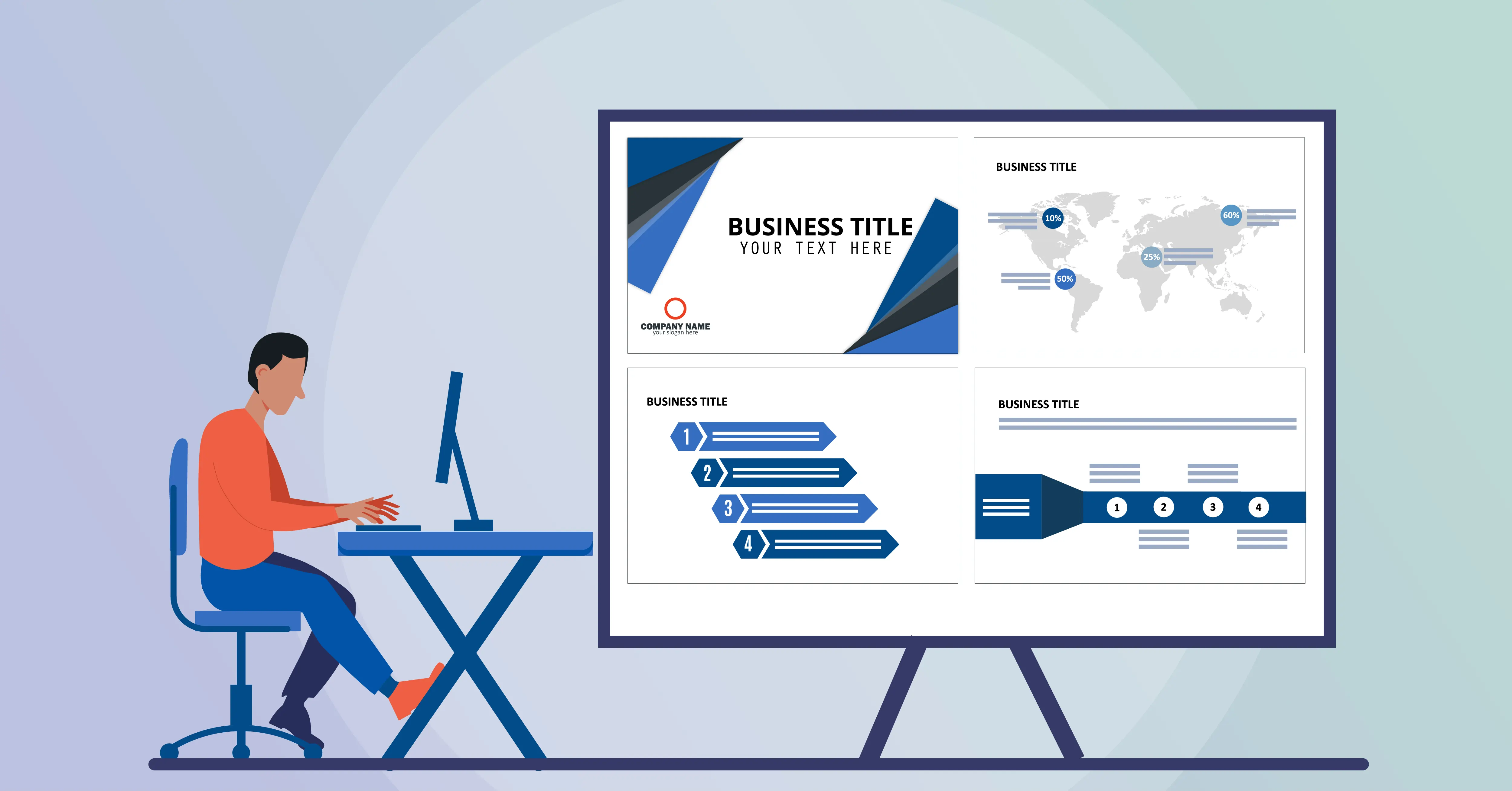
We offer both template-based and fully-tailored presentations depending on your needs. Our seasoned designers ensure your brand is reflected in the final output, aligning with your communication style to drive deeper engagement. Each presentation follows our 5D methodology to ensure a thorough process from ideation to delivery.
Our extensive design process overcomes challenges with a seamless digital assets system, creative research, brand touchpoint development, and rigorous testing. We ensure that every presentation is easy to manage, impactful, and in tune with your company’s needs.
While we specialize in visual and interactive design, we also offer content development. Our team ensures that both the design and content are cohesive and optimized across different devices, maintaining user experience quality.
INK PPT helps businesses build authority with presentations that are professional and engaging. By partnering with us, you’ll experience communication transformation, with presentations that effectively convey critical information and engage multi-level stakeholders.
With experience in numerous events and seminars, we understand the demands placed on event speakers. INK PPT ensures that last-minute presentations maintain quality and create a positive impact on audiences, transforming your presentation experience.
As digital mediums expand, the demand for well-designed presentations is rising. We incorporate the latest technological trends and design solutions, ensuring your presentations stand out across devices like tablets, smartphones, and more. Our services include designing for interactive touchscreen solutions at receptions, malls, events, and more.
INK PPT’s services are built to adapt to technological advancements, ensuring efficient communication both within and outside your organization. We offer innovative designs compatible with devices like iPads, Android phones, and others.
Our presentation designs are crafted to reflect your brand's communication style, creating presentations that drive engagement. We integrate key branding elements such as imagery, typography, and readability, ensuring consistency across all touchpoints and platforms.
Our 5D methodology consists of:
We handle your digital assets securely, ensuring that sensitive content is managed with care throughout the design process. Our rigorous testing and deployment process ensure a safe and smooth experience for all clients, keeping data security at the forefront.
Consult with our Business Advisor