
Contact Us
Let’s Partner for Your Next Big Presentation
Consult with our Business Advisor
.webp)
Thank you! Your submission has been received!
Oops! Something went wrong while submitting the form.

Financial firms create pitch decks that are comprehensive, precise, and unsuccessful. The brief focuses on comprehensiveness: covering strategy, track record, risk framework, and leadership. The deck checks off all those boxes but only convinces those people who understand the business. And it fails to convince anyone else.
Investors don't want the most comprehensive view of the business in your deck. They look for something concrete that allows them to justify their attention. That thing isn't usually some graph; it is usually a straightforward statement of why the business, configured as such, is a good investment right now.
During more than ten years and 4,000+ engagements, we at INK PPT haven't seen a single spreadsheet close a round.
Those responsible for crafting a financial company pitch are experts on that company's strategy. This expertise, while important for the due diligence, creates a unique blind spot in a pitch setting. That is, it makes it hard to see the deck as a newcomer would.
The internal team speaks the language of process and methodology. The external person is listening in terms of asymmetric returns and downside risk. These languages differ, and nobody on the internal team is going to catch this difference since everyone speaks in exactly the same terms.
When a leader sees this point, he or she doesn't react with disagreement; they recognize that this communication problem is something that they have felt before but couldn't explain.
Most financial firm decks feature the business model on slide number eleven or twelve – after six slides of market context and three of the strategy. By the time an investor reaches it, they've already formed their opinion – minus the one piece of information that would allow them to form that opinion correctly.
This order follows the convention of investment memos, which require context before conclusions. In investment memos, the reader has already decided to keep reading; in the deck, the reviewer is just making up their mind. By burying the business model, you force the investor to examine the whole deck before understanding what they're examining.
Before bringing on a designer, there is one question that needs a sentence-long answer: who pays us, how, and why does the business make economic sense at scale? If the discussion of this question demands a separate conversation, then the problem is not in the deck. Sort out the problem before moving forward. And once resolved, include the sentence in slide number three.
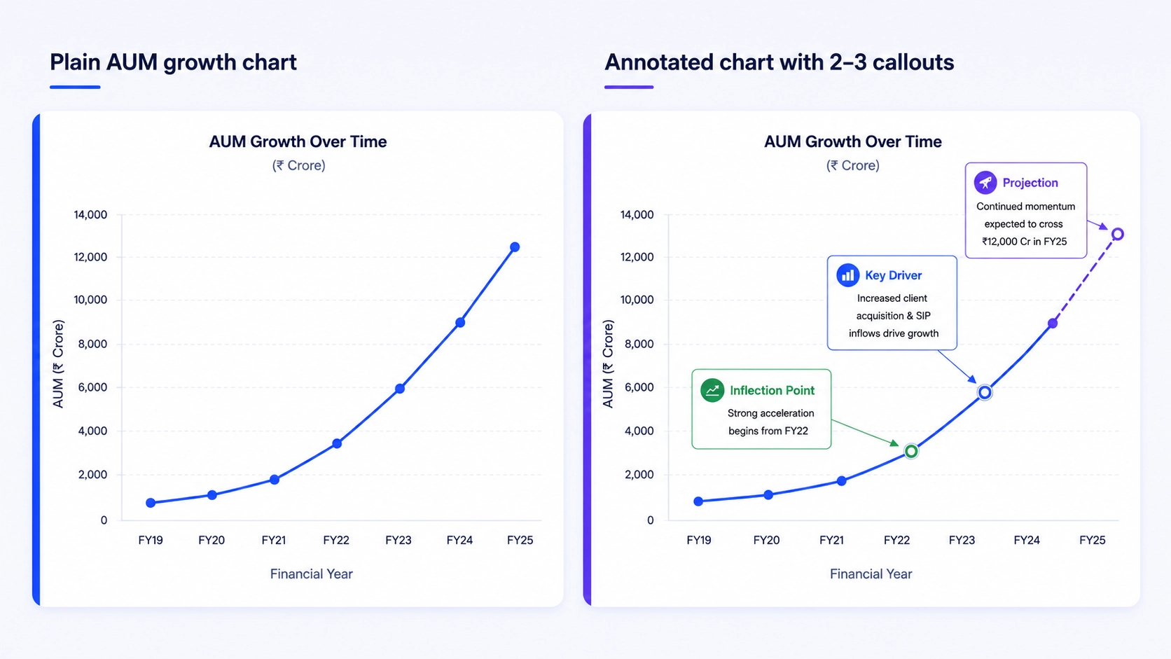
Remove all labels from the graphs contained in the deck. Ask a team member who has not designed the charts what narrative each of the graphs tells. In most financial firm's decks, no narrative can be discerned.
Graphs contain numbers. They do not reveal causality, intention or direction. For instance, an increase in the company's asset under management from 200 crore to 1,400 crore is data. But what caused the inflection point, is it replicable, and what would the trajectory look like under conservative assumptions is the actual argument. When investors are presented with cognitive overload, they will not build arguments, they will simply form opinions based on the data visualized.
For every single graph in the deck, create a brief that will state one implication in the form of an argument (not in the form of a description). If you cannot come up with such sentence before creating the graph, the graph is not ready for inclusion in the deck.
Every forward-looking prediction calls for a disclaimer. Every estimation begs for a caveat. While this may be appropriate in the legally sanctioned documents, it is toxic in the pitch narrative.
Once an investor comes across the sentence stating that "past performance does not predict future results" inside of the narrative slide, he/she instinctively interprets that the company prioritizes protecting itself rather than making the case. The senior management in financial organizations recognizes this problem and cannot do anything about it. Although the legal review is valid, its resolution is not bypassing it but rather separating it from the main task.
The investment narrative (presented at the pitch and sent as a leave-behind document) communicates the commercial argument without any in-line hedges. The additional packet contains the compliance language in its full glory.
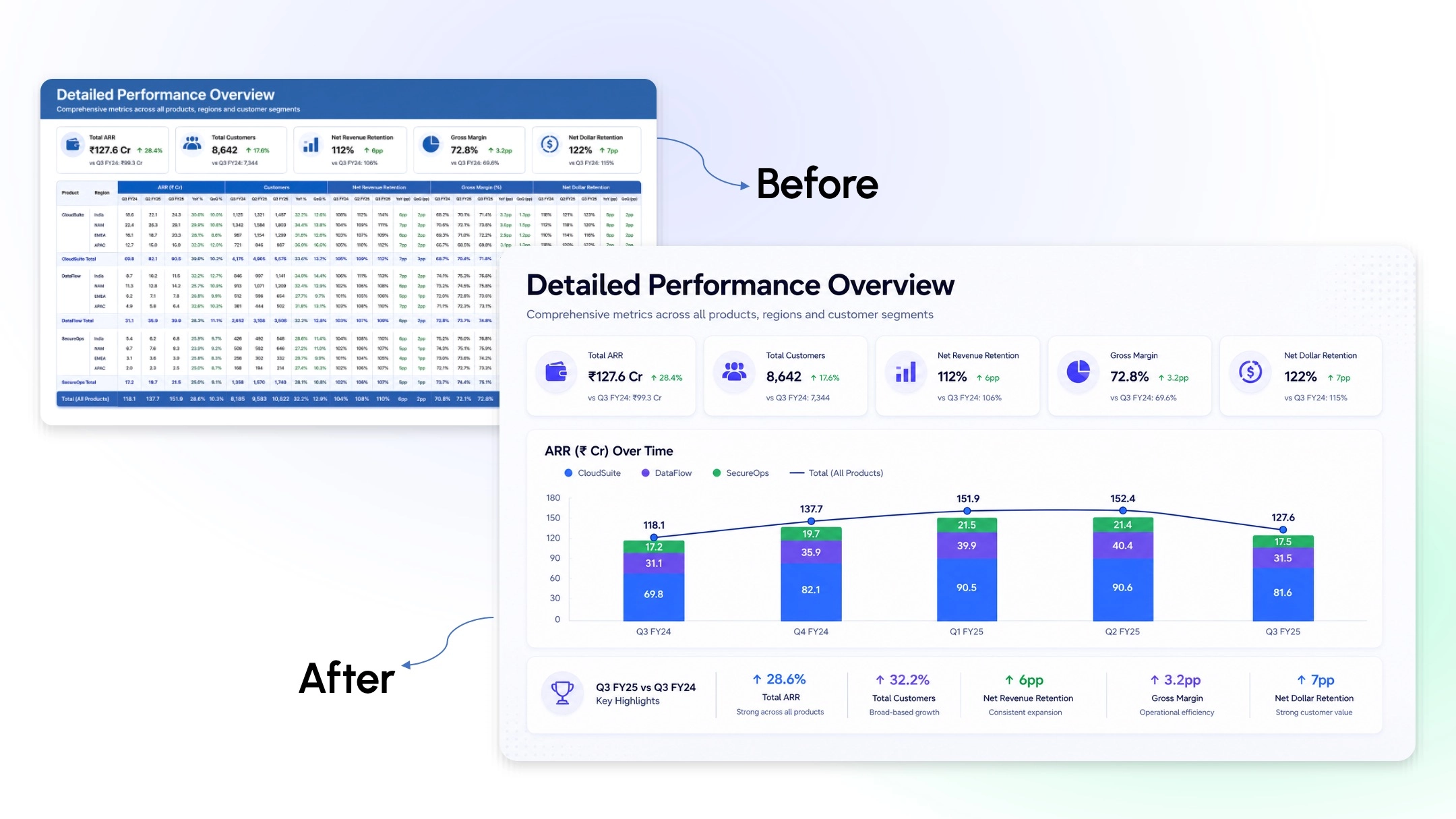
Tables full of numbers. Charts with default formatting. Outdated templates. Tiny footnotes. This has nothing to do with aesthetics. Astute investors interpret the visual presentation as a barometer of execution. A firm that cannot explain its value proposition well implies that it is unable to maintain clarity in all other aspects of its business.
A brand guidebook ensures consistency. Visual hierarchy ensures communication. It follows then that the brief which leads to the output of the deck should also have one thing specified per slide: what is the key message on this slide? The designer is responsible for making sure that happens.
When building a presentation on behalf of a client, one usually asks questions such as: "What shall we tell?" and "How do we represent ourselves well?" These are questions you ask yourself when creating a due diligence document, but not while working on a pitch deck. The right question is: "What shall this particular investor believe in order to accept the pitch, and how can we do it the quickest way possible?" A properly constructed pitch differs a lot from a presentation made for the sender even if it is about the same business.
Before you start building your slides, ask this one crucial question: what does this investor already think and believe, and what is the one point he/she should be convinced of in order to accept the pitch? A family office limited partner holds different priors compared to a fund of funds. The architecture of your pitch deck will differ accordingly even if the business stays the same.
An LP or institutional investor will understand the landscape broadly. They want to understand whether there is still an inefficiency present that is yet to be priced into the market, and whether the proposed strategy is the right instrument to exploit that inefficiency. Framing this way puts both parties in a place of partnership in the evaluation process, rather than putting the firm on the defensive.
When a track record is presented from the standpoint of history—a list of returns and a corresponding benchmark—it invites the objection that past performance does not guarantee future results. It's far better to frame the track record from the standpoint that the conditions which delivered these returns persist, and here's why our process is uniquely suited to exploit them. Same data, but a whole different set of argumentation and posture toward the investor.
There is a difference between pitching a fund that asks for X number of crore to deploy and a fund that asks for X number of crore because the strategy has a hard cap, the vintage closes in Y number of days, and entry is at the current NAV. This makes an entirely different kind of case to the investor.
Please answer these before the design brief is created.
Business model: Is there a one-line sentence that explains who pays, under what terms, and why the unit economics make sense at scale? If you need more discussion, then the deck is not yet ready for commissioning.
Chart argument: Is there a one-sentence explanation for each chart in the presentation? If you can’t explain the implications in one sentence, then the narrative brief is not yet complete.
Compliance boundary: Which document gets the legal layer and which one contains the narrative? If the answer isn’t clear, the compliance language will be defaulted into the main deck.
Visual hierarchy: Does the brief include which claims have priority on each slide? Compliance with brand standards ensures consistency but not necessarily delivery of the main message.
Investor objection: Do you know what objection the investor audience poses first, and is there a slide devoted to addressing this objection? If you will address it in Q&A, then the pitch is not yet crafted for its audience.
The decision to raise capital is made in the briefing room, not the design room.
High-quality financial service firms miss out on capital they deserve because the pitch deck is built to please the ones who already get it, instead of making the case to those who still don't.
The place to show rigor in the process is the model and the data room. It is the place where the case gets made. That clarity, along with how you use it when commissioning the pitch, makes all the difference.
If that choice has not been made before your next fundraising campaign, then this is the time to make it.
As a passionate explorer, I see crafting the perfect story as embarking on a refreshing Himalayan journey. Every narrative is an adventure, a voyage of imagination, meticulously molded into captivating presentations. I'm here to guide you, ensuring your story becomes an unforgettable odyssey, with each creation as a vibrant landscape ready to captivate eager audiences.

About the Author


Consult with our Business Advisor