

Contact Us
Let’s Partner for Your Next Big Presentation
Consult with our Business Advisor
.webp)
Thank you! Your submission has been received!
Oops! Something went wrong while submitting the form.

A few years ago, I attended a corporate pitch where the slides were crammed with text, paragraph after paragraph. The presenter was articulate, yet by the midway point, most of the people had taken out their phones. Why? The graphics did not capture the attention.
Proceed to the next event: the same company was on stage, but this time their deck was entirely different. They did not have text-heavy presentations, but instead, they used creative presentation icons to convey their ideas. A simple lightbulb icon for "innovation," a gear for "strategy," and a handshake for "partnerships." The audience was hooked at once. The same message, but this time it was crisp, interactive and catchy.
That is the strength of the stylish icons for presentations.
Even though icons are small, they are mighty design elements that can transform boring, text-saturated slides into engaging visual narratives. Icons are essential, whether you are creating a corporate pitch, an annual report, or a training deck, to convey information clearly and straightforwardly and establish a stronger brand identity.
Before exploring the category of icons, it would be beneficial to understand the reasons why they are important in presentation design.
Icons are universal symbols. You do not need to explicitly state that we provide innovative solutions, as you can simply include a lightbulb icon. The human brain decodes pictures 60,000 times quicker than text; thus, icons are guaranteed to be understood immediately.
Too many text-filled slides are not good. Best icons for slides can break the monotony, add balance, and relieve the eye. A clean icon instantly attracts the eye, making slides easier to scan.
The same visual colour icons that you consistently use in your brand name to reinforce your brand image can also be used as PowerPoint design elements to solidify your brand image. This will give you trust, and your presentation will appear professional.
Human beings recall pictures more than words. Incorporating presentation icons design, and storytelling tends to keep your audience more engaged and remember your main messages in the future.
Smaller visuals in the form of icons represent big ideas. This would prevent clutter, and your message is conveyed without making the slide overloaded.
Why struggle with cluttered slides when our design experts can craft engaging, icon-rich presentations for you? At INK PPT, we specialize in turning complex stories into compelling visuals that captivate audiences.
Since we are well-informed about the benefits, we will discuss the seven types of stylish icons for presentations that will enhance your next presentation.
Not all icons are created equal; each style has its own personality, purpose, and impact. By choosing the right type of icon, you can transform your slides from ordinary to unforgettable.
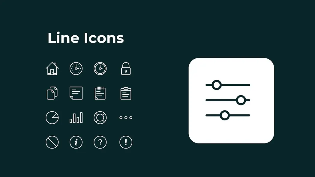
Line icons are bare, relying on clean strokes to depict objects straightforwardly. They are simple and thus very versatile for use in a corporate deck, annual report, or infographic. If you prefer to download them, there are still other websites, such as flaticon.com, which provide a large number of free icons for PowerPoint.
Why use them?
Hint: corporate decks work best with line icons in subdued colours, or in brand colours to prevent inconsistency
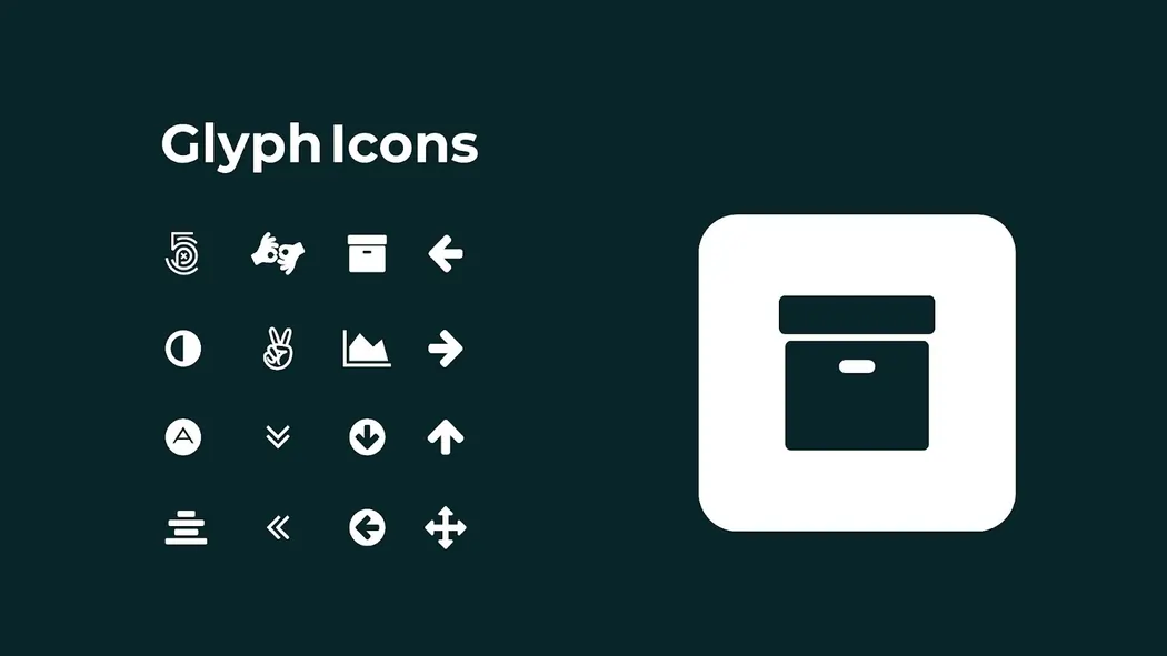
Glyph icons are filled and divided with slight horizontal and vertical divisions. They tend to be black and white and can also be used in smaller sizes.
Best for:
Tip: Stick to one colour palette across all glyph icons for a sleek, unified look.
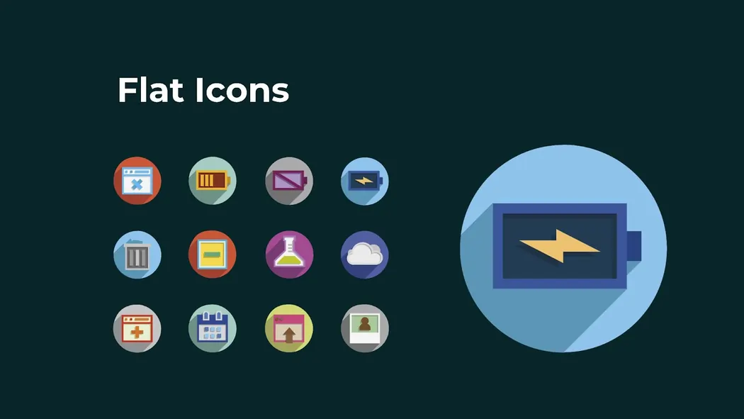
Flat icons are bright, vivid, and simple. They have objects reduced to basic forms, which are comfortable to read. A variety of free PPT icons is available in a flat design style. These icons are easy to use and can help improve your slide, and they are completely free. In fact, these icons are quite popular and can easily be changed to your favourite colour and presentation style to achieve a unified and neat appearance.
Why choose flat icons?
Pro tip: Want to make a creative presentation icon? Flat icons are put in the spotlight to emphasise important statistics or processes. They are very beautiful on a white or low background.
Material icons, designed by Google, are simple yet rich in graphic effects, featuring shadows and highlights. They are realistically clutter-free.
Perfect for:
Quick hack: On a limited scale, material icons are best used to highlight certain points; otherwise, they won't dominate your layout.
Dimensional icons provide perspective and depth. They frequently mix two- and three-dimensional images, providing an effective visual effect. Although 3D icons may seem difficult to handle, they provide a unique and elegant look, making presentations more engaging.
Advantages:
Trick: Dimensional icons are best used in important slides, such as product or strategy maps, to ensure they are easier to remember.
Handmade icons are warm and personified. Their lines are usually flawless, and the slides look natural and friendly.
Best used for:
Hint: Use informal fonts to support the informal mood of the hand-drawn icons.
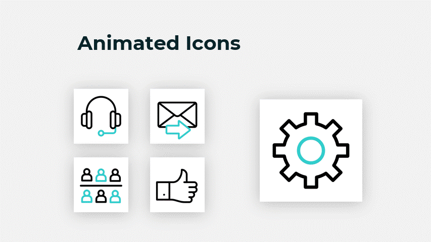
The animated icons make the engagement process a step better. They are dynamic or reactive when clicked on.
Why they work:
Hint: highlight data or important transitions with animated icons. Excessive animating may be too much; thus, moderation is best.
You don't necessarily have to create icons yourself. Free PowerPoint icon design resources are available on many different websites:
– Massive collection of free icons in all styles.
– Customizable icons in multiple formats.
– Professional, royalty-free icons with thousands of options.
Pro Tip: Ensure that the presentation icons' design theme and branding aligns.
The use of icons does not simply involve putting them anywhere on the slides. To maximise these PowerPoint design elements, these tips should be adhered to:
Icons are not an option anymore; they are now a must-have PowerPoint design feature of anyone who is determined to leave a permanent impression. Granting a line icon provides simplicity, while an animated icon adds animation to a slide; each style serves its purpose.
With the inclusion of sleek icons in presentations, you can enhance your content by making it easier to comprehend, view, and recall. Is it a corporation pitch, a training module, or a brand storytelling deck you need to prepare? Icons can help you connect with your audience on the same level, even before you present your pitch.
Ultimately, excellent presentations are not about cramming words into slides. It is all about storytelling to your audience. With the right creative presentation icons, your story will always shine.
What variety of icons will you experiment with in your next presentation?
Ready to Elevate Your Next Big Pitch?
With INK PPT, you get more than just stylish icons—you get storytelling, branding, and impact-driven design. Whether it’s a corporate pitch, training module, or annual report, we make sure your message sticks.
I'm not your typical creative; I'm an avid thinker and ideator who seeks out adventurous experiences and thrives on great challenges. My passion for bringing characters to life through motion results in captivating aesthetics and enthralling storytelling.

About the Author


Consult with our Business Advisor