
Contact Us
Let’s Partner for Your Next Big Presentation
Consult with our Business Advisor
.webp)
Thank you! Your submission has been received!
Oops! Something went wrong while submitting the form.

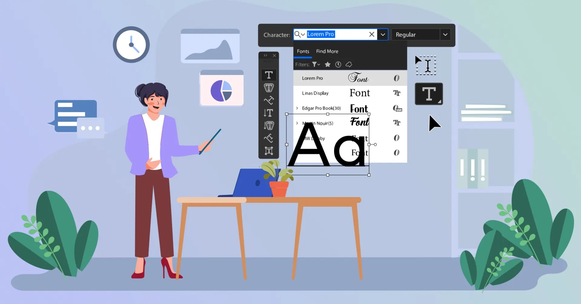
Farewell, Old School. Hello Font Fame.
Now, I’ve been customising presentations for over a decade, and if there’s one rule I’ve learned the hard way, it’s this: your typeface will make or break your message.
Oh yes, I know, we all fell into the default of Arial and Calibri. But people, 2026 is not the year of boring typefaces. It's the year of typefaces that speak out. Typefaces that start dialogues. Typefaces that scream “I know what I’m doing” before you even get to slide number two.
So if you're after your next deck to glow with the radiance and majesty of a thousand suns (or at least make a great impression with your manager), let's explore the presentation font trends dominant in 2026.
Font trends are more than superficial style indulgences; they are deliberate strategies rich with potentiality. In fact, the global font and typeface market was valued approximately $1.2 billion in 2026 and will keep growing at a modest CAGR of up to 4% through 2033, Meanwhile, Monotype’s 2024 Global Font Use & Forecasting Survey (consulting with nearly 4,800 creatives across 13+ countries) concluded that 83% of creatives are of the view that typography plays a key role in the personality and transmission of a brand, and most font-choice priorities (76%) focus on readability and accessibility, and variable fonts, fonts that adapt weight, width, and/or slant in a more dynamic way, are gaining serious traction.
Audiences crave clarity, brands crave personality, and type design software features wiser, adaptive typefaces today. It’s not decoration—just a design decision that’s rooted in actual growth, user preference, and visual-communication science.
Now let's look at how these trends work in your presentation font scheme to create maximum impact.
We are in a world where authenticity triumphs over refinement, where "relatable" beats out “robotic.” That’s why handwritten fonts top the presentation font trends list for 2026. Handwritten fonts are personal, raw, and human, like scrawls in a Bullet journal notebook or margin comments in a brainstorming notebook.
Whether you're proposing a passion initiative or the soulful TED-talk equivalent, handwritten fonts make your slides look like they're written by you, not from atemplate. All about contrast: pair a handwritten headline with a clear, modern body font (e.g., Montserrat or Lato) to strike a balance between charm and legibility.
Pro Tip: Incorporate hand-written fonts such as saffron, bold in limited quantities. Use them in headings, quotations, or personal anecdotes, but not for entire paragraphs.
Remember the flat design hype? Flat Design Fonts just got redesigned—smoother, more clever, and constructed to function with hi-res screens. These fashionable typefaces mix the epitome of minimalism with enough personality to stay interesting.
The best flat design typefaces are often ultra-sharp, geometric, and sans-serif. They're the Helvetica generation with sharp kicks. They are excellent in product demos, financials, and startup pitches, in other words, anywhere you want the function to be prominent.
Visual Hack: Slam some bold white type over a black gradient background or full-screen image. Clean. Bold. Unforgettable.
2026 sees the end of typographic monogamy. Mixing fonts is not just allowed but encouraged. Designers are combining serif and sans, thin and thick, classic and quirky to create visual rhythm in each slide.
The secret? Balance. Pair fonts with varying personalities but complementary energy. Make boring content rock through the use of a decorative title and clean body type.
Design Note: Refrain from using more than 2-3 fonts to a presentation. Otherwise, you’ll go from trendy to frantic faster than you can say “Comic Sans.”
Struggling to choose fonts that look great and feel-brand appropriate? Here at INK PPT, we don’t merely choose fonts, we develop visually cohesive storytelling with input from your audience and your message.
Don't roll your eyes quite yet, though. While hipster fashion perhaps peaked with flannel and fixies, hipster typefaces are still going strong but branched out long ago to become some of the coolest typefaces around. These typefaces have personality in spades: cheeky proportions, hand-assembled qualities, and retro-modern sensibilities.
Hot Tip: Pair a hipster header with a clean flat font for a modernized vintage feel. Eccentric yet professional.
In the age of quick scroll, bold typefaces are the designer's equivalent of a firm handshake. Big. Weighty. Unforgettable. Those are your fails-safes when your message needs to make a strong immediate statement.
Presentation Hack: Make more than just the font bigger. Experiment with kerning, all caps format, and alignment. Be bold with bold typefaces and make them headline winners, not body workhorses.
Farewell static typefaces, and welcome kinetic and variable fonts to animate, breathe, and interact with your slides! With rapid innovation in design programs and screen technology, 2026 fonts are no longer present to be read but to be experienced. Right out of the typography trends in Wix, this newest set of fonts comes alive and responsive, fluid, and ready to boogie all over your screen.
These are no ordinary popular type styles; they are the best of the latest type faces that stretch, compact, or slide based on screen size, transitions, and user interactions. Variable fonts, in particular, are able to have one single file represent different weights or widths so that your slides are smoother, faster, and a whole lot more responsive.
In Mind: When you're making a static deck, these coldest fonts will look tight or heavy. Use them where motion explains, not confuses.
Bonus Hack: Use kinetic fonts sparingly, ideally just for your opening slide or title transition. Make the motion of the font work with the energy of your message, not against it.
You recognize this sensation when you hear, “This looks so Apple,” or “This is clearly a Nike campaign”? That’s the power of customized fonts. Branded in 2026 are no longer choosing trendy fonts; they are ordering fonts that are in sync with their personality, values, and tone of voice. If you are making a company presentation, this font-as-identity idea is your new friend.
They are not fonts you grab from a shelf. They are handpicked or customized popular fonts redesigned to fit brand traits. If it's rounded terminal, bold lowercase, or geometric slope, these trend fonts say a thousand words without uttering one.
Use solely brand-approved fonts, but you can make your slides more distinctive through:
Pro Tip: Create a font library in your design team, and categorize the fonts in terms of tone: authoritative, friendly, inventive, classic. Assign each team a visual voice that works with their message but falls within your company’s underlying personality.
Design Hack: Even without having a proprietary font, select from the trendiest fonts that are in sync with your brand tone.
Alongside one another, kinetic type and branded typography are heralding the future of presentation type trends. One injects your deck with energy and motion. The other incorporates it deeply into brand personality. Use either wisely, and your slides will look fabulous, but more importantly, they’ll feel unforgettable.
Fonts are no longer letters on a slide; they are a deliberate asset in your storytelling arsenal. This year in 2026, we are witnessing the ideal union of bold and deliberate typography. From handwritten typefaces that gently speak authenticity, to kinetic typefaces that physically kick your message ahead, typography is having its protagonist moment.
And the good news? No design degree and no custom font foundry are necessary. Thousands of the coolest and most popular font styles are available to download for free (FontSquirrel, Google Fonts, and yes, Adobe Fonts too).
So whether you're pitching to investors, briefing a team, or just announcing your Q2 results, your font choice matters more than it ever did before.
Now go ahead and give your slides a glow-up.
Get your messages not only read, but experienced.
Just let them talk even before you talk.
Keen to create a presentation that will be remembered? Get slides made that bring together the coolest fonts, stunning visuals, and powerful storytelling, all in your unique style, by INK PPT.
As a passionate explorer, I see crafting the perfect story as embarking on a refreshing Himalayan journey. Every narrative is an adventure, a voyage of imagination, meticulously molded into captivating presentations. I'm here to guide you, ensuring your story becomes an unforgettable odyssey, with each creation as a vibrant landscape ready to captivate eager audiences.

About the Author


Consult with our Business Advisor